by Sarah | Nov 25, 2019 | Blog, Blog Posts
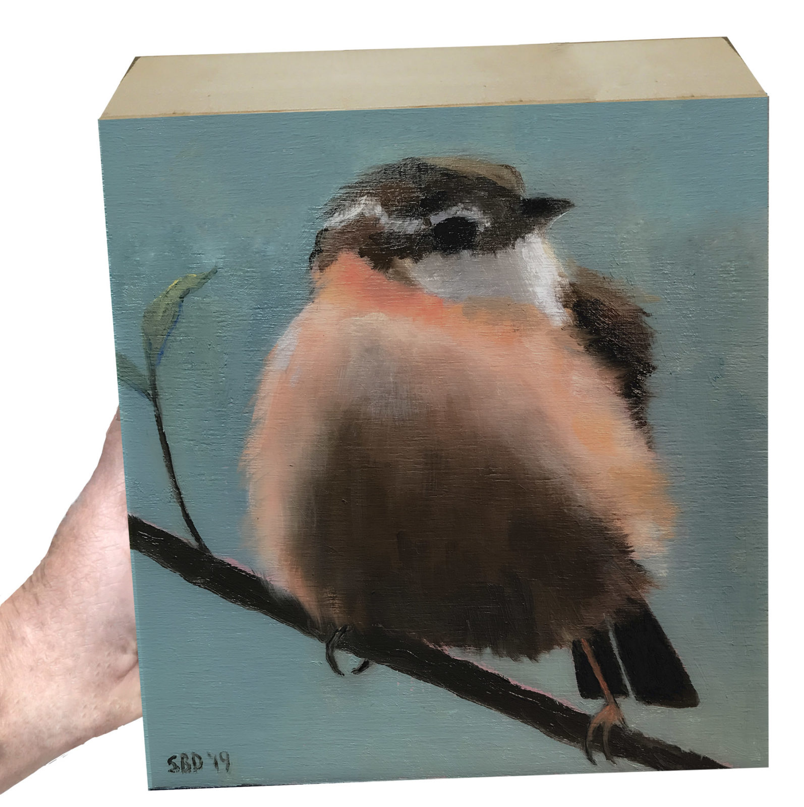
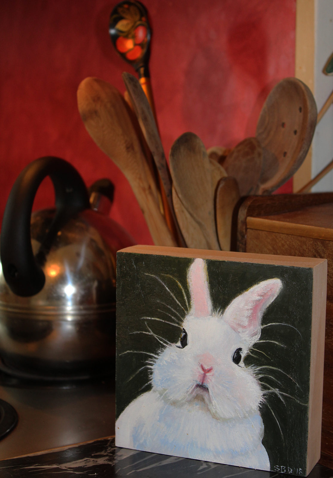
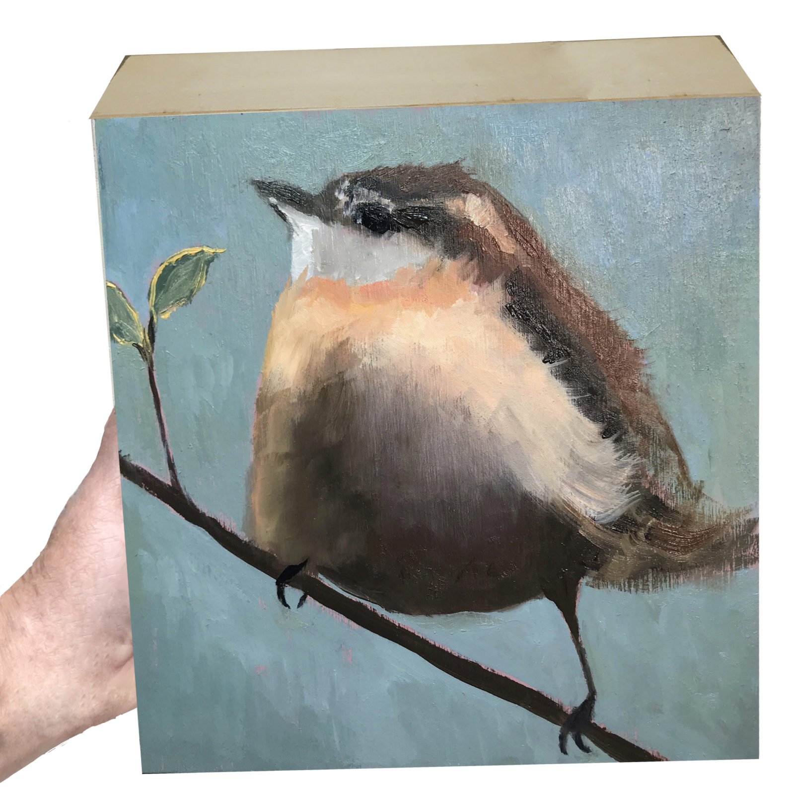
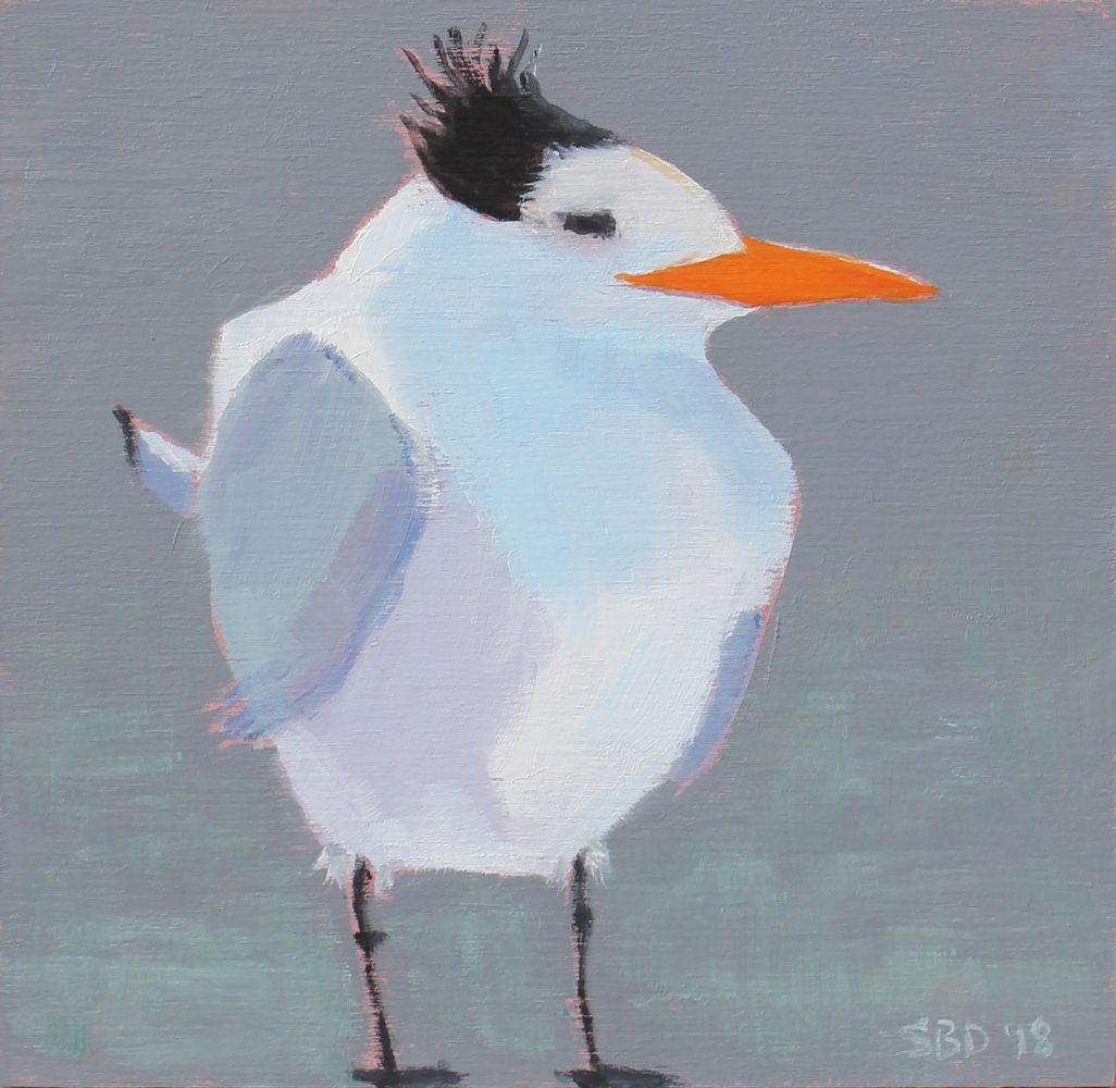
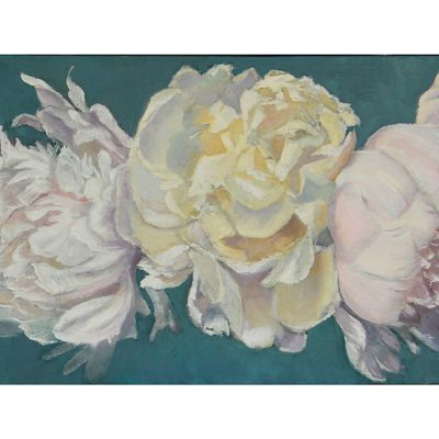
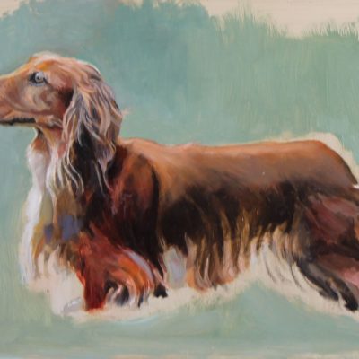
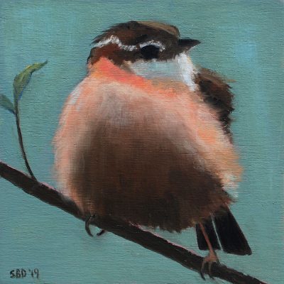
What a year this has been! Most of it has been dedicated to illustration and the publication of our book, Frog’s Rainy-Day Story and Other Fables. I’ve been able to grab time to fit in these little paintings, which I’ve grown to love. I have them scattered all over my house. They’re on blocks of wood (6″x 6″x 1 5/8″}, so they hang in cozy spots and sit on tables, windowsills, even by my stove helping me cook.
Everything here makes wonderful gifts for friends and family. Please take a look around and enjoy.
Oil paintings on Wood 6″x 6″x 1 5/8″
by Sarah | Jan 23, 2019 | Blog
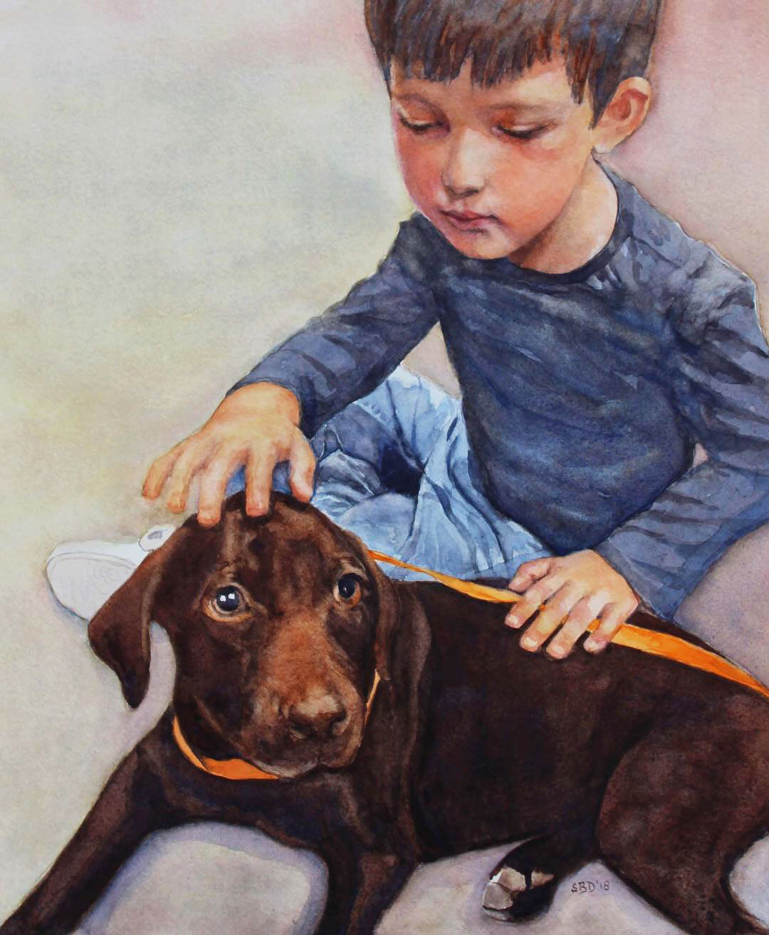
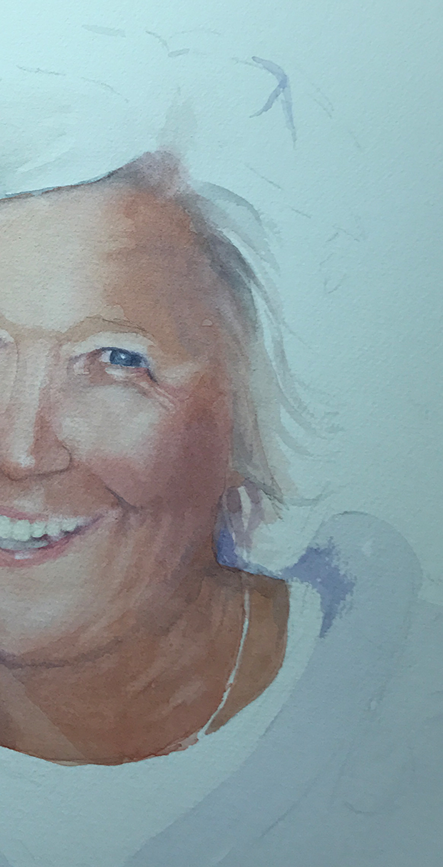
This is James and his new puppy. His grandmother (a dear friend) asked me to paint a portrait as a Christmas present to her son and his wife. She wanted a soft look, and watercolor is a perfect medium for that.
I was given a 3″x5″ photo from which to work, and the finished portrait would be 16″ x 20″. Help! Thank goodness for PhotoShop. I was able to blow the picture up and see some of the details. Next the colors. Would they be accurate? Mary sent me samples of hair and skin color as James lives in Colorado…I live in Charleston…
This is going to be a short blog as I got well into James’ portrait and remembered I needed to take photos. You can see some of the drawing here, and the puppy is well underway. I used a combination of Transparent Red Oxide and Quinacridone Sienna to arrive at the wonderful orange/copper color on the nose and highlighted in the fur. At this point, I’m just starting to figure out the fingers and hand placement. Also, what is going on with the rear paw? Which leg was it attached to (look at the photo below)?
Here is the sweet photo of James and the puppy.
I thought you might like a closeup of James’ sweet face. I really wanted to capture his intent, his thoughtfulness. I hope I succeeded.
Mary sent me this wonderful picture. “They love it!” she said.
No sweeter words.
by Sarah | Jul 30, 2018 | Blog, Blog Posts
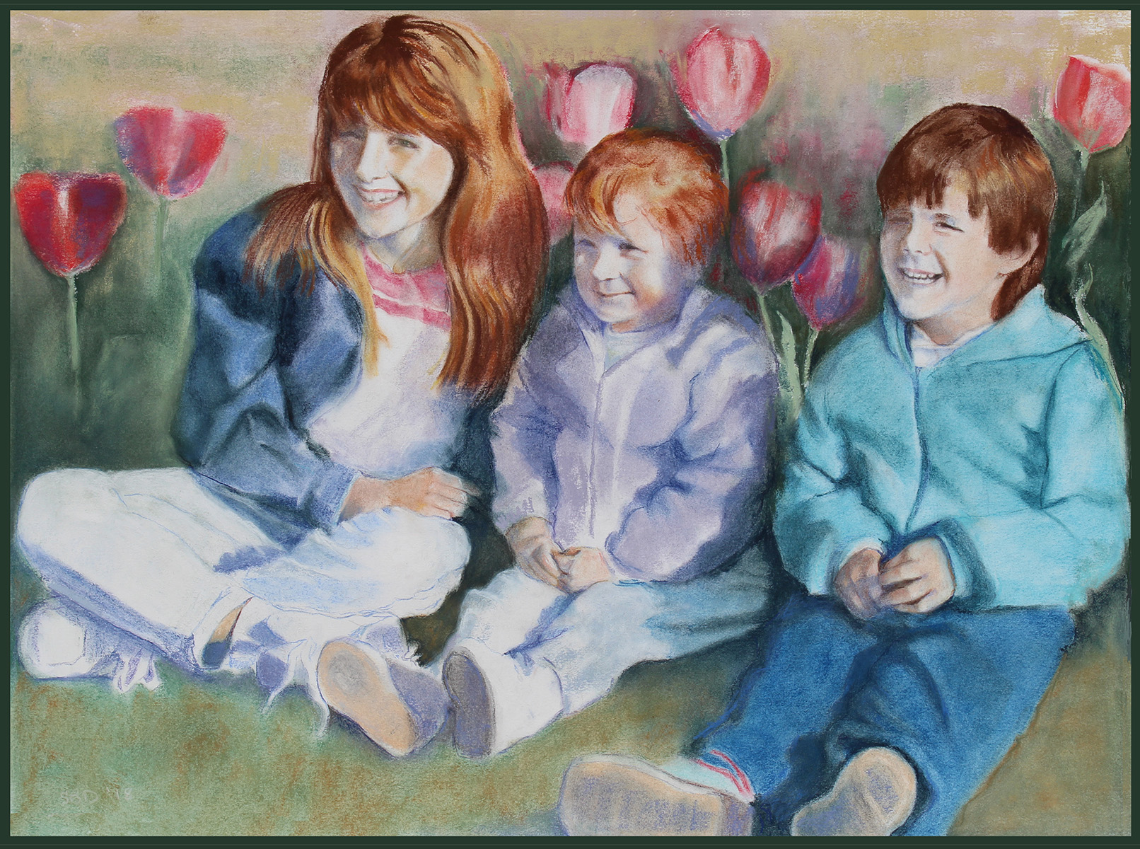
   A dear friend, Jan Fincher, asked if I’d do a pastel portrait of her three children when they were little (being now fully grown with children of their own).
   She then gave me a wonderful 3×5 photo taken many years ago of the kids in a bed of tulips! It’s the only one she had of them all laughing together at that age.
   The light was behind them casting shadows on the right side of their faces. I felt like a sleuth trying to figure out what the eyes were doing behind those shadows. You’d be amazed at how much moving something, even something as small as a dot, can change the character of a face. A millimeter or less can make a big difference!
Below is a closeup of Aimeé, the youngest. I love that face! Here I’m trying to find the placement of the features. The hardest part was capturing the slight amusement in her eyes and mouth.
In this next image, I’m laying in the tulips. I’m also thinking about this wonderful red hair!
Now I’m adding in the siblings. Ashley has reddish blond hair. Will’s hair is brown.
About this stage, I’m realizing that these tulips are as big as Aimeé’s head. They really are this size in the photo, but it doesn’t work here.
I’m also discovering that if you forget what you’re doing and lay your hand down, say on the tulips, you’ll then find that red pastel settling wherever your hand lands next. I spent more time than I like erasing or washing my hands…grrr.
Below you’ll see that I’m starting to reduce the size of the tulips, trying to treat the picture as a whole. For me, probably the hardest part of painting is eliminating, deciding what is important and what isn’t. That’s probably why I don’t do landscapes. Just look at how many different shapes, lines and greens are out there! Brain implode.
Once I got the ok from Jan that I’ve managed to capture the kids’ likeness, I started to relax and fill in the legs and sneakers.
I’m thrilled that the Finchers are pleased. Jan told me, “I’ve shown the picture to all three and they all have commented on what cute kids they were! Ha ha!”
That they were!
by Sarah | Jul 4, 2018 | Blog, Blog Posts
This piece, “Out On A Limb,” was so much fun to paint!
This is a watercolor on watercolor canvas, which I’ve never used before. Every medium has its own very distinct look.
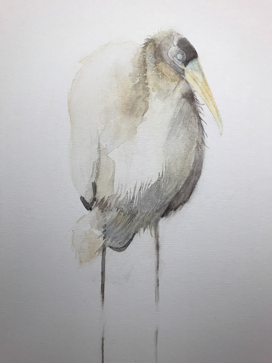
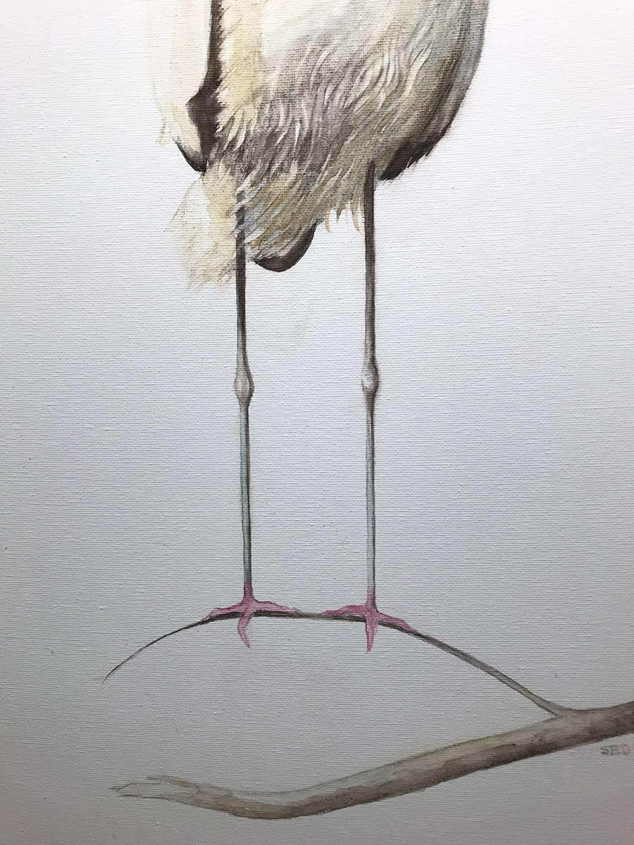
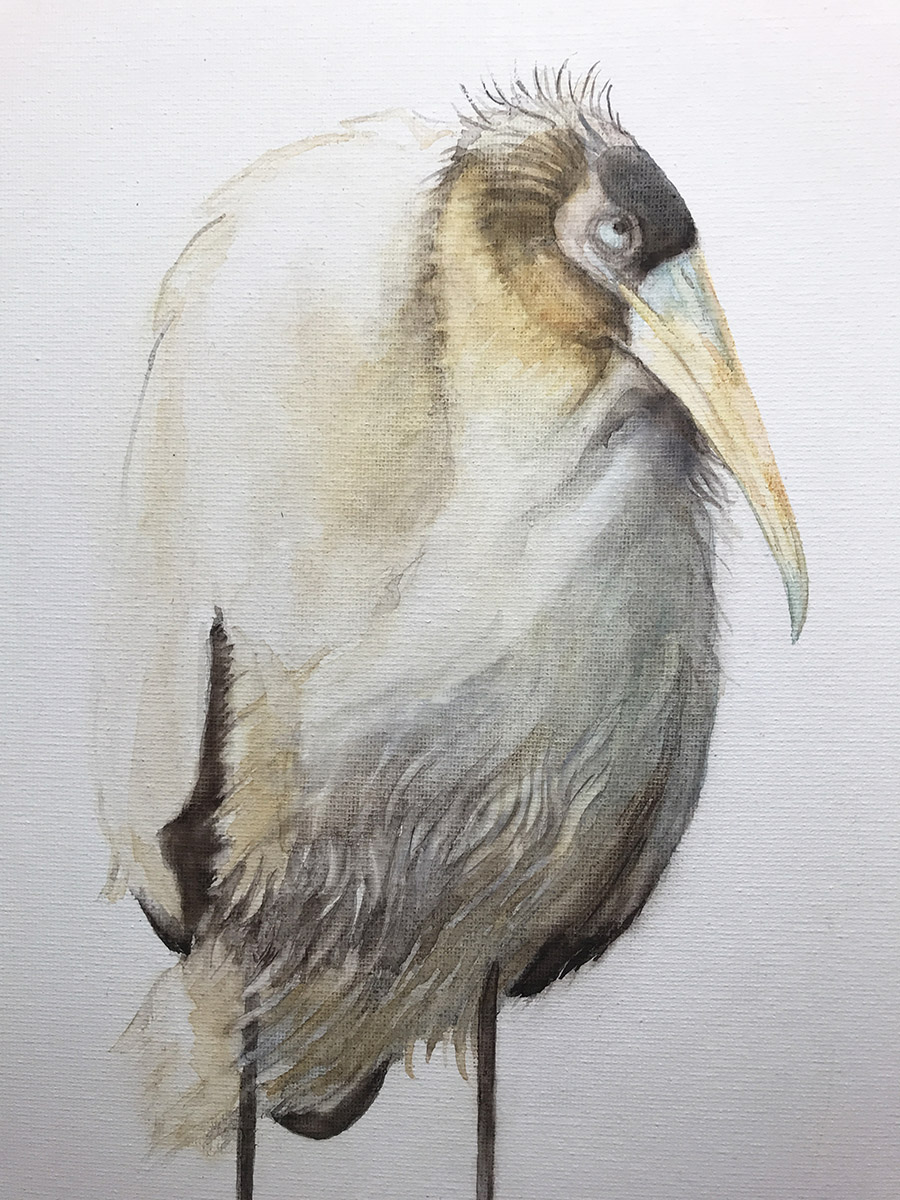
This wood stork is young. Notice that it still has tufts on the top of its head, and its beak is not yet overly long.Wood storks are among the most bizarre looking birds!
The Three Gents
If you clump mature wood storks together, they look just like old men. For fun, I thought I’d just throw in this humorous watercolor take of wood storks that I did many years ago. It now hangs in the home of dear friends.
This is my first drawing exploring the “look.”
I apologize that all of these images are rather dark at the bottom. They were taken with my Iphone 7 in my studio.
Where to put the knees? I can’t tell you how many times I moved the knees up and down. These fellows have deceptively long legs!
At this stage, I’m also trying to determine the length of the beak, which becomes really long as the bird matures. Much like herons and egrets, the necks of wood storks can tuck into their shoulder and back, giving them a hunched-over look, which adds to their overall crazy appearance.
Those pink feet! That’s when I think God made animals not only for our pleasure, but also for a real laugh! Life would be so colorless without them.
Here you can see the canvas and strokes. Again, these Iphone photos don’t do the finished fellow justice. He is really much brighter, and the background is actually white.
Here he is, out on a limb. He’s standing here waiting for someone to take him home.
This photo is more accurate as it was taken with my Canon. The painting is 12″x24″.
by Sarah | May 15, 2018 | Blog
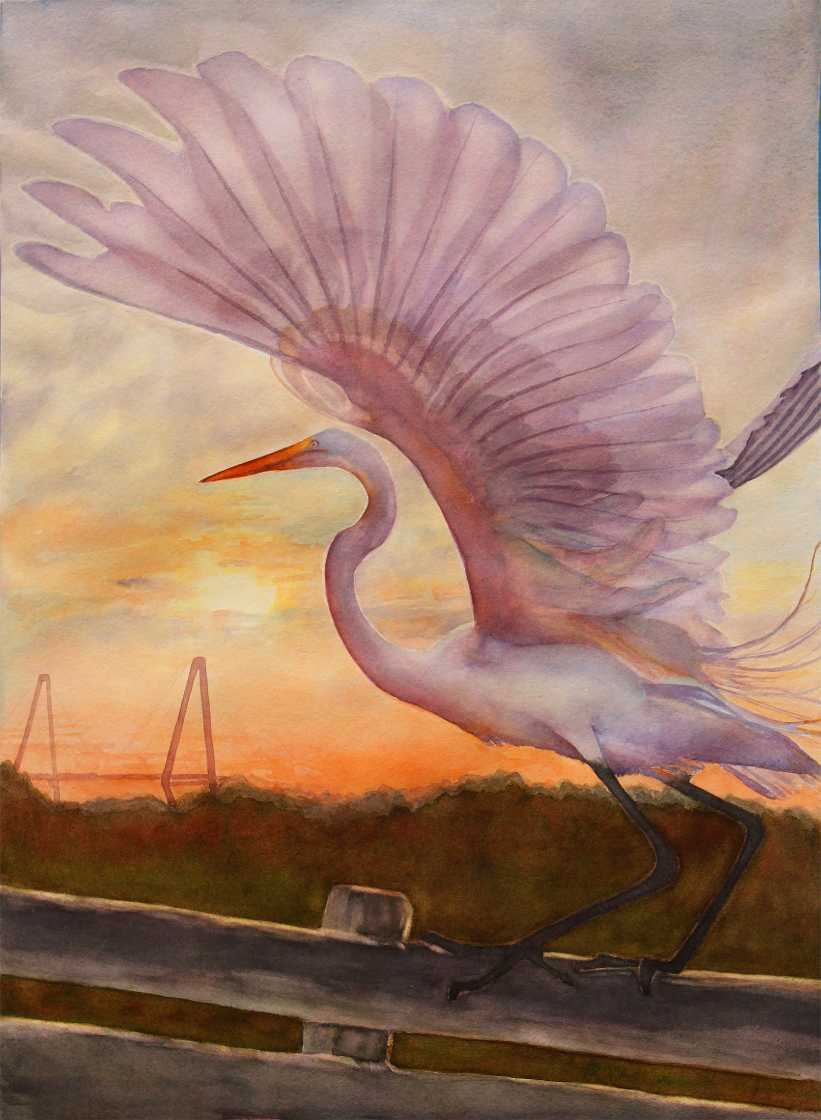
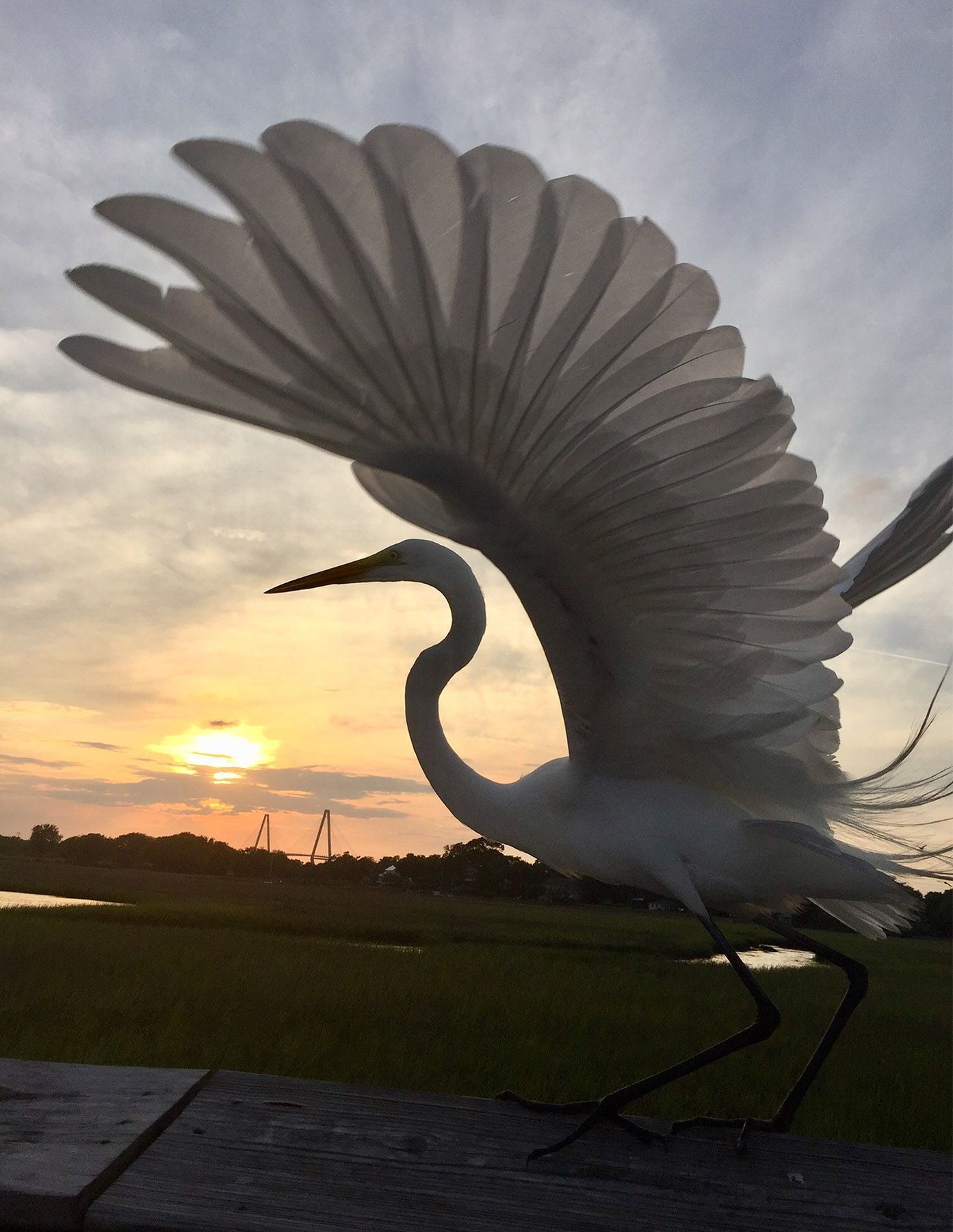
This is a commission that I just finished for someone who had seen the photo (below), and wanted me to paint it.
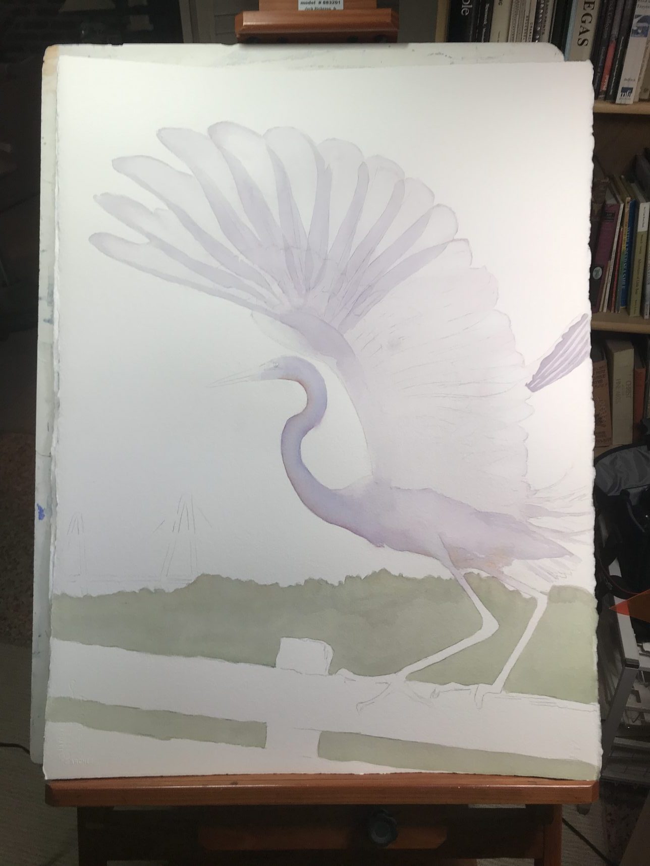
I knew that the photo below (taken by Luke Champion, a teenager who has split-second reflexes) needed to be a watercolor, as there were these wonderful layers of translucent feathers – perfect for this medium. I also knew that I had to invent the color, as it was to portray the rising sun, and the feathers would naturally pick up some of the early morning reds and oranges. I have to tell you that this was one of the more difficult paintings I’ve yet to do. I felt as if I’d entered a labyrinth, a maze of overlapping feathers and shadows.
I drew in the lines and started filling in the shapes. It wasn’t long before I realized that I was already going too quickly. If the shapes weren’t right, I’d have to start over again.
You can click on any of the images, if you want to see more detail.
I am not at all savvy about bird feathers. In fact, I almost flunked biology due to my lack of bird knowledge… However, I began to notice that there were at least three discernible layers, and I’ve read that there are six. Thankfully, I only saw three…
It was pretty early on that I began to get lost in the maze… which smaller feather was related to the larger one? Which feather let the light through? Which one didn’t?
I was also trying a new paper, Twin Rocker, a handmade paper that has quite a different look from my normal Arches cold press paper. I loved the colors that it picked up, but mistakes are not easily corrected. On my third try (two Twin Rockers, and one Arches), I started to pull it together.
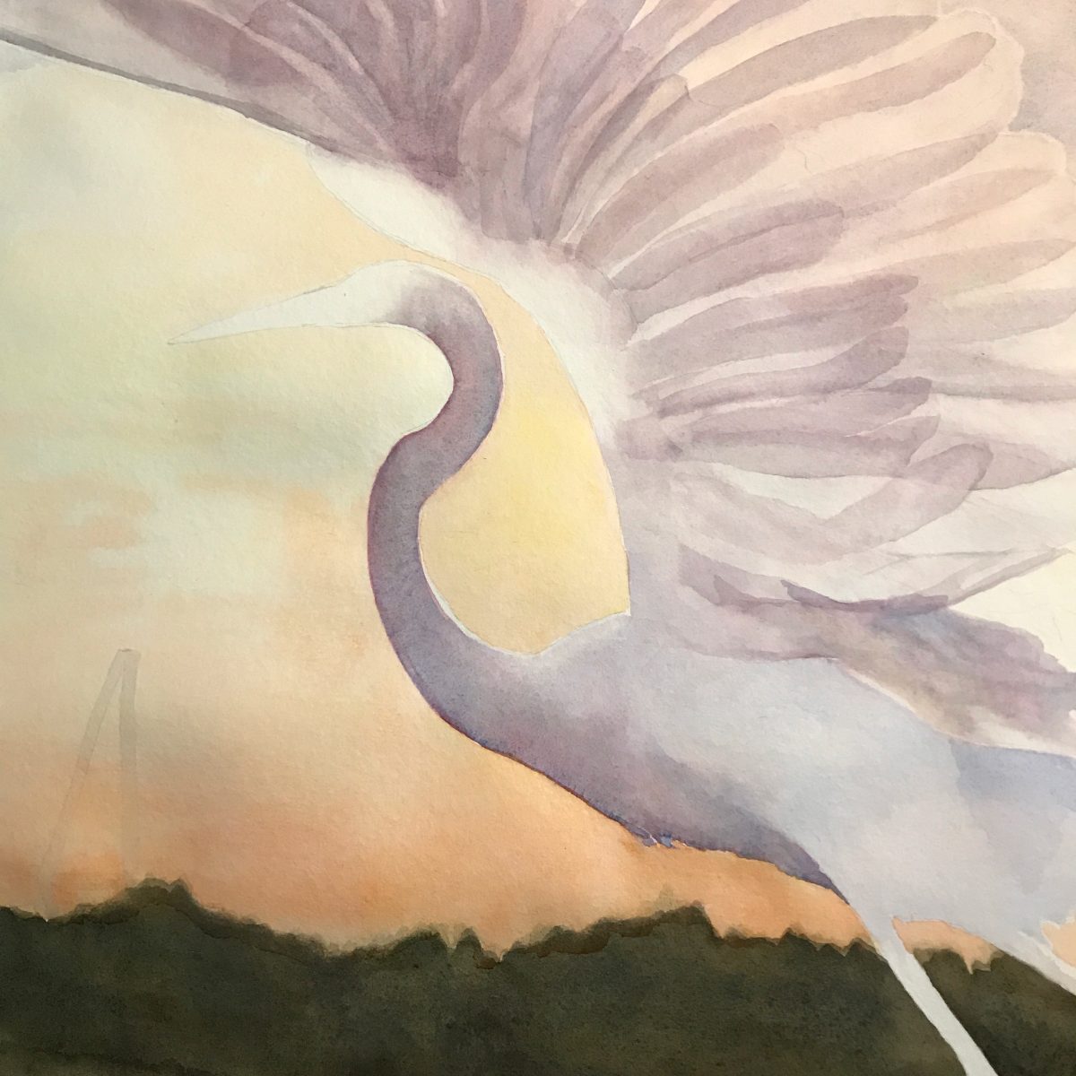
Here you can see how beautiful the granulation is that is unique to watercolor.
Here as well. This is the Twin Rocker with the beautiful subtleties.
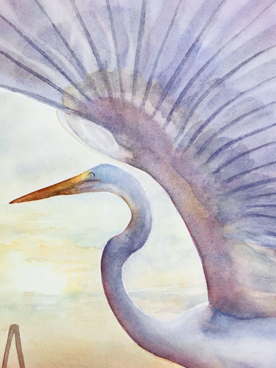
I had to push my colors as I tend to lean towards the earth tones. I knew the bright oranges hadn’t really reached the blue sky as yet so I just hinted that the light and colors were rising. I hope you like this piece.Â
Scary stuff to wait to see if the owner is pleased. Phew, he likes it!!
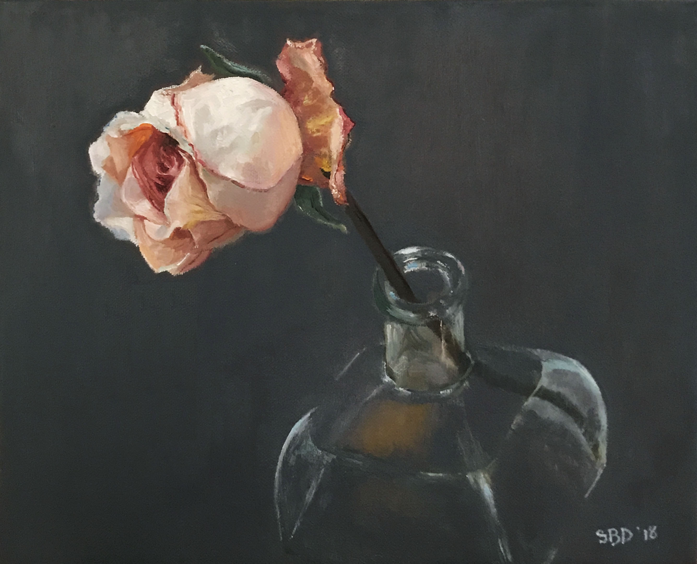
by Sarah | Feb 2, 2018 | Blog
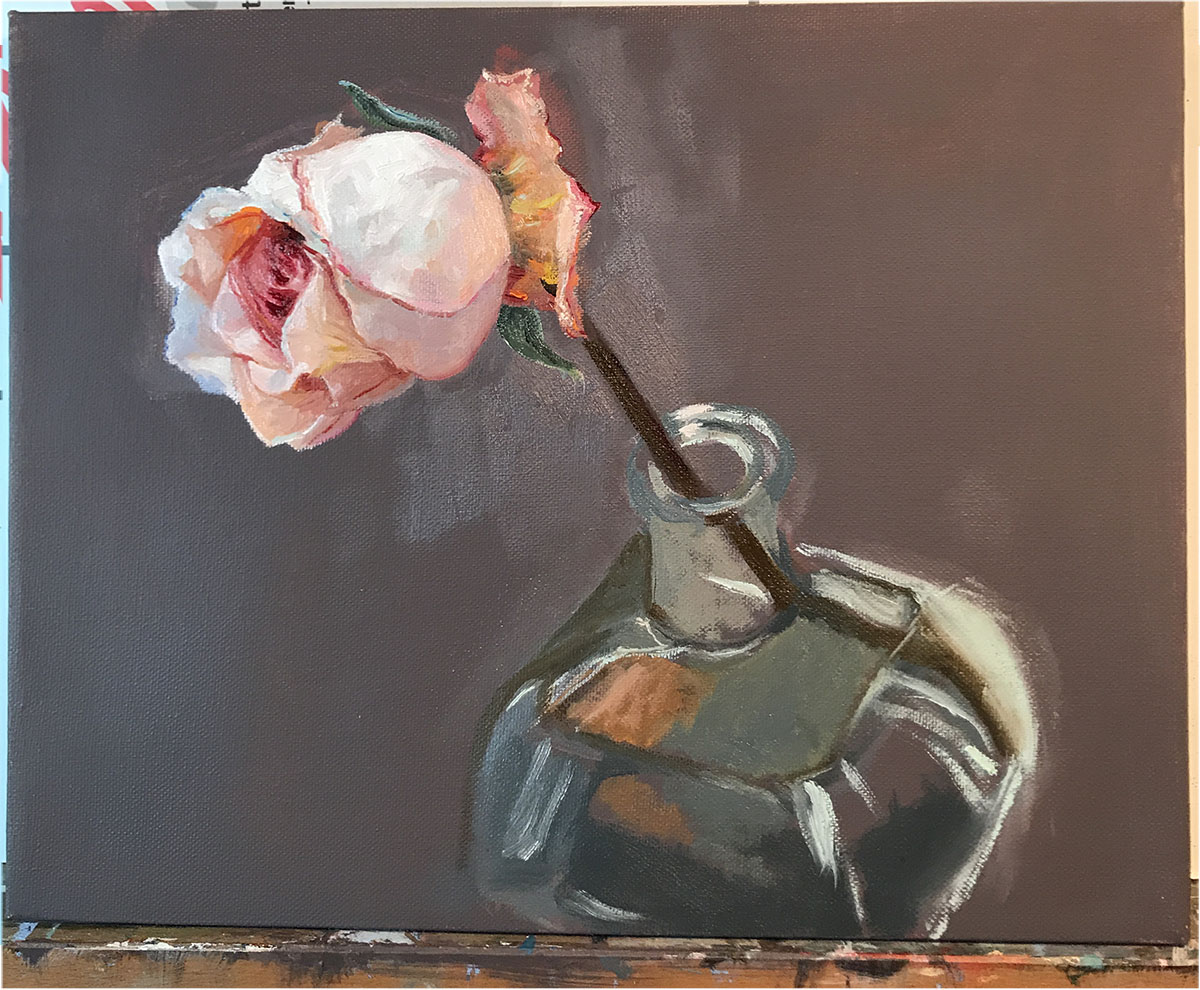
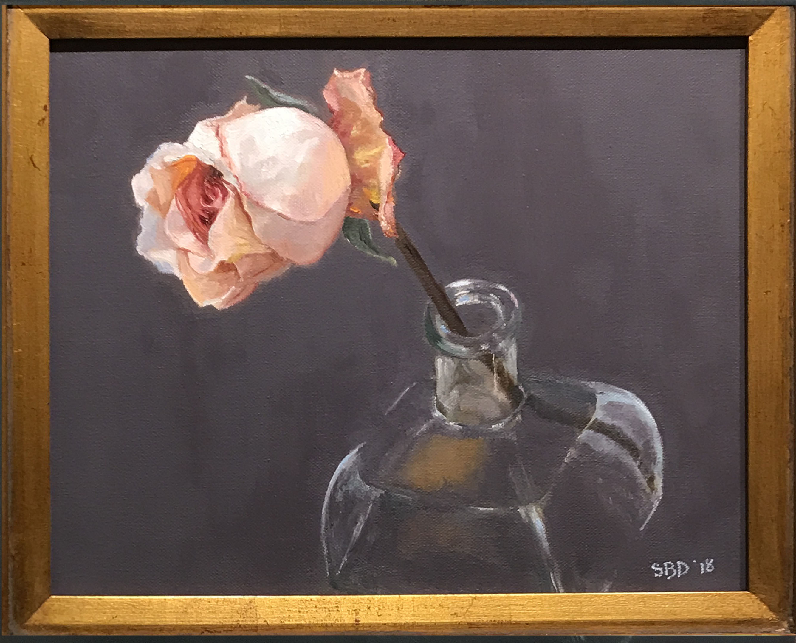
How this still life evolved
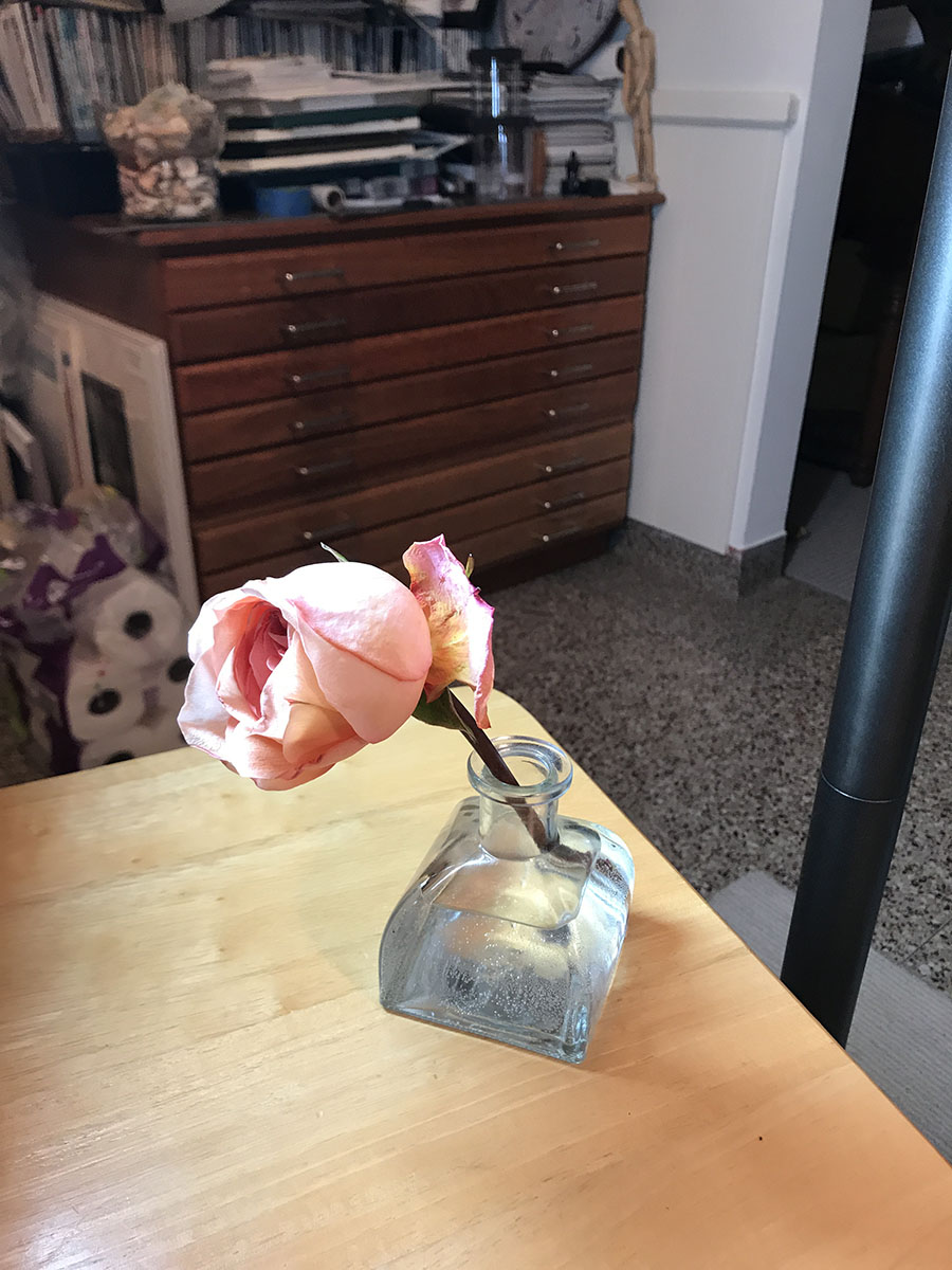
I started out with this rather pathetic setup. The rose was dying, and I’m working against time. I loved the light on the vase, and the colors in the rose, but not the pine table top. This is when I decided to improvise.
Â
Â
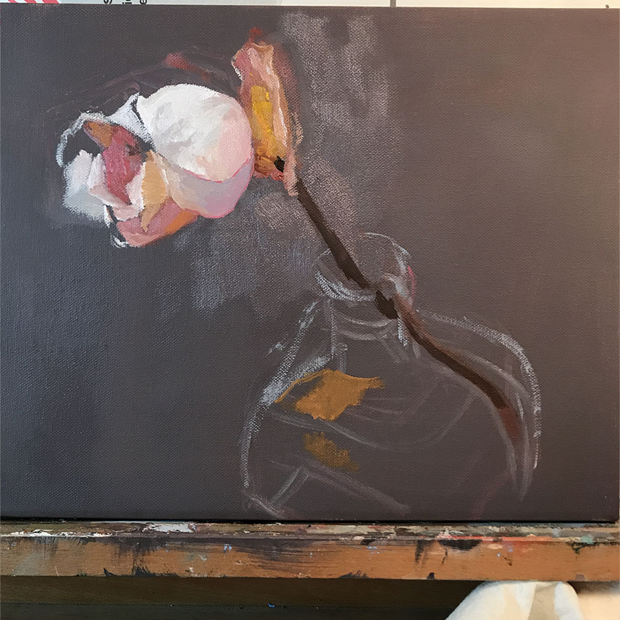
I laid in the grey background first, then proceeded with the rose, and suggested the vase.
The more I defined the rose, the more I liked the suggestion of the vase. I sort of liked the realism against the more free form.Â
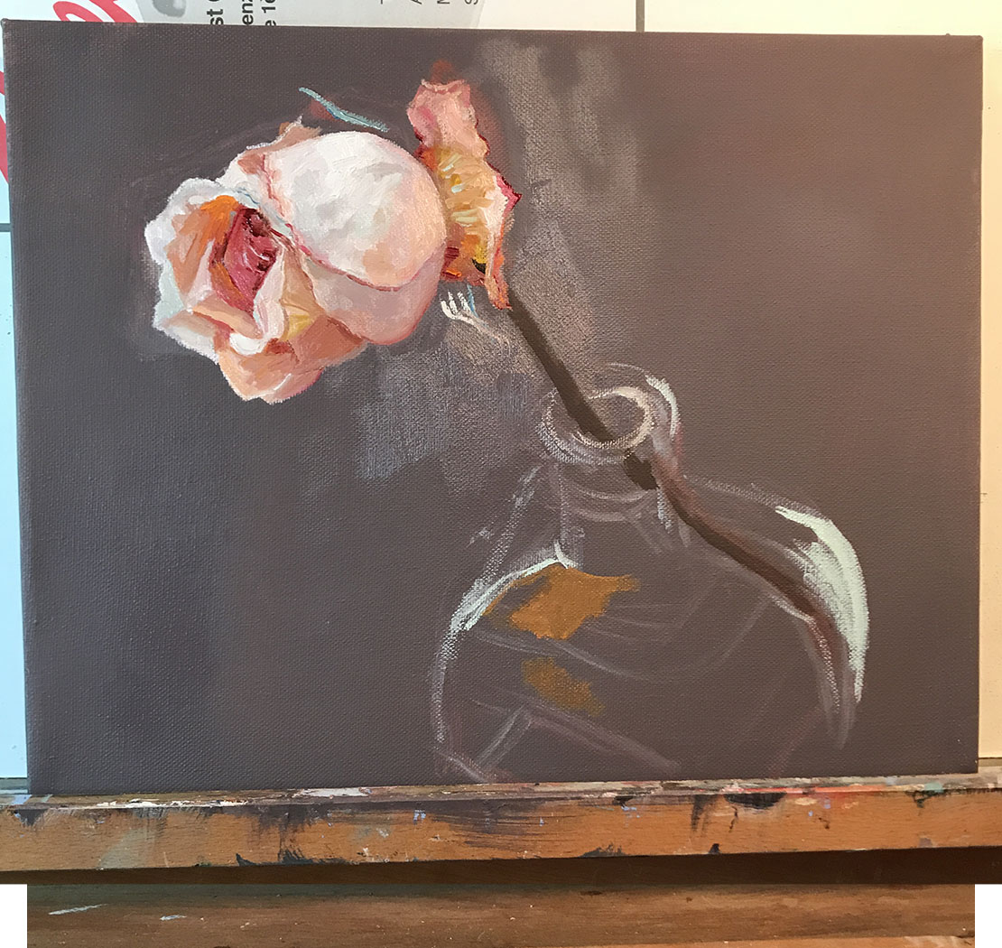
I then filled in the vase imagining what it would be like if the pine side table were dark. I did not like the vase filled in. To me, it lost the spontaneity
So I went back to suggesting the vase with simple line where the light hits the curves and edges. I put in reflections of the rose to bring more color to the vase, and to draw the eye down. I want you to know that I spent, probably, the most time on that little line in the upper lefthand corner of the base of the vase. It’s truly amazing how a small dot can change the weight or balance of a painting.
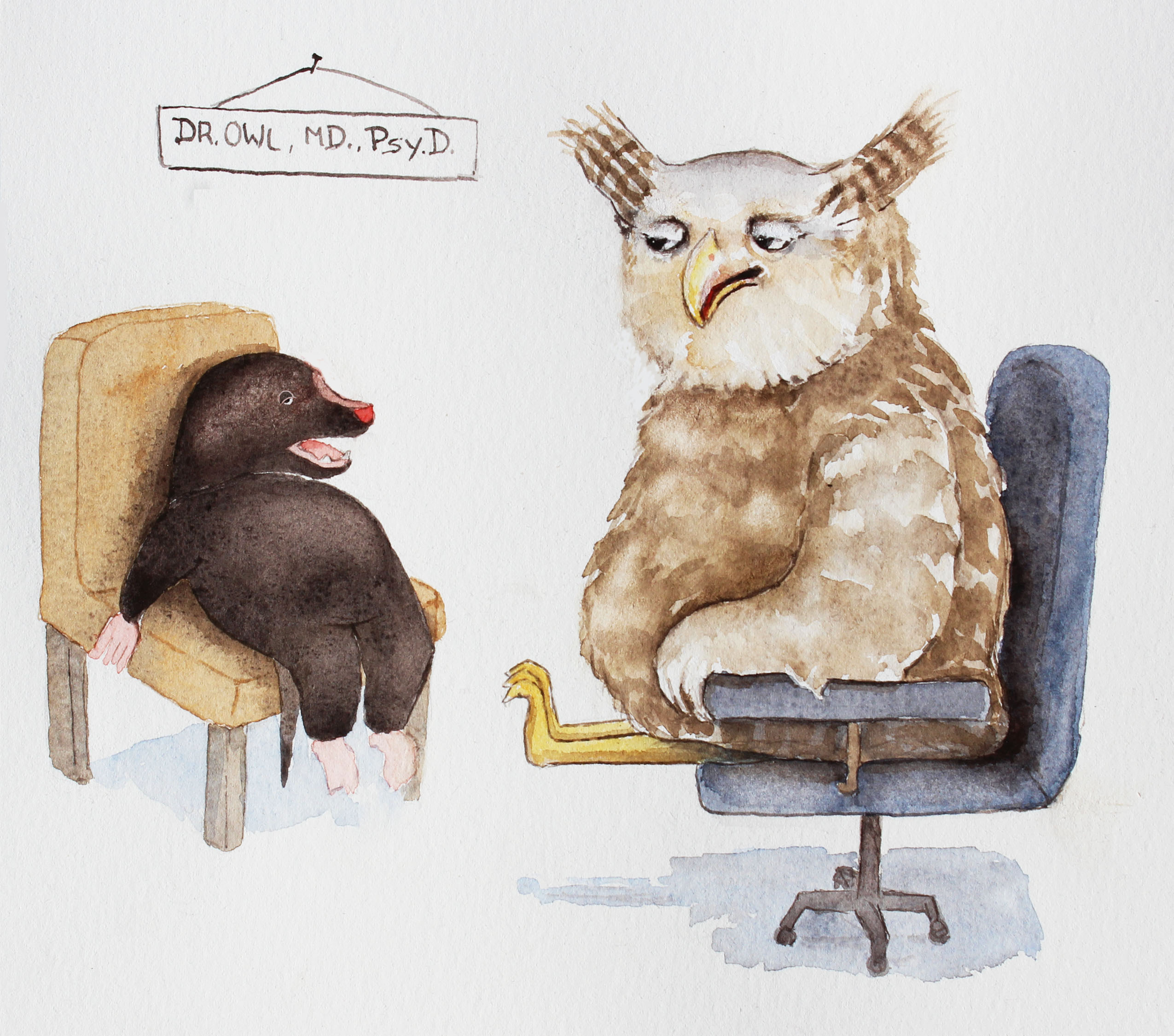
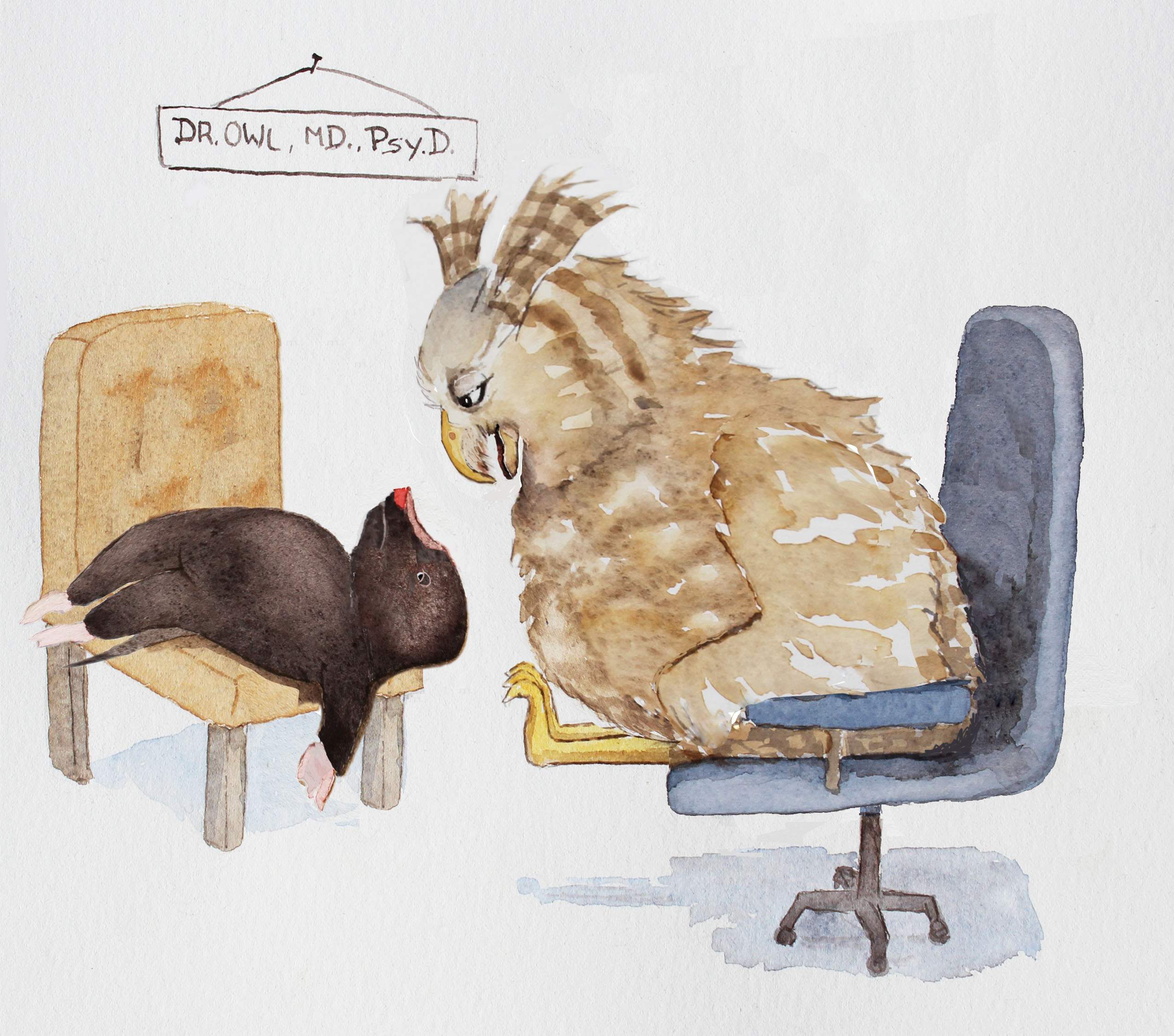
Now I’m turning to the FABLES again. I’d love to complete them by the end of March.
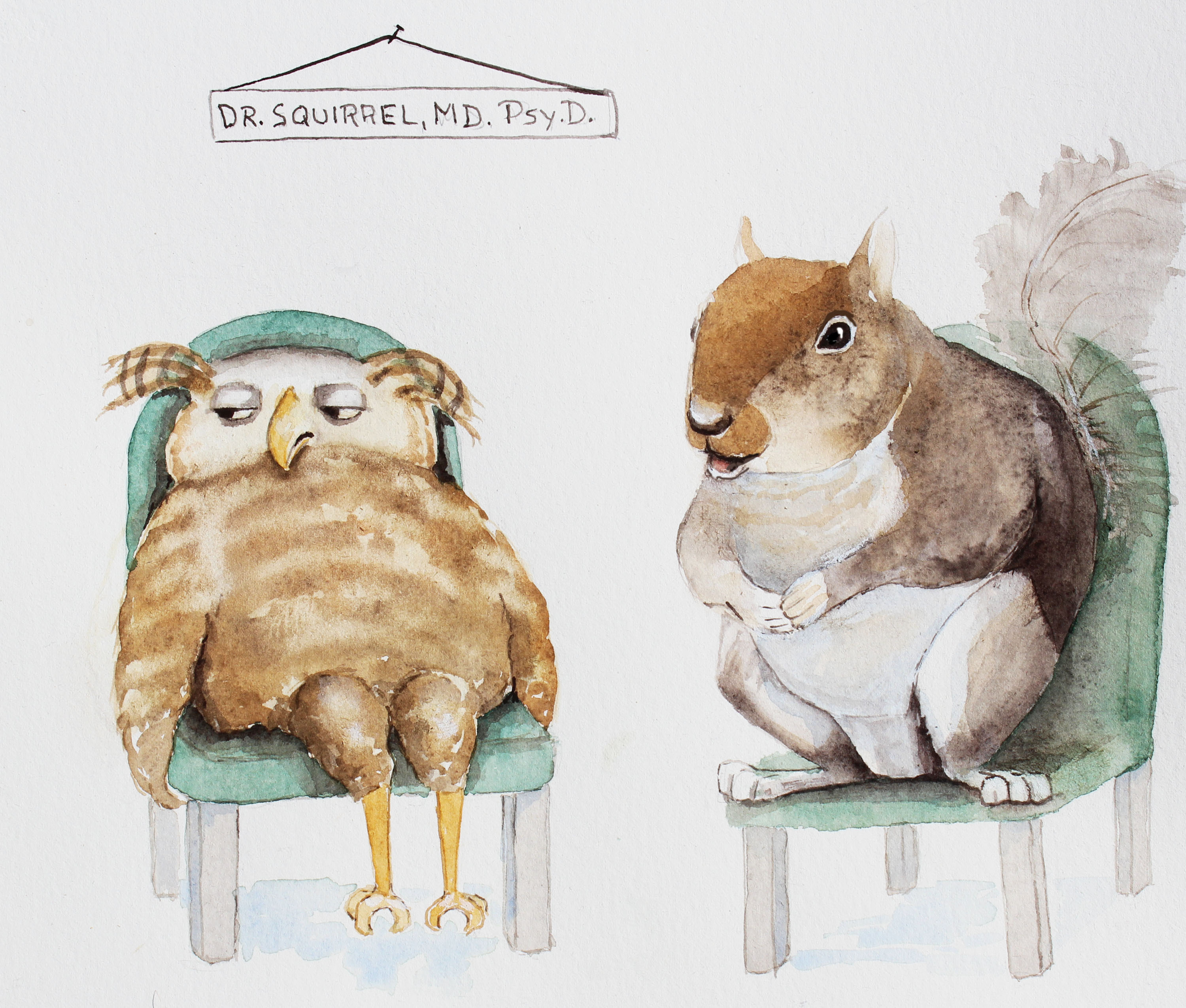
Now I’m Working on the Fable,
Owl’s Client
I’m going back and forth between illustrating and fine art. I really love both!
 “What seems to be the problem, Mr. Mole?” said Owl.
You’ll have to read the Fable to find out what happens…
by Sarah | Oct 10, 2017 | Blog, Blog Posts
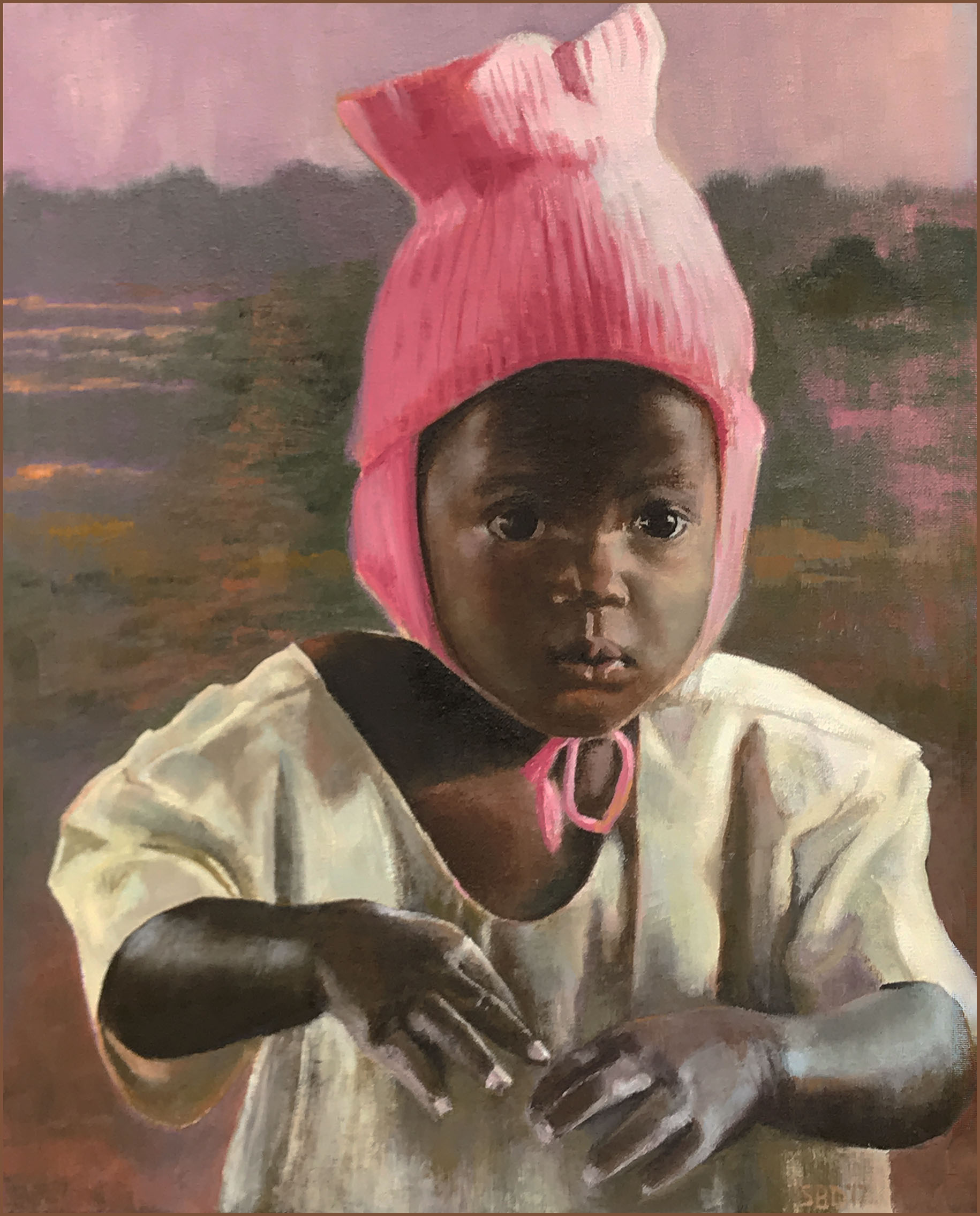
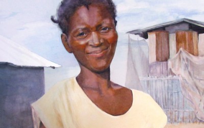
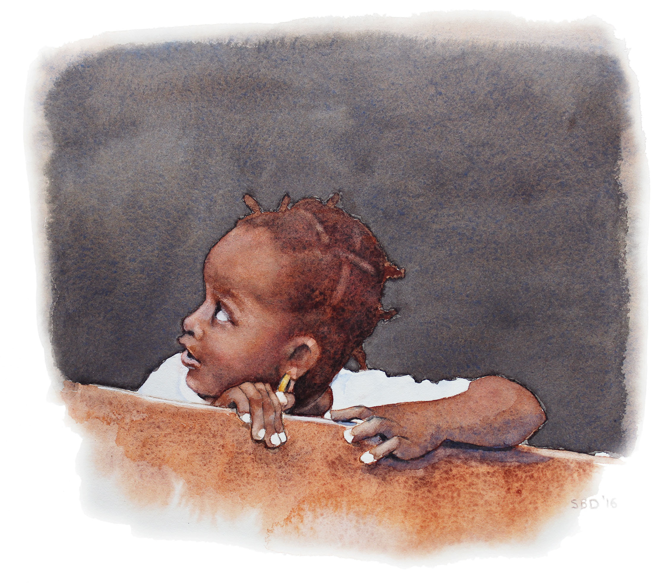
“The Pink Hat” is a painting I’ve been wanting to do for months! A dear friend had been to Uganda, and this little girl’s picture was among the photos. Her innocence was so compelling. So was the hat. Interestingly, the most difficult part for me were the hands. The way the lighting fell on them, and basically removed the dark brown color, made for an interesting problem. How to place the light and not draw the eye there as the subject was really the face!
I forgot to take a picture of the initial drawing. Frankly, I’m amazed I remember to take any pictures at all. I get so immersed in the paint that I forget where I am.
She looks a bit strange…however, I’m trying to locate the shapes and values. The lines had already suggested the movement or placement.
Where are the darkest darks, the midtones, and the light?
I’m still laying in the darks, and finding the placement of the facial features.
She’s starting to take form, and I can lay in the hat, which I’ve been dying to do. I just love her expression!
The wonderful part of being a painter is that you can decide what you want to emphasize or not. What color should the background be? Green is the complement of pink…does that work?
I love her outfit. Again, what shadows do I bring forward (with a reddish tone) or set back (with a cool blue or blue/black). You can create great tension with cool colors against warm, not just light against dark.
I decided I wanted a Ugandan countryside behind this little Ugandan girl. It’s filled with greens, pinks and oranges.
Now I’m moving to the hands with the gown as the background.
Her right hand was interesting in that there were so many colors, shapes, darks and lights.
The left hand was a bear! Hands are so expressive. I remember my mom’s hands so well…she who couldn’t sew on a button, but spoke volumes with her hands. I wanted these hands to express a certain vulnerability. Only time will tell if I succeeded or not.
Here’s the final piece. I decided to go with the left hand connecting with the right but relaxed as she’s not thinking about her hands. This hand was rough as I stated before. You have to be careful where you want the eye to go. It will be drawn to the light, and the hand is not the subject but, hopefully, an added statement.
THANKS if you managed to get to the end of the blog! Please comment if you have things you’d like to know or if I’m not conveying my thoughts in a way that makes sense (which is highly probable..).
’til next time!
Sarah
by Sarah | Aug 14, 2017 | Blog, Blog Posts
“Doots”
My childhood best friend, who died last year was just so full of life! She loved to laugh.
We met in pre-nursery school, and were both “Doots.” We started the renowned “Doots & Doots Detective Agency”… solving all manner of crimes…often ones that we committed.
I was asked by her siblings to paint her portrait as a gift to her husband. I so dearly wanted to capture this loving, zany friend who was always looking for a joke or plotting something mischievous.
I have to say that this was the hardest painting I’ve ever done. Often I’d cry.
But the painting was presented to her husband last week, and I was so touched by his thoughtful note:
“I can’t begin to describe the impact of your painting. Such a blessing. God’s in His heaven and Sandy’s with Him. Love you.”
Oh, I’m so glad I was asked.
Here are a few thoughts en route to the painting
This is what’s called a “value study.” I gave arbitrary colors to the various values on Doots’s face, namely dark black and dark blue for the darkest values. The middle values on the face are purple/gray. The interesting thing I learned is that you can use ANY color in a painting and it will make sense as long as the value is accurate. It will look astoundingly right. Value is key!
I’ve enclosed a value chart here going from the lightest light to the darkest dark, so you can see the variations.
Doots’s brother stopped by, and we determined that he had the same coloration as Doots. These are the sample colors that I used primarily on her face in the painting.
I should add that the finished painting (above) is actually on white paper, so the colors are not accurate (sigh). The camera has a hard time registering white, and often gives the picture a yellow, red or blue cast. Frustrating!
Painting almost always requires many failed attempts. For instance, I couldn’t get the right side of Doots’s face without her looking truly bizarre, so I’m hiding it in this photograph… I, also, realized that her mouth was too wide. She also looked fat, and I didn’t want that, so I scraped the whole thing. Sort of like bad batches of cookies…
I didn’t take many pictures as I worked through this painting as I was so absorbed that I forgot. Next time I’ll do better…
Aside from my fine art paintings, I’m illustrating a book of fables that my husband has written called “Timely Tales.” I love them! Here are two preliminary illustrations. I’ll be posting new ones here as I trot along…
It’s Carnival Day!
I’m bored!
           Back to Work…
Well, now it’s time to get back to work…Â
by Sarah | Jul 25, 2017 | Blog
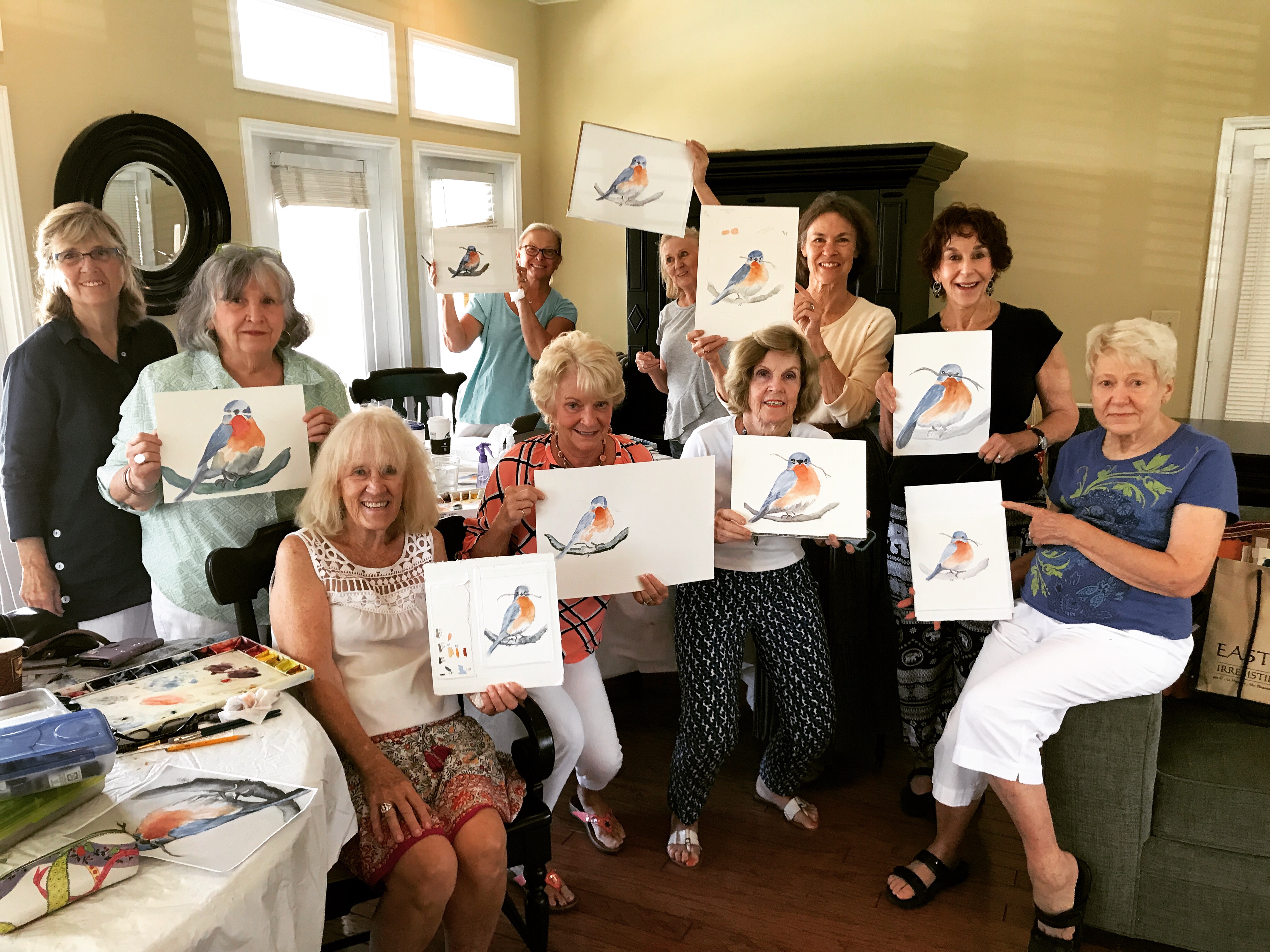
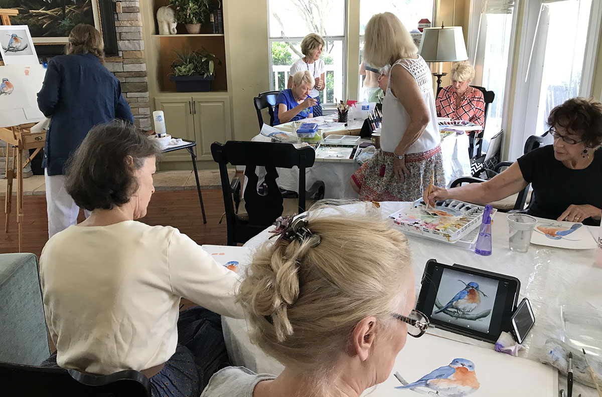
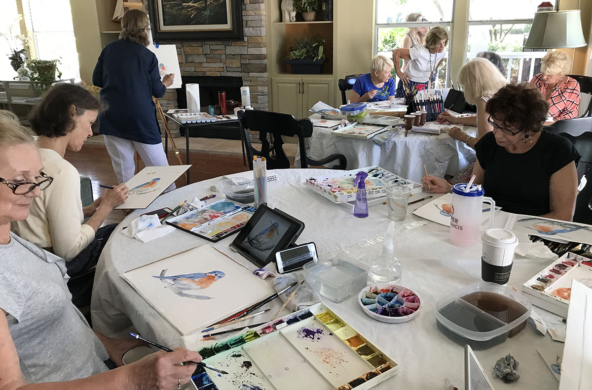
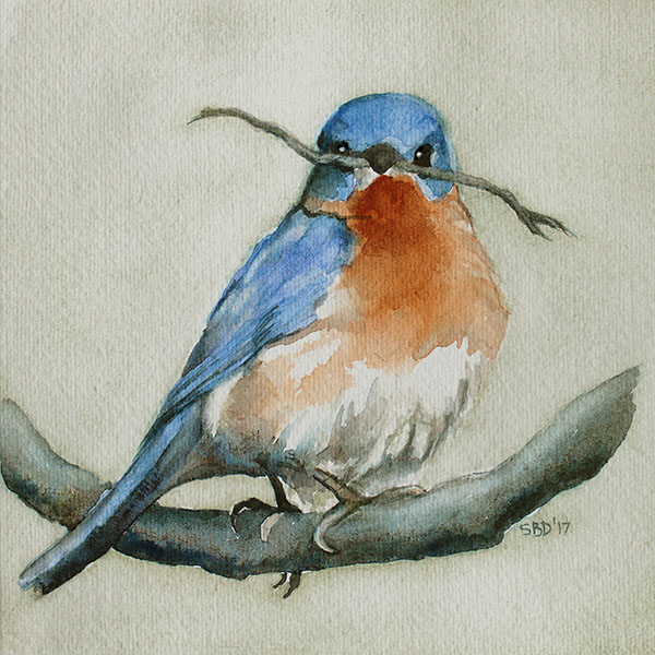
I taught my first class! They liked it!! Who knew….
When I was in my twenties, I taught an art class of about twenty students, all ages. Within several weeks, most of the class had evaporated! Â After that, I determined that I should leave teaching to others…
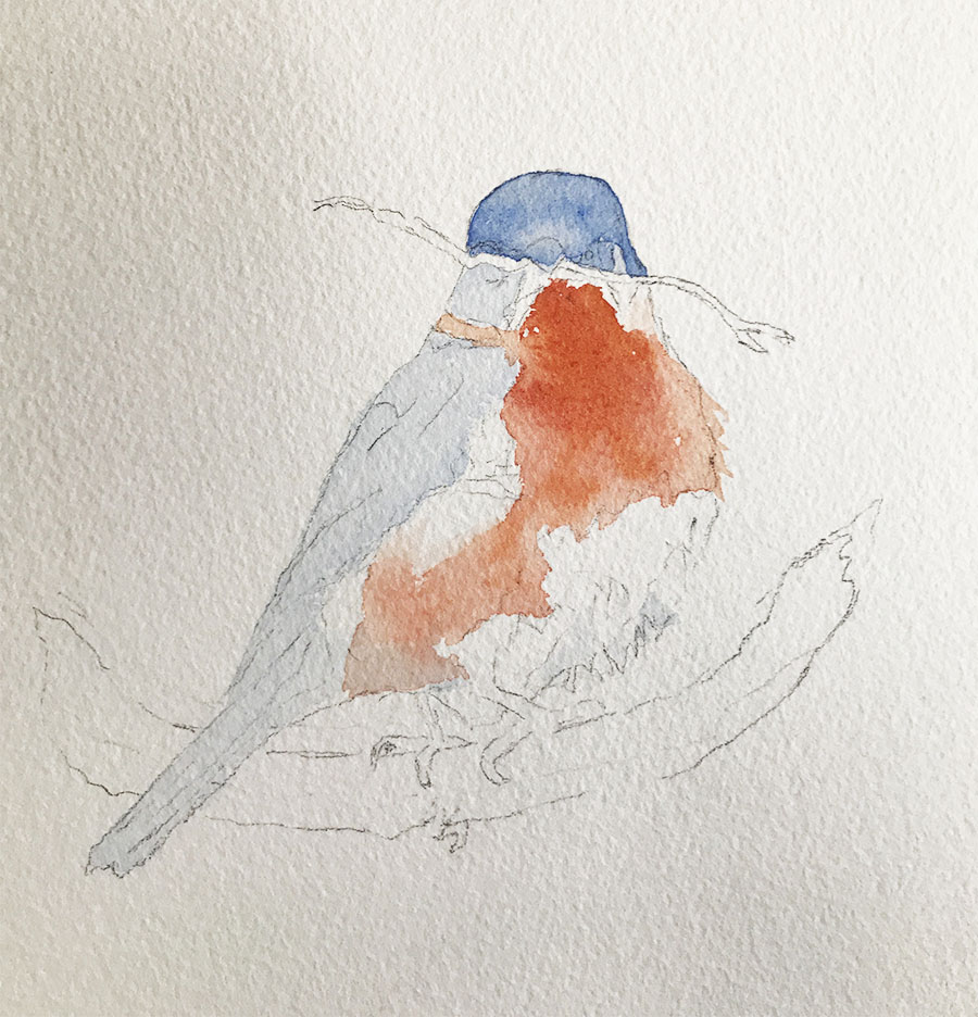
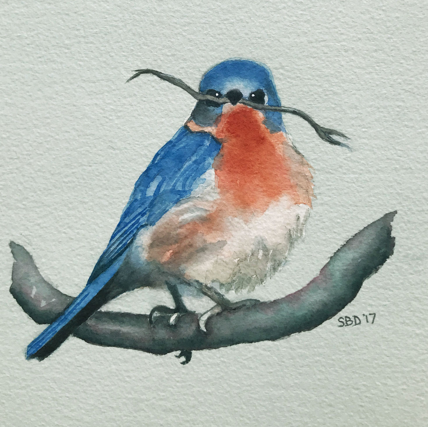
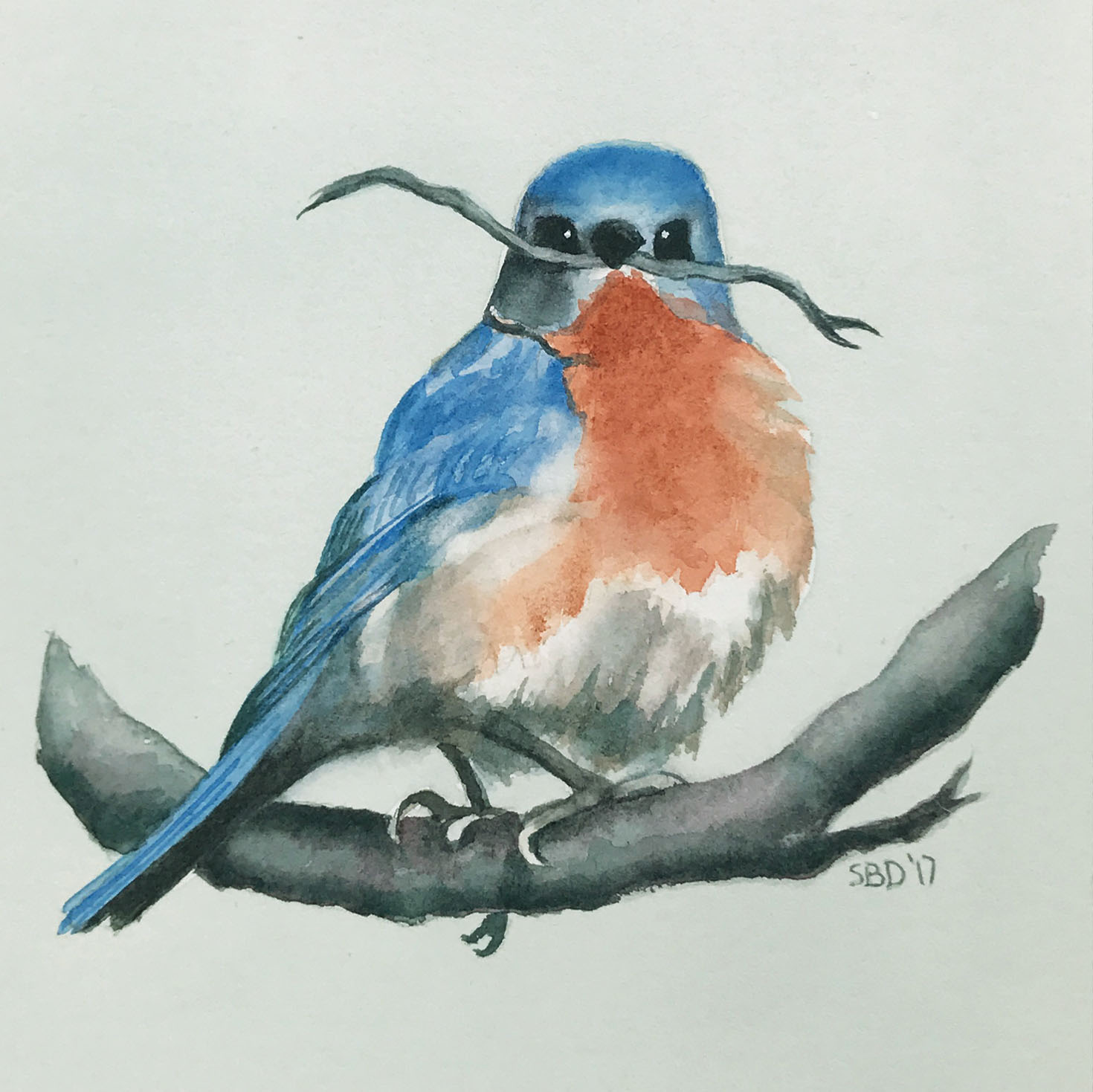
When I was asked recently to demonstrate watercolor, I started the class by reciting my experience, but figured I’d aged and acquired some knowledge that could be useful. I used my bluebird painting for everyone to copy, and I painted along with them.
While the class painted their bluebirds, I painted two: one on Arches 300 lb. cold press paper; the other on Arches 300 lb. hot press paper. I thought it would be fun for everyone to see the difference. Hot press paper is smooth, and has none of the dips and rises of cold press, so the watercolor slides more readily and produces a different look.
They did a great job, and they all stuck around!! They’ve even asked me to come back!
Below you can see the class working away, and in the distance so am I, madly trying to keep up with TWO birds!
*Click on the images if you want to see them close up.
Here are the two Bluebird drawings side by side. The 300 lb. cold press paper is on the left. The 300 lb. hot press paper is on the right, and you can see the Arches logo on the bottom right. The “300 lb.” indicates the thickness of the paper.
*Click on the images if you want to see them enlarged!
Here are the two finished Bluebird paintings: Â The 300 lb. cold press paper is on the left. The 300 lb. hot press paper is on the right.
*Click on the images is you want to see them enlarged!
PAINT – For the Bluebirds, I used Daniel Smith:
- Aureolin (Yellow)
- Cobalt Blue
- Phthalo Blue (Red Shade)
- Quinacridone Rose
- Quinacridone Burnt Scarlet
- Quinacridone Sienna
- Alizarin Crimson
- Prussian Green
- Winsor Green (Blue Shade)
To make light black, I combine: Cobalt Blue, Quinacridone Rose and Aureolin.
To make dark black, I combine: Winsor Green and Alizarin Crimson.
PAPER – Arches Cold press and Arches Hot Press:
- Cold press is best for beginners as it absorbs water better, and is easier to work with. It has a clean look.
- Hot press is great for detail line work and inking, and stays wet longer as it lays on top of the paper longer so you can play around with it.
The next class we’re going to be doing “Hydrangeas” on hot press paper. You do this with the paper on an incline, and you watch what the pigment does as it rolls down the page…This is going to be a fun class! I’ll keep you posted!
This has been a particularly busy time since moving from one side of Charleston to the other. I love where God has put us, backed up to a creek coming in from the Inner Coastal Waterway. We can put our kayaks right in off our back yard, where we can see Dolphin, Osprey, Herons, Egrets, and so much of His creation. That’s my husband, Michael, in the distance, and Maisie (or Brussels) is making sure he stays on course…
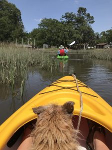
Kayaking with Maisie
by Sarah | May 26, 2017 | Blog
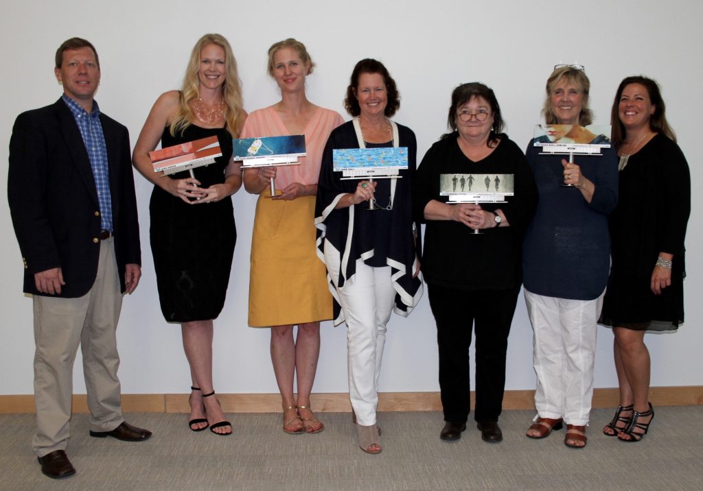
I never thought that a painting I did with enticing lips would be chosen to be on a billboard!
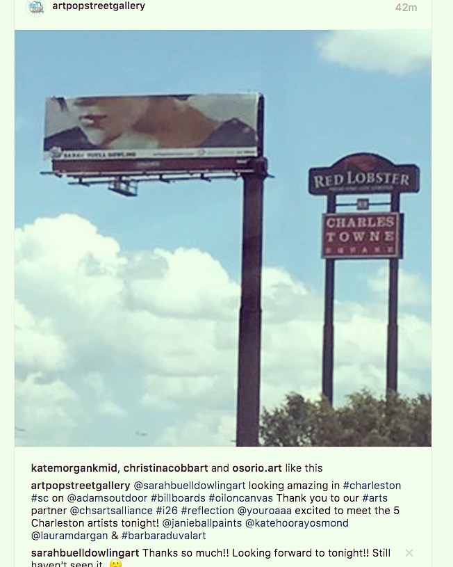
A wonderful group called “ArtPop” (ArtPop Street Gallery) is on a move to fill billboards all across the US and eventually even in Europe with art!
ArtPop worked with the Charleston Arts Alliance and Adams Outdoor Billboards to launch the movement here. They had a city-wide contest, and we five (holding our unusual trophies) are the winners! Who knew?? Last night we had the opening send-off with the billboards lighting up! We’re each on several billboards throughout the city, and move when the billboard is needed for someone who can actually pay… I still haven’t seen any of mine, but many have, and I’ve heard it looks great.
Here is the original painting, and you can see where I took the long, skinny part that I submitted for the contest.
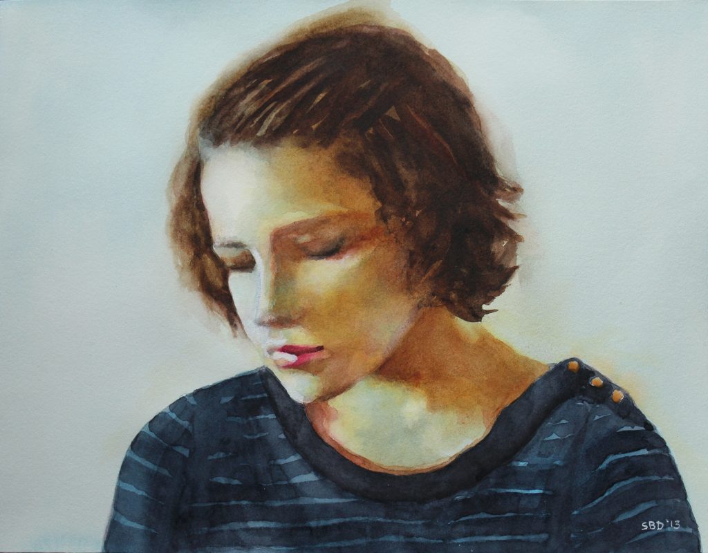
“Reflection” – This piece is for sale and, if interested, can be purchased in the SHOP
Thanks for taking a look.
Come on down or over to Charleston and see the real thing!
by Sarah | Mar 28, 2017 | Blog, Blog Posts
I’m posting birds probably because it’s spring, and we’re moving, and I’m decidedly feeling the nesting urge. Our house has sold, but we’re not clear where we’re headed yet, except we know we’re staying in Charleston.
I want all my paintings to find a nice home where they’ll be loved and bring a smile or provoke a thought. The best way to do that, one would think, would be to have a sale.
All my paintings will be anywhere from 20% to 25% reduced. Gag!
I’m hoping this blog will, perhaps, cause you to feel the nesting urge, and bring one of these paintings into your home.
§
This little Wren just found a home! He was grabbed on Instagram before the sale even began!!
I had to paint this Wren as he’s been sitting on my kitchen window sill chirping his heart out. I figured he was singing “paint me!” And so I did.
COME TO MY STUDIO!
1393 SOUTHERN MAGNOLIA LANE MT. PLEASANT, SC 29464
Friday, March 31 ~ 4 – 9pm
Saturday, April 1 ~Â 10am – 3pm
Â
ORÂ PEEK IN ONÂ MY WEBSITE
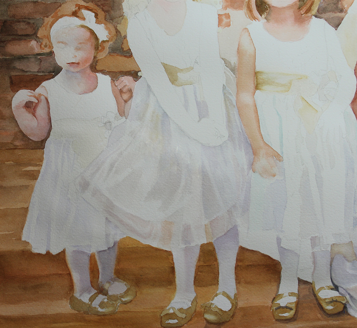
by Sarah | Jan 4, 2017 | Blog
I’ll try and take you through the process.
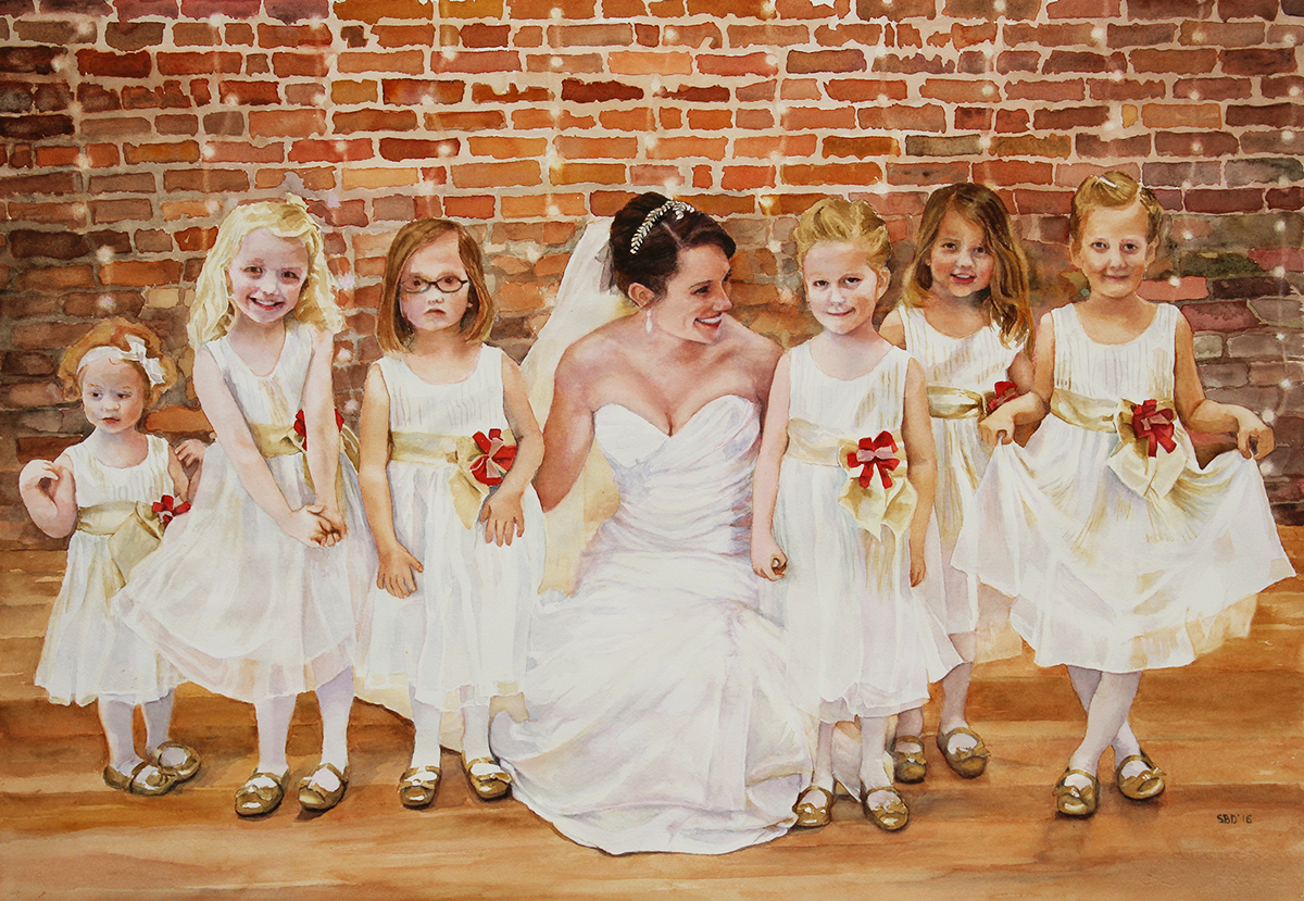
Once I’d done the drawing (1st image on right), I then put liquid masque over the areas where I wanted to be able to wash color, and keep the white of the paper (namely, the small lights against the brick wall). Those are the brown blobs you see.
Next, I painted the bricks and floor to establish my background.
Then I started laying in the pale purples for the shadows of the material, and golds that were reflected in the sparkles that were throughout the dresses. This I had to do slowly as the shadows and reflections are subtle. Remember, everyone was wearing, basically, white! I wasn’t trying to recreate every little nuance, but just suggest what was going on. This, frankly, is what took the most time. The skirt is fundamentally made up of shapes, lots of them, in varying subtle colors. This forced me to call on attributes that I don’t naturally have, namely discipline…
The third and fourth images show more of the laying in of the colors, gradually adding more depth each time.
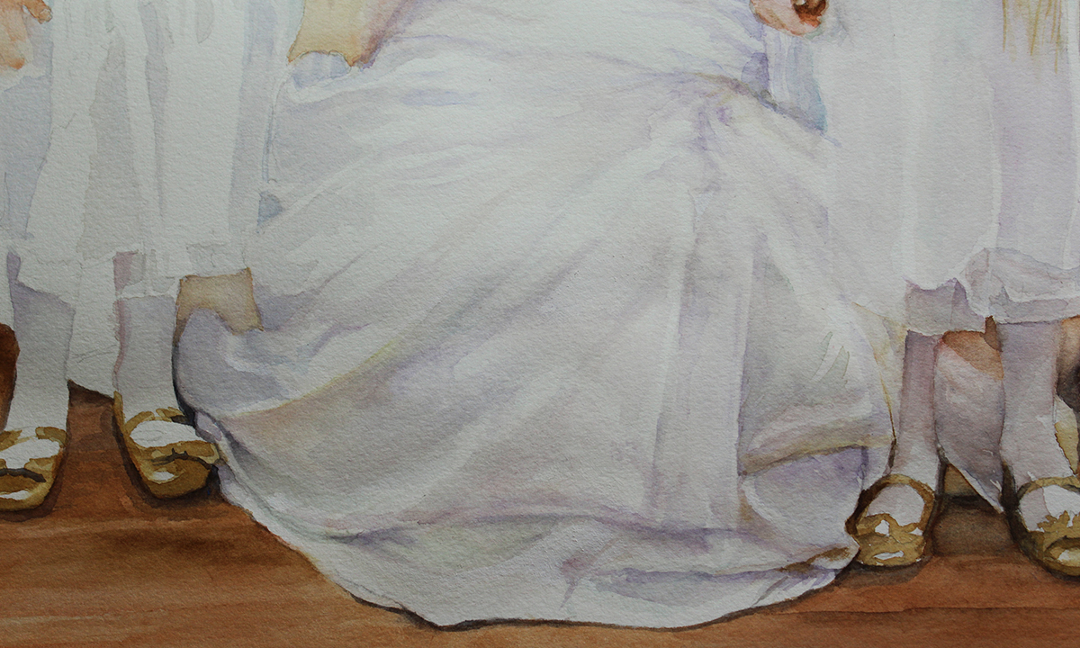
On the right is a close up of the bridal gown shapes and folds.
Below are close ups of the flower girls
Luke chose a wonderful gift for Rosie. For me, it was thrilling to see them so happy with my painting.
“She loves it! She was really taken aback.
It so wonderfully captures all the personalities of those little girls and that special moment”
Luke Riddle
“I LOVE LOVE LOVE IT!!! Thank you so much Sarah! You did an absolutely amazing job!“
Rosie Riddle
If you’d like a watercolor, pastel, charcoal or oil portrait or painting for someone special, please go to my Commissions page or contact me through either email or phone (912-223-8674), and I’d love to work out something for that special person.
by Sarah | Dec 13, 2016 | Blog |
Merry Christmas & Happy New Year to All!
Sarah
by Sarah | Dec 13, 2016 | Blog
Merry Christmas & Happy New Year to All!

by Sarah | Nov 16, 2016 | Blog
“SOPHIE”
Â
Pastel Portraits Make wonderful Keepsake Gifts!
“Merry Christmas, Sophie” – Personalized digital print
fits right into an 11″ x 17″ frame
~ wonderful gift for a child ~
Patrick’s boys actually picked the charcoal as the look they would like. They’re thrilled!
Charcoal portraits make wonderful keepsake gifts!
TESTIMONIALS
“Oh, Sarah! Words fail me. It is beautiful!”
Â
Jennifer  Riesmeyer Elvgren, Sophie’s mother
“We met with Sarah one morning and she took pictures of my teenagers while we were having a conversation. She was able to take the photos and piece them together into a work of art. The drawing is beautiful and catches their personalities. Thank you Sarah!”
Â
by Sarah | Oct 27, 2016 | Blog
“SOPHIE”
Â
I’m now offering colored pastel as well as sepia and charcoal portraits!
These make really wonderful gifts!
Patrick’s boys actually picked the charcoal as the look they would like. They’re thrilled!
TESTIMONIALS
“Oh, Sarah! Words fail me. It is beautiful!”
Â
Jennifer  Riesmeyer Elvgren, Sophie’s mother
“We met with Sarah one morning and she took pictures of my teenagers while we were having a conversation. She was able to take the photos and piece them together into a work of art. The drawing is beautiful and catches their personalities. Thank you Sarah!”
Â
by Sarah | Jul 11, 2016 | Blog
Image size – 11″ x 14″
Matted size (ready for framing) – 16″ x 20″
            ~
3 DIFFERENT CHOICES
sepia on toned tan paper
sepia on white drawing paper
charcoal on toned gray paper
            ~
I’M NOW OFFERING PENCIL PORTRAITS AS A BEAUTIFUL GIFT OR KEEPSAKE
~
All Portraits are on acid-free paper & placed in an acid-free mat, perfect for framing as a keepsake.
~
~
$375.00 per subject
~
I will work from either a photo or a live model
~
Price includes shipping (within Continental US)
8 1/2% sales tax on South Carolina orders
~
For more information & To Order
~
Call: 912-223-8674
~
Or Email me
through the Private CONTACT box below.
~
by Sarah | May 19, 2016 | Blog
I’m madly painting and framing in anticipation of this Spoleto Festival. I have no idea what to expect, but I’m hoping that the people who might like my work will find me. As you can see from the paintings on this post and in the side panel, I don’t have one style. I range from photorealism to folk art, and from color to monochromatic. People coming into my tent are going to think it’s the work of nine different painters. In order to get into a gallery, I have to have a singular look….hmmm.
The “Caribbean Girl” above is an example of a pretty monochromatic piece. I like that the edges sort of float away…
This piece below, “Awaiting,” is not only monochromatic, but it has a folk art/modern feel. It’s not what I would call a “pretty” piece, but I love line and inference. What or whom are these Mennonite ladies waiting for?
I hope to see you in Charleston!
by Sarah | Oct 22, 2015 | Blog |

“GREAT BLUE”
At last I am finally painting! “Great Blue” (oil on canvas) has been a long time in the making. The piece below is the initial painting. I love the blues in that piece but I was more interested in achieving a more natural look. I’ve done few landscapes, and my mind gets blown by all the choices of shapes, greens, lights and darks etc. Which one should I pick?? Don’t believe it if anyone tells you that painting is easy…
For this piece, in order to make the white wing fade more into the background, I had to make leaves of a similar value, not necessarily color but value. The head was too large, and the beak too obvious. This might seem like simple matters, but frankly these are the decisions that make me want to eat ice cream.
I tucked more trees in to create more interest in the background, and bring more of the orange/pink color into the whole piece. I, also, wanted to created lost/found areas like under the curve of the left wing and again further down the wing. The dark areas force the light of the curve of the wing to come forward. The final painting, I hope, has a delicacy of movement that I don’t think was in the initial one. It’s that fluidity of movement that birds have that pulls me. I hope I’ve been successful.

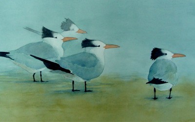
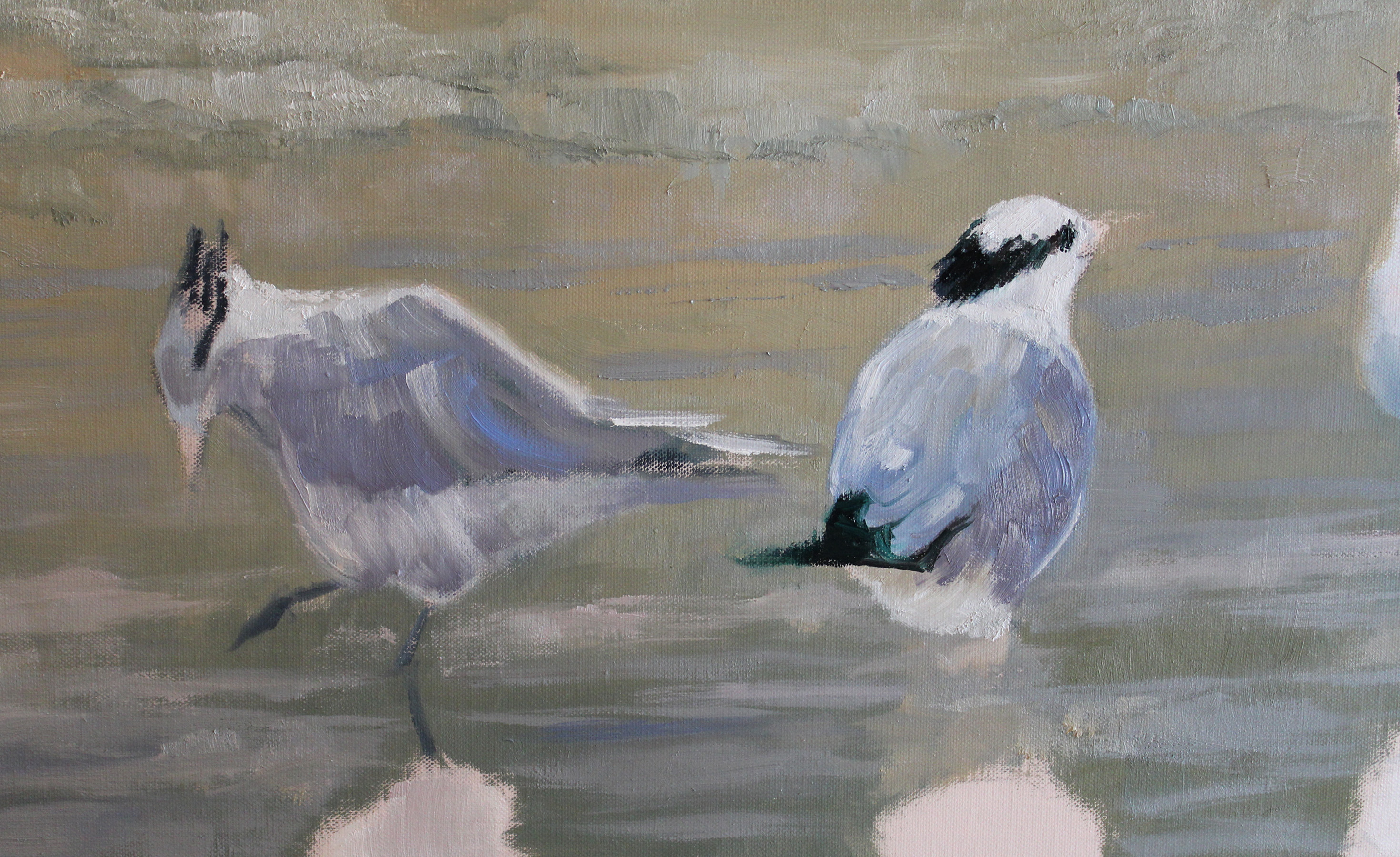
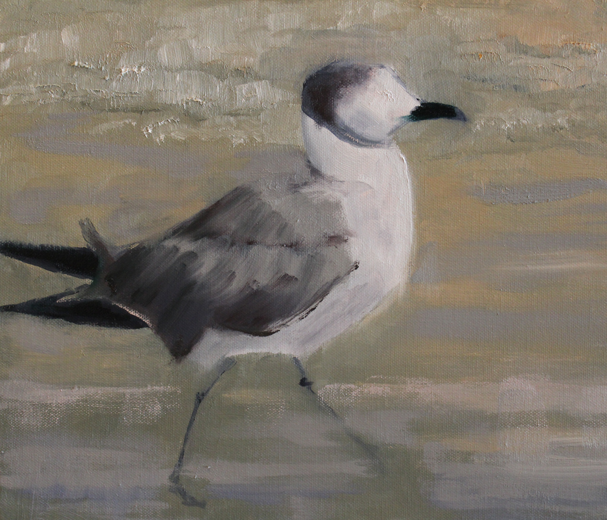
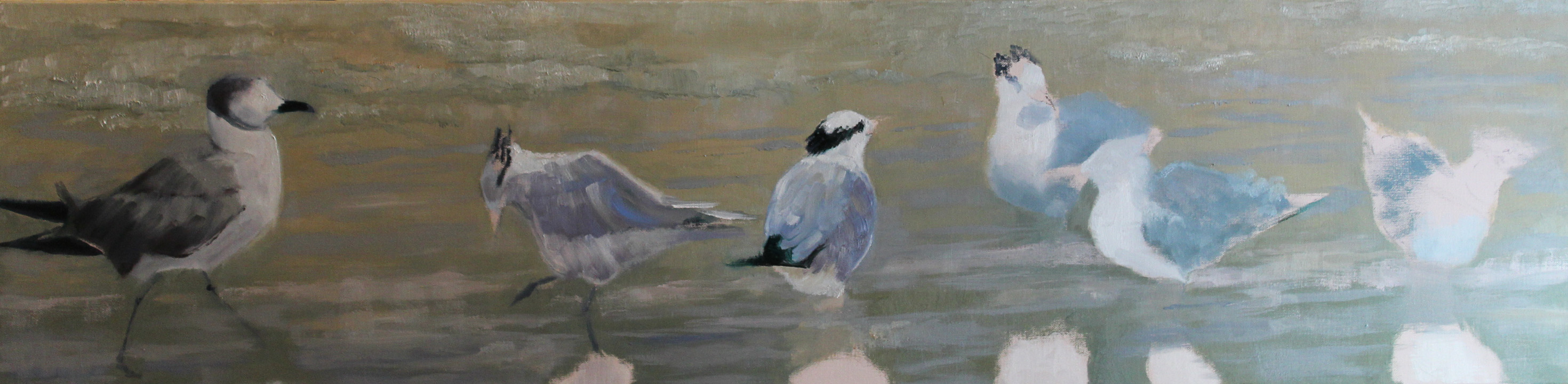
This next series  is the progression of a whimsical piece, “The Interloper.” I’m always torn between super realism, folk art and whimsy. I’m supposed to have a single look, but I can’t decide… I like them all. This piece is about a bunch of Royal Terns who notice this fellow who’s entered from the left, the uninvited Seagull. These Royal Terns I find endlessly amusing with their stocky stance, wild hair and big orange beaks. I mean…
The first four stages are laying in the various birds. The last image is the final piece. I’ve tried to keep it loose with line and shapes having more importance than definition. Again, movement is an important element here.
“The Interloper” is 12″ high x 48″ wide (oil on canvas)
Step I – step II – laying in the Royal Terns and their various reflections in the water.
All the birds are in, and now I need to fill in the lights/darks and accent the lines. I really love line.
The final piece. “THE INTERLOPER” Click on the image to see it in a larger version.
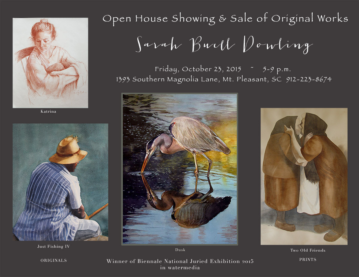
If anyone is in the Charleston/Mt. Pleasant vicinity, please come to my Open House! Fred Hudson will be at the piano.
by Sarah | Mar 12, 2015 | Blog, Blog Posts |
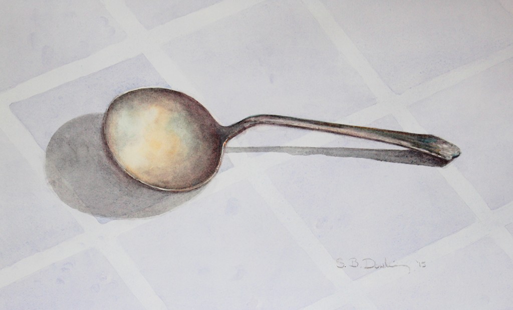
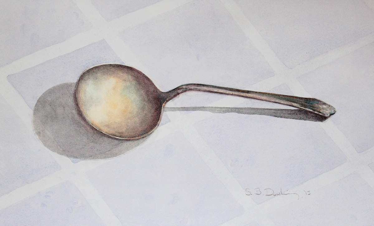
The Beauty in a Spoon
I saw this spoon in a drawer of antique silverware belonging to my mother. I was struck by this particular one and its simple beauty. I loved the way the silver caught the colors that were nearby: the orange ruler and the aqua of a glass bird. They really weren’t even that near, but the spoon seemed to find the colors anyway.
I’m always intrigued with line and shadow, and the line of this spoon seemed wonderfully simple, even elegant. I placed it on this cloth of squares, which to me emphasized the roundness of the bowl and its shadow.
This seemingly simple watercolor is actually more difficult to paint than one would think. I was very touched by the following comment, which the son of a former classmate of mine made when he saw this piece:
“Metal is lit directly (with the source lights that are reflected once to your eye ) and by the surrounding objects that are also reflecting light (so that light reflects twice: once from the directly-lit object and then from the reflecting object to your eye). This is true of all materials that aren’t true black, but metals reflect light in closer to coherent image than other materials, which cause greater ray scattering. So polished silver would show warped but optically coherent reflections of the lit objects around them, and fabric, for example, reflects only the most incoherent suggestions of nearby lit objects, just smudges. To suggest so unambiguously, using only pigments, that the spoon is tarnished silver, is to not only get the colors right (which takes tons of practice) but to smudge the colors to somewhere between optic coherence and total diffusion.”
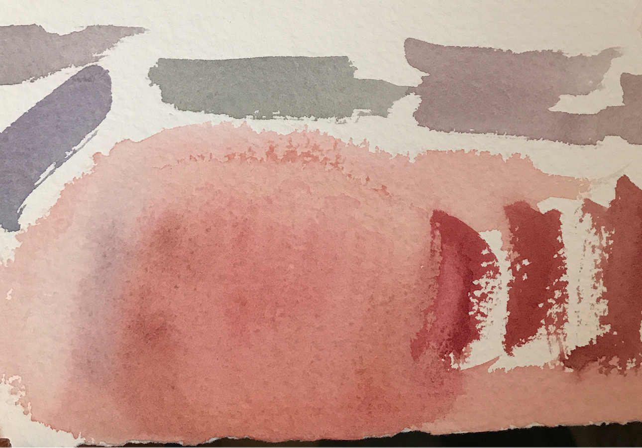
I wanted to post this piece as it’s the first in a series that I’d like to do using minimal color. I hesitate to say shades of gray, but that’s what fascinates me at this moment. I love the subtleties that can be found in grays. Not only do they range from dark to light, but also from one end of the color spectrum to the other. In my next blog, I’ll give a range of samples.
If anyone is wondering why I have so little to show, I’ve been busy with my younger daughter getting married. It was lovely, and great fun!
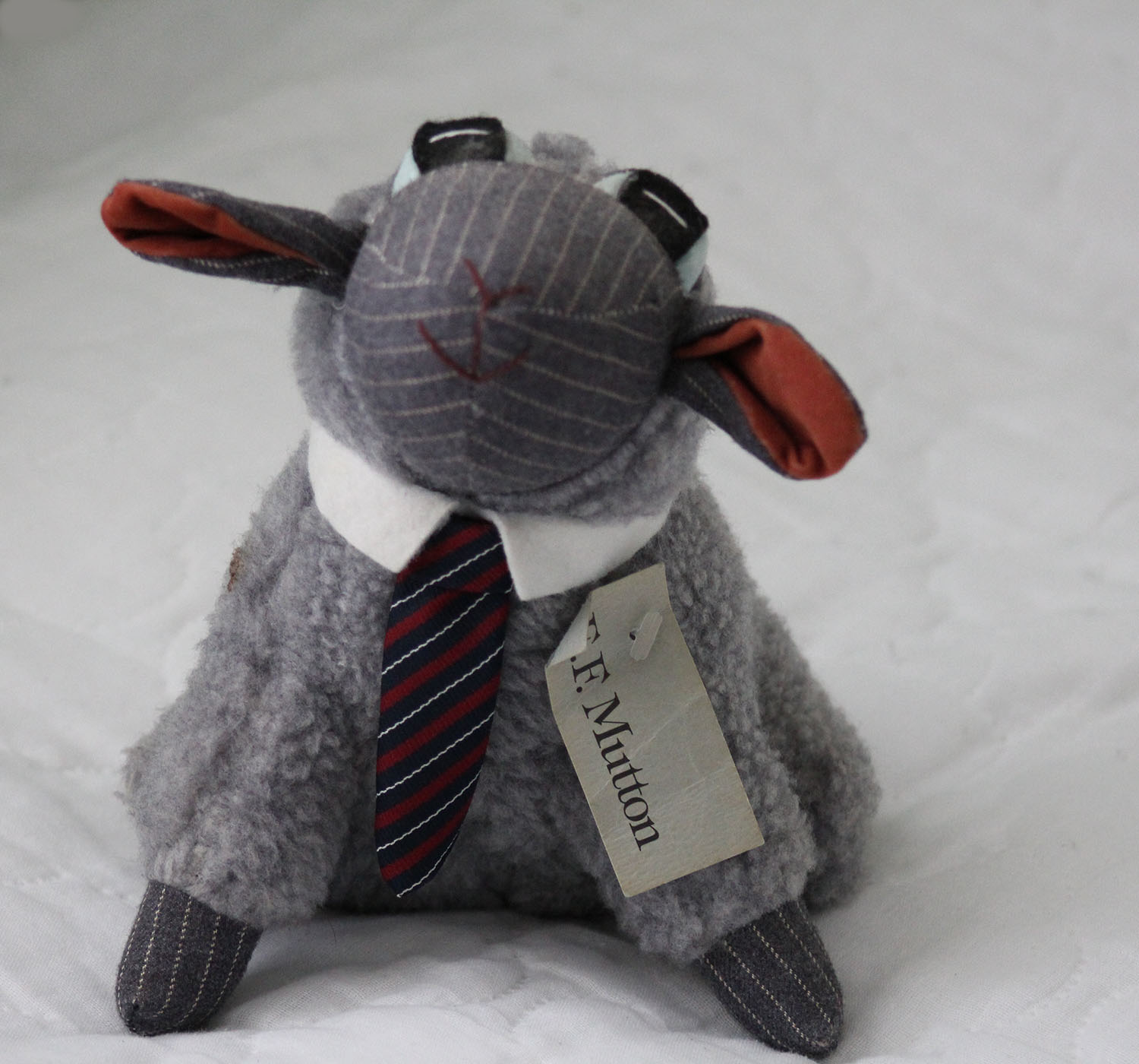
Also, I was thrilled that she wanted me to design and sew her dress. I learned sewing in junior high home economics, and it took. Also, my husband and I had a stuffed animal company (Under the Lamb, Inc), and I created several products, including an executive lamb, called E.F. Mutton, our biggest selling product. I did the original lamb. My husband wrote “The Wool Street Journal” to go with it.
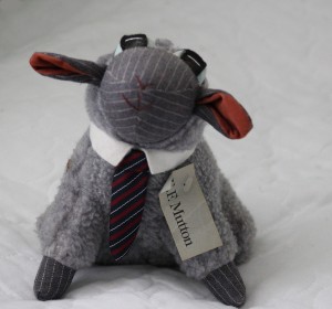
E. F. Mutton
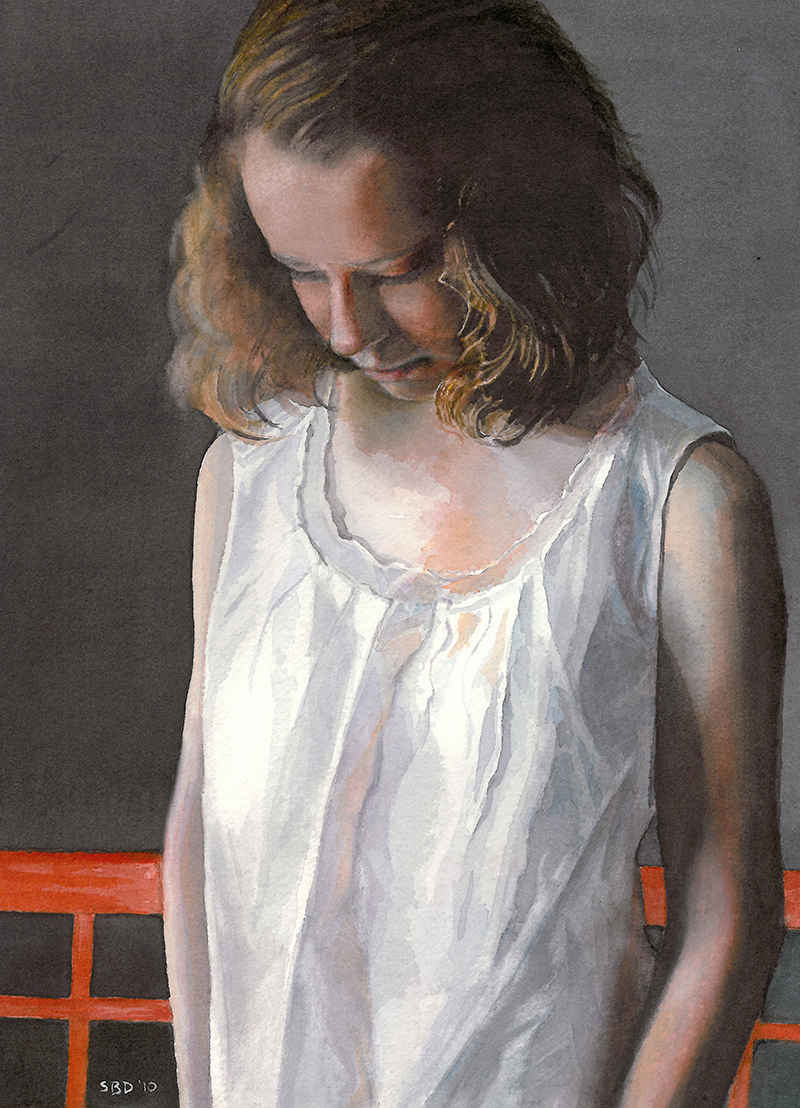
Here is my daughter, Katrina, Â in the dress and train. She, by the way, has been the model for many of my paintings.
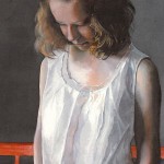
Pensive
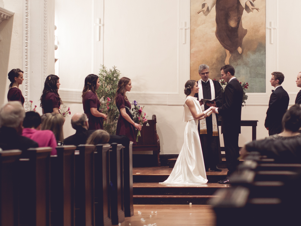
This cell phone picture shows the top. I love the way it falls around the neck.

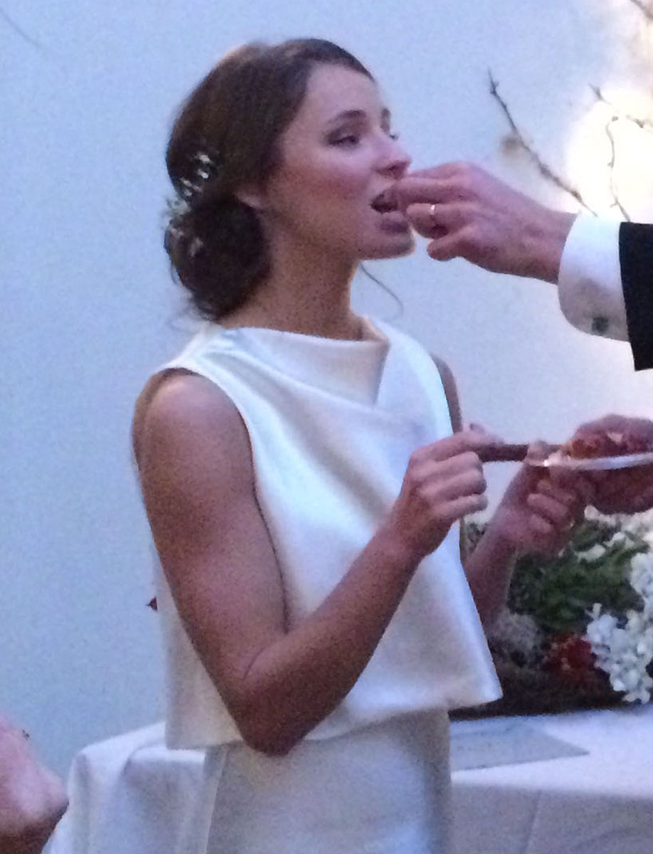
Eating the Cake
I’d say that’s enough for now. I’m busy reclaiming my life, and I hope to get painting as I haven’t been able to do in years! This Saturday, I was just juried into the Charleston Art League, and I’m excited to plug in and see what happens next.
In case you didn’t see, we now live in Mt Pleasant, SC, outside of Charleston: Â 1393 Southern Magnolia Lane, Mt. Pleasant, SC, 29464.
Thanks so much for looking!
SPRING IS HERE!


