by Sarah | Nov 25, 2019 | Blog, Blog Posts
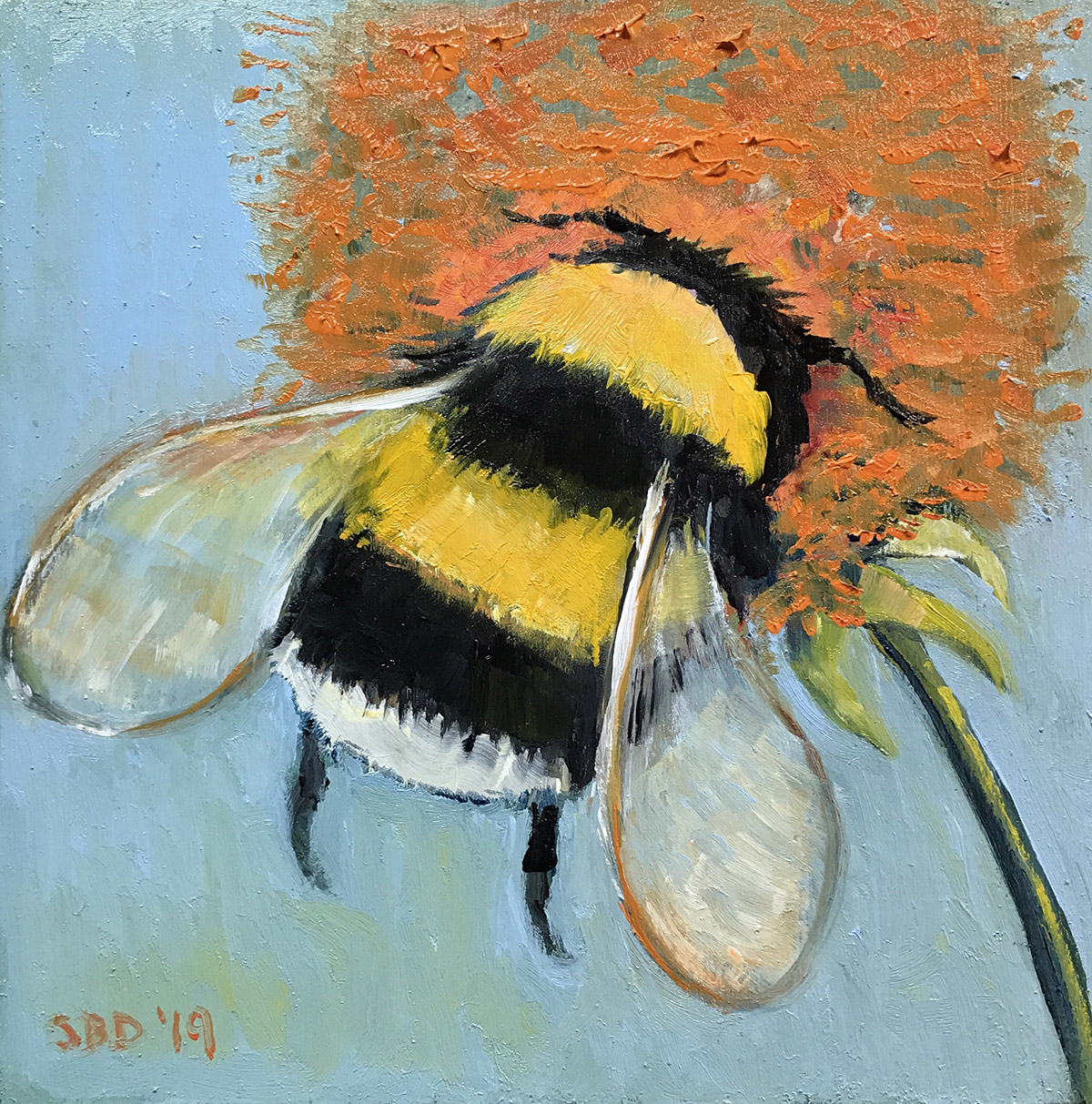
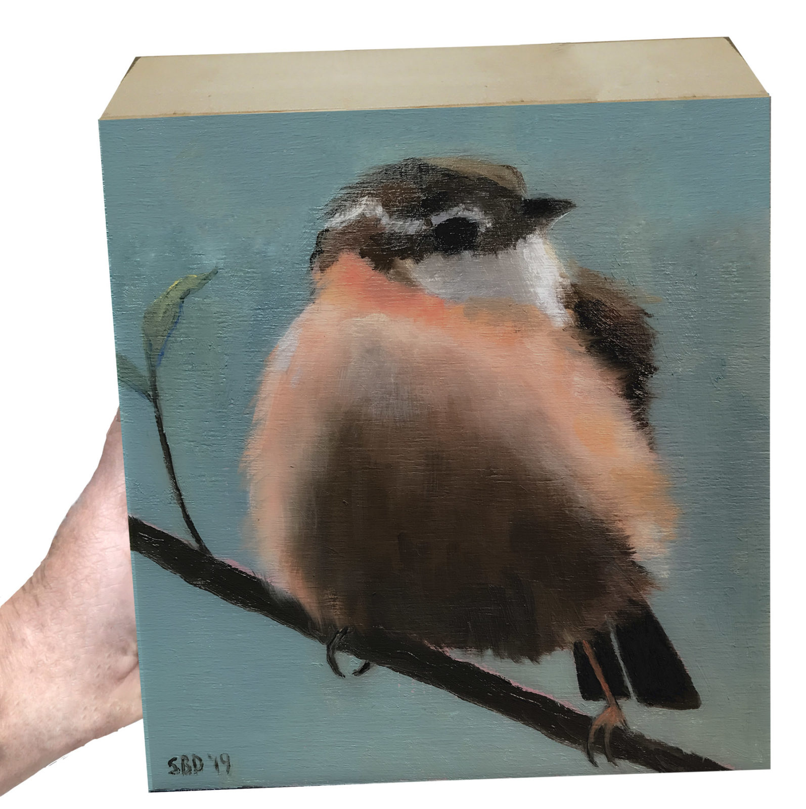
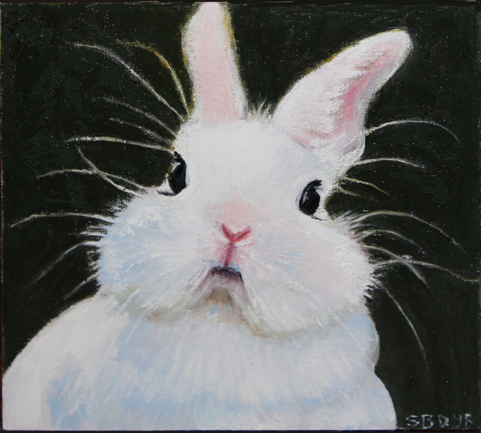
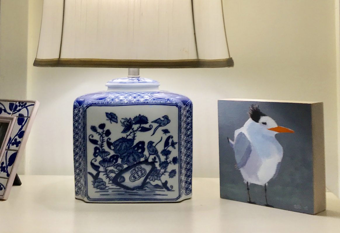
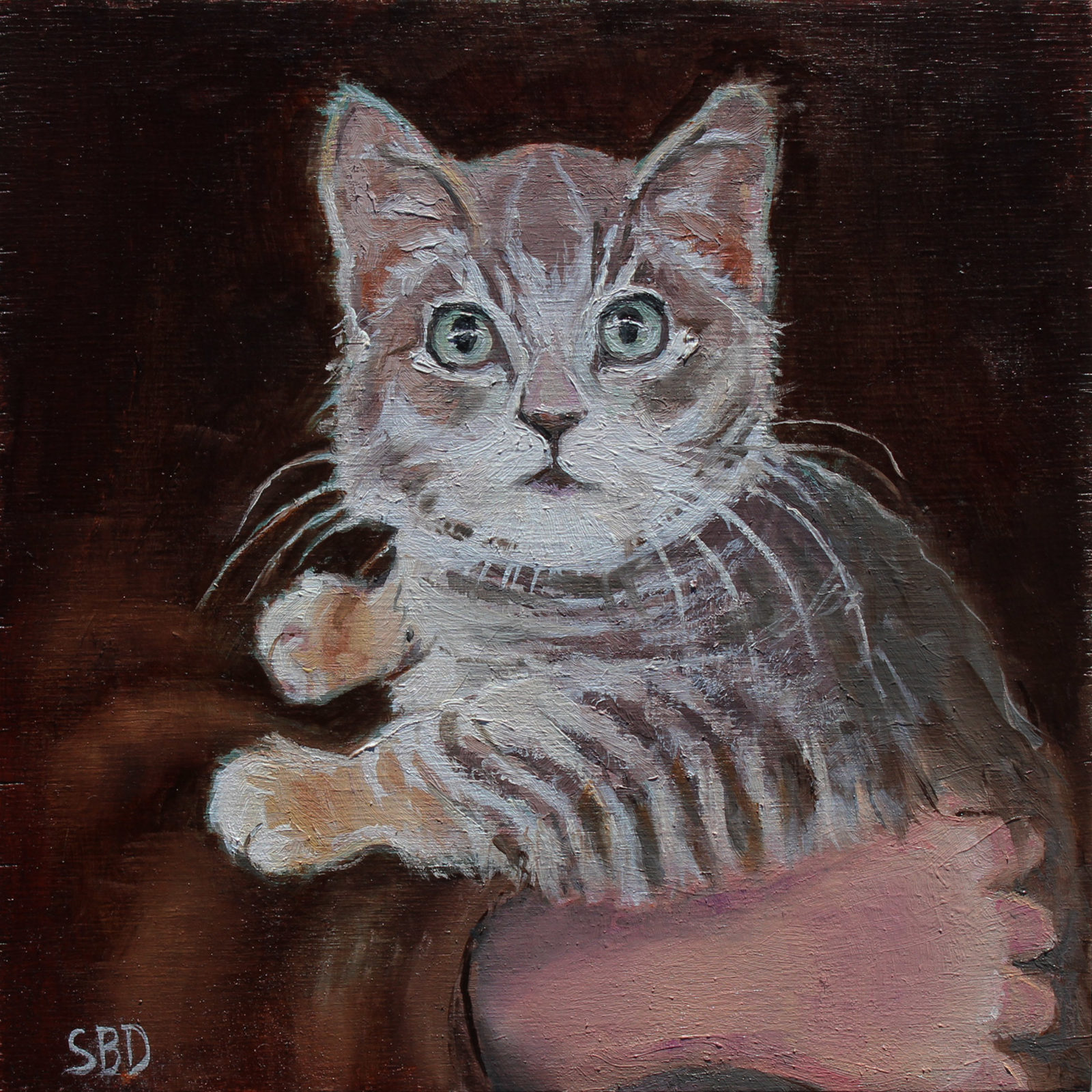
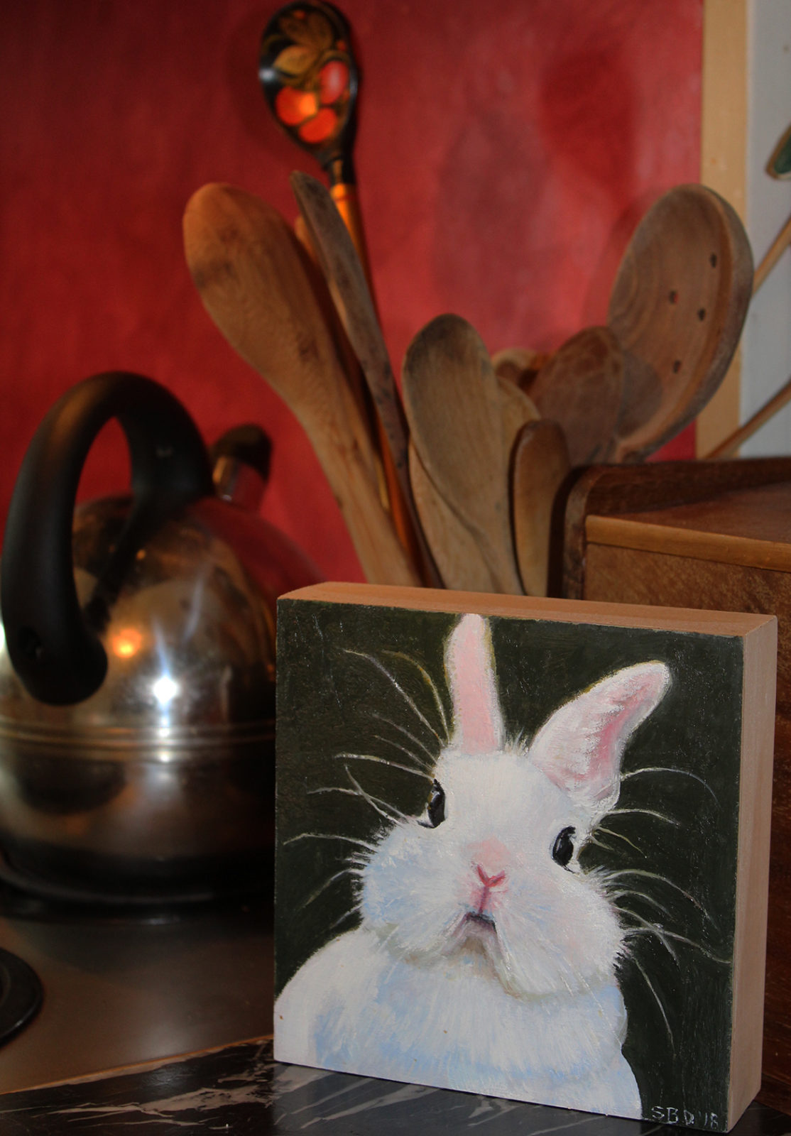
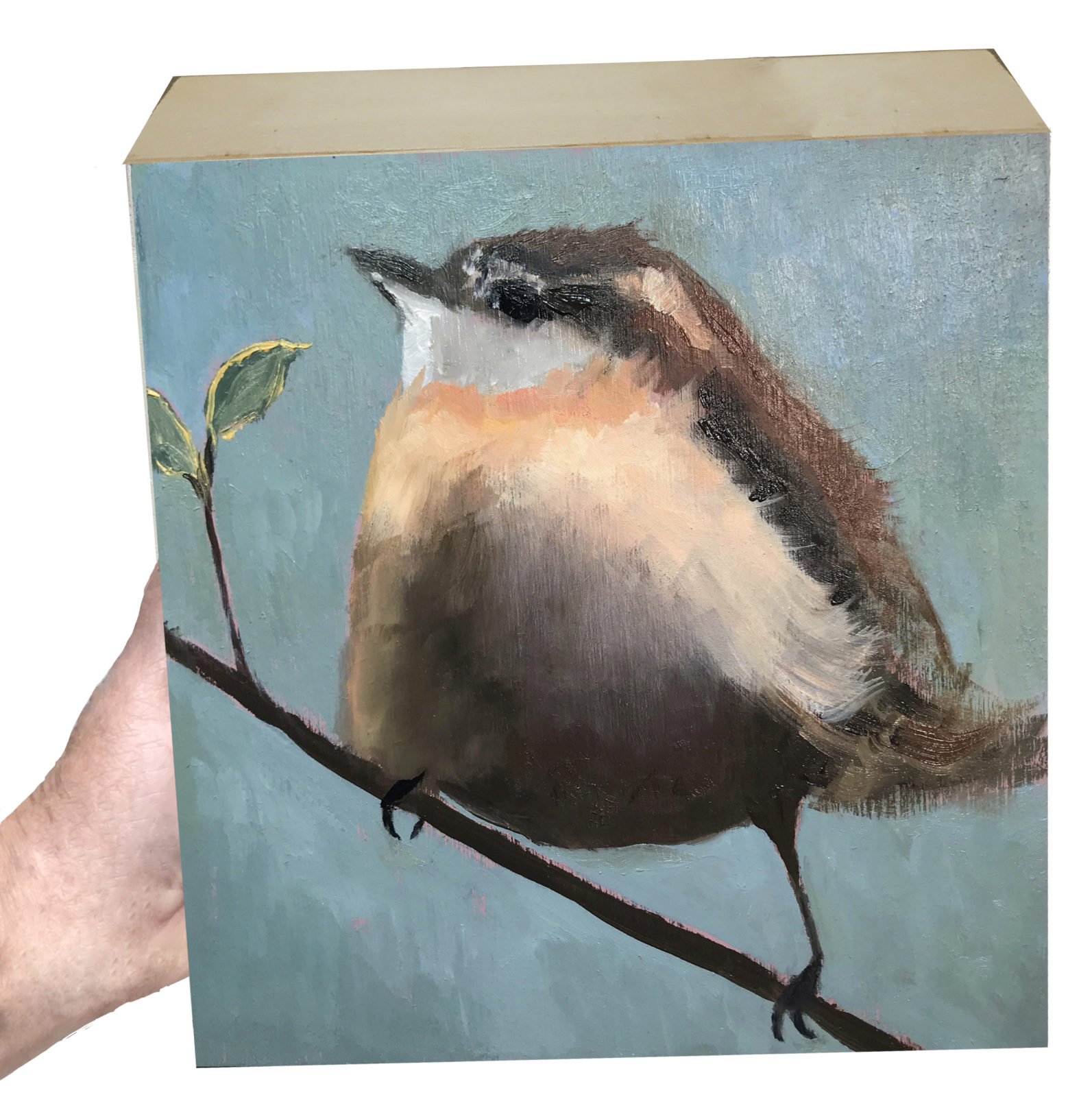
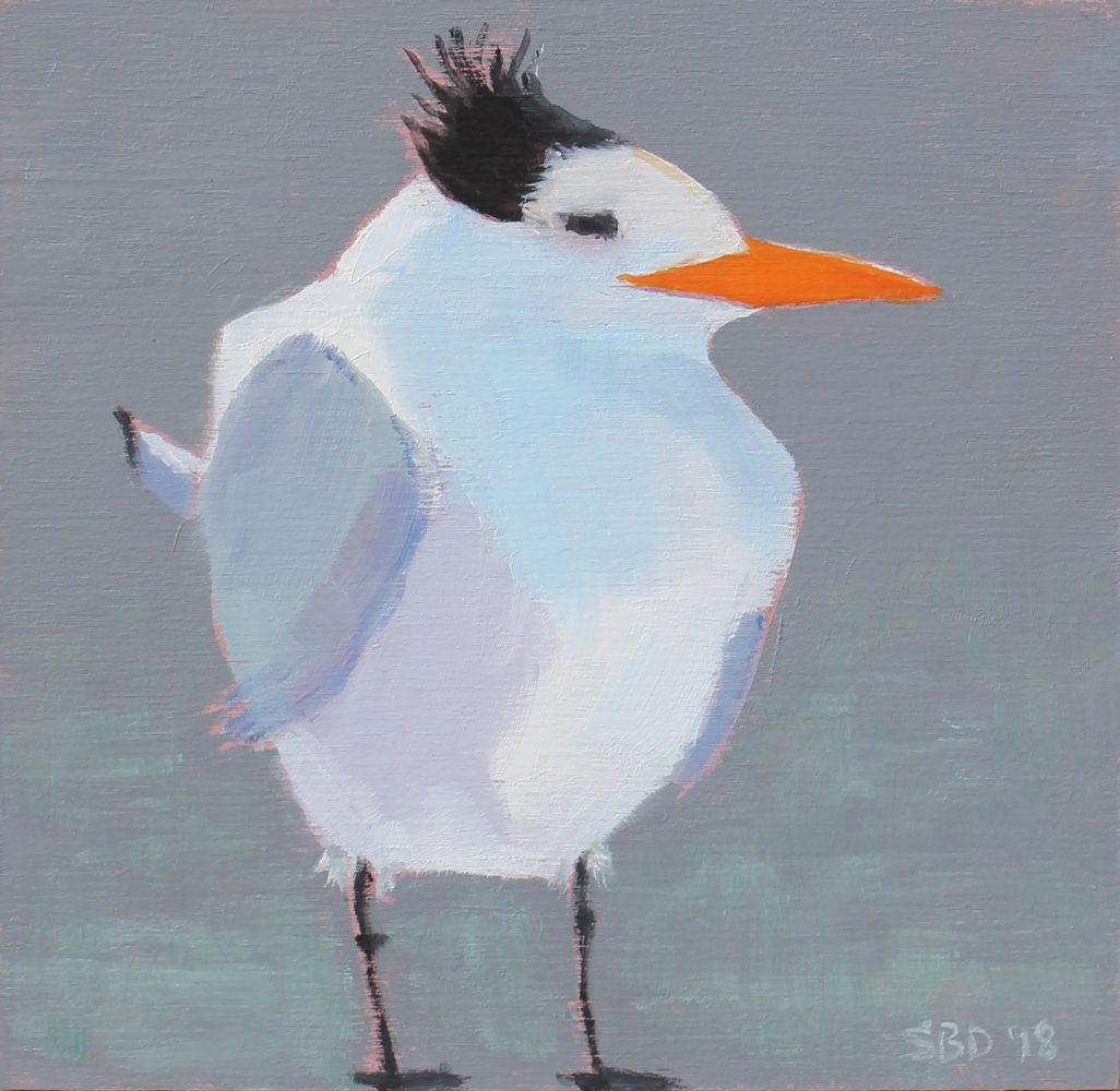
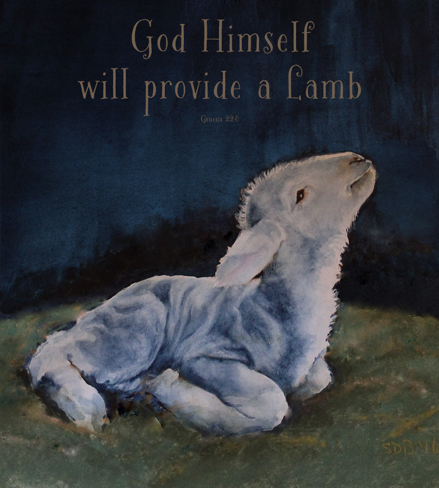
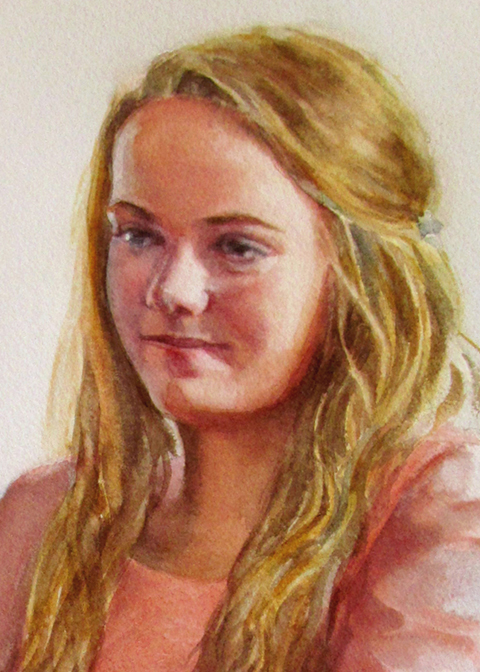
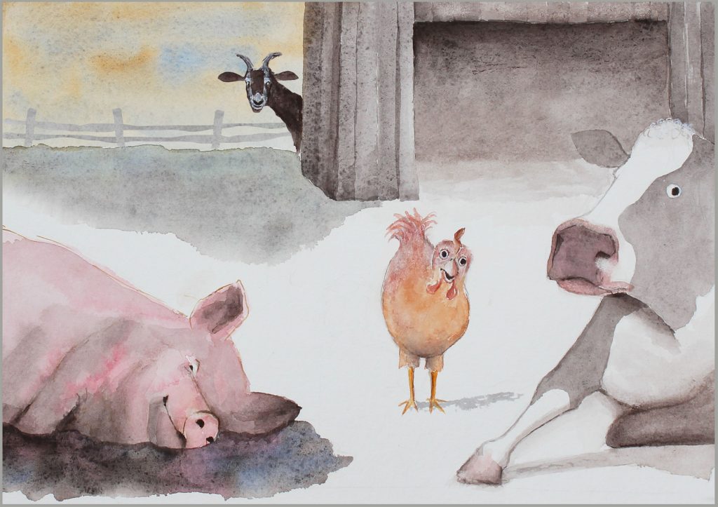
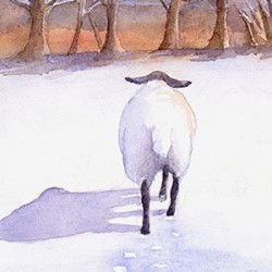
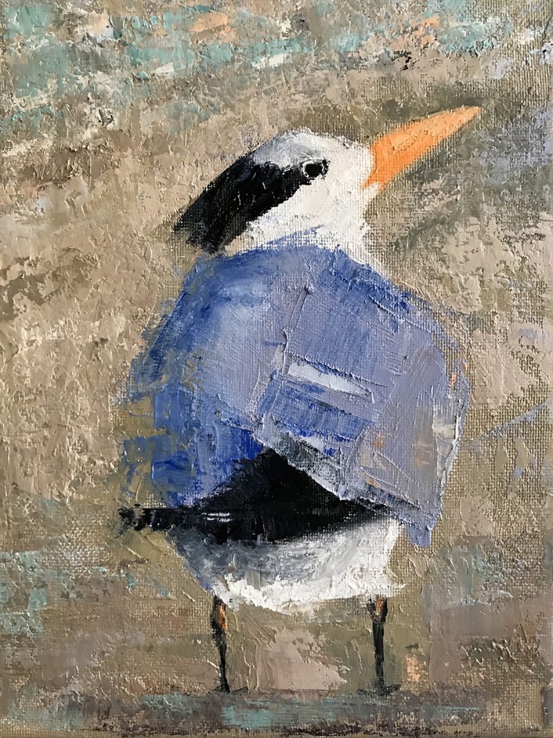
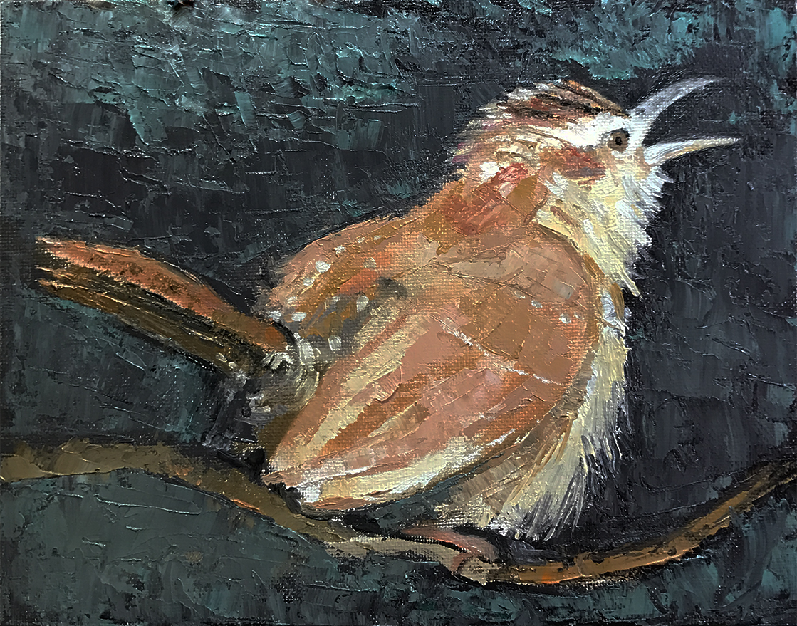
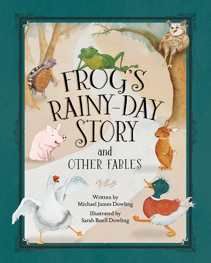
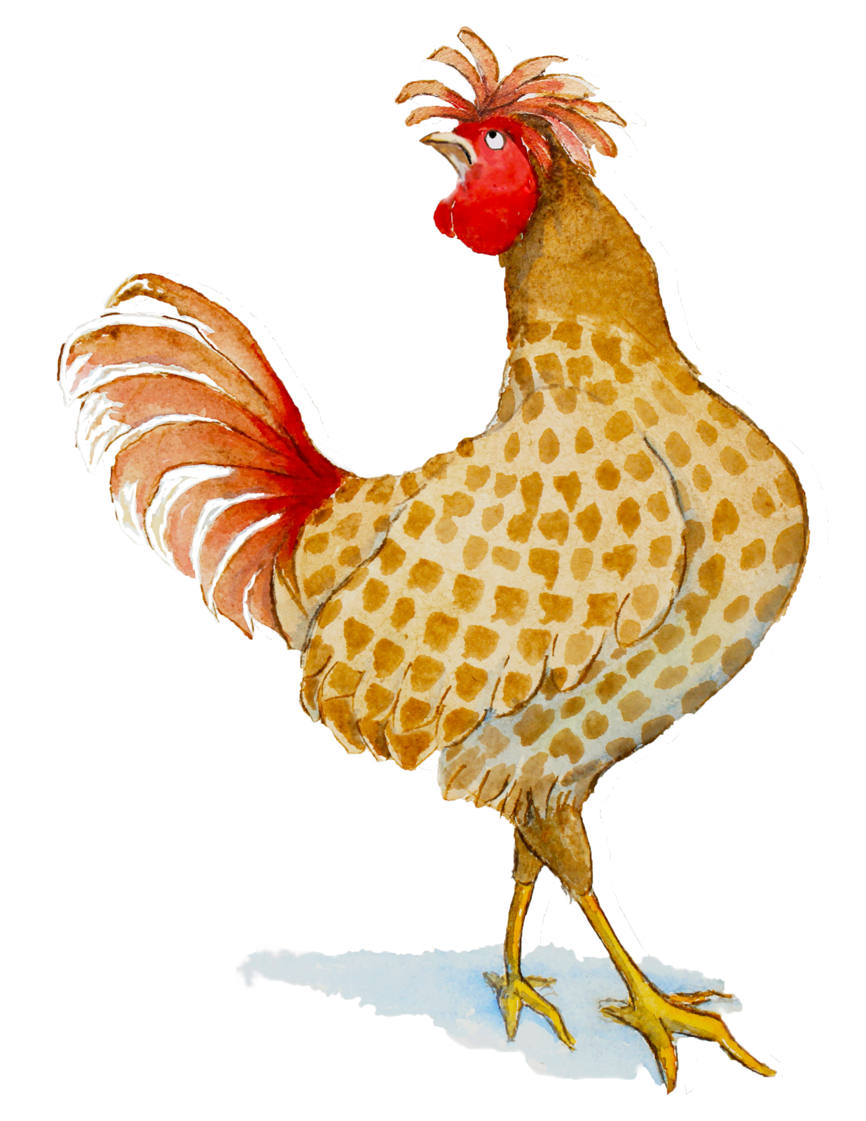
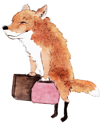
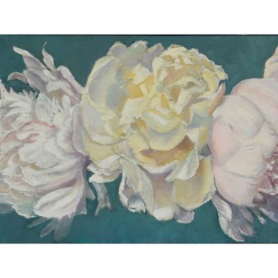
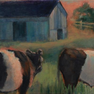
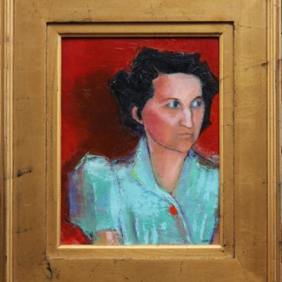
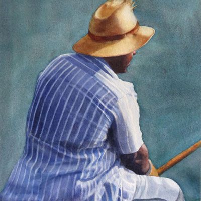
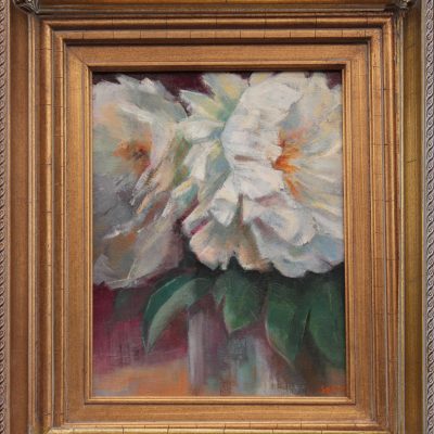
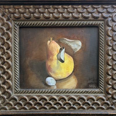
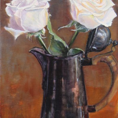
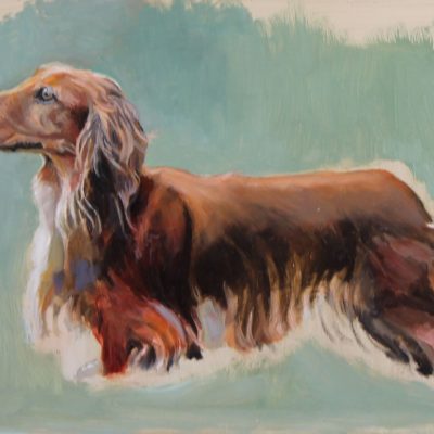
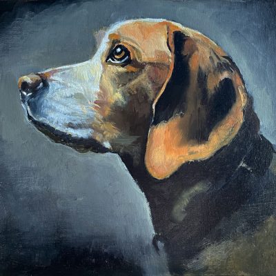
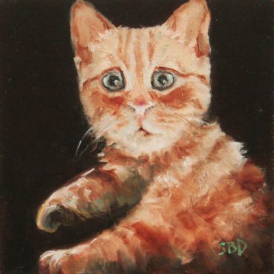
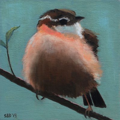
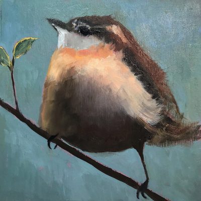
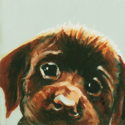
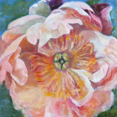
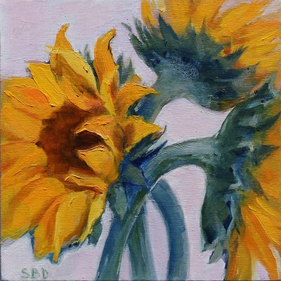
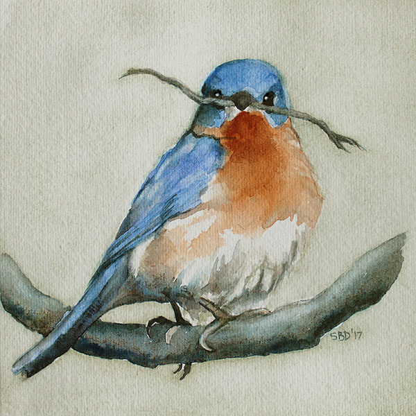
What a year this has been! Most of it has been dedicated to illustration and the publication of our book, Frog's Rainy-Day Story and Other Fables. I've been able to grab time to fit in these little paintings, which I've grown to love. I have them scattered all over my house. They're on blocks of wood (6"x 6"x 1 5/8"}, so they hang in cozy spots and sit on tables, windowsills, even by my stove helping me cook.
Everything here makes wonderful gifts for friends and family. Please take a look around and enjoy.
Oil paintings on Wood 6"x 6"x 1 5/8"
by Sarah | Jul 30, 2018 | Blog, Blog Posts
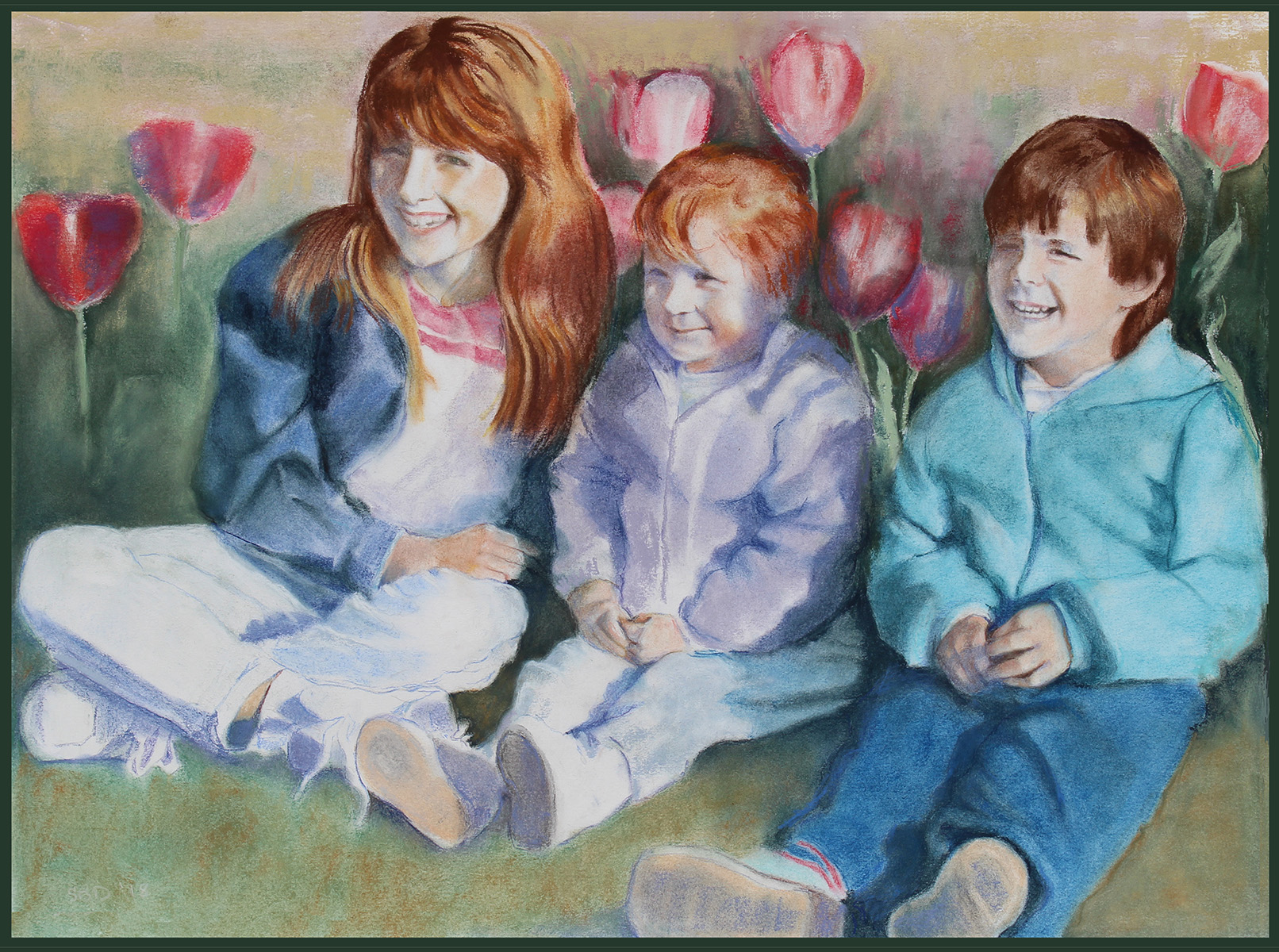
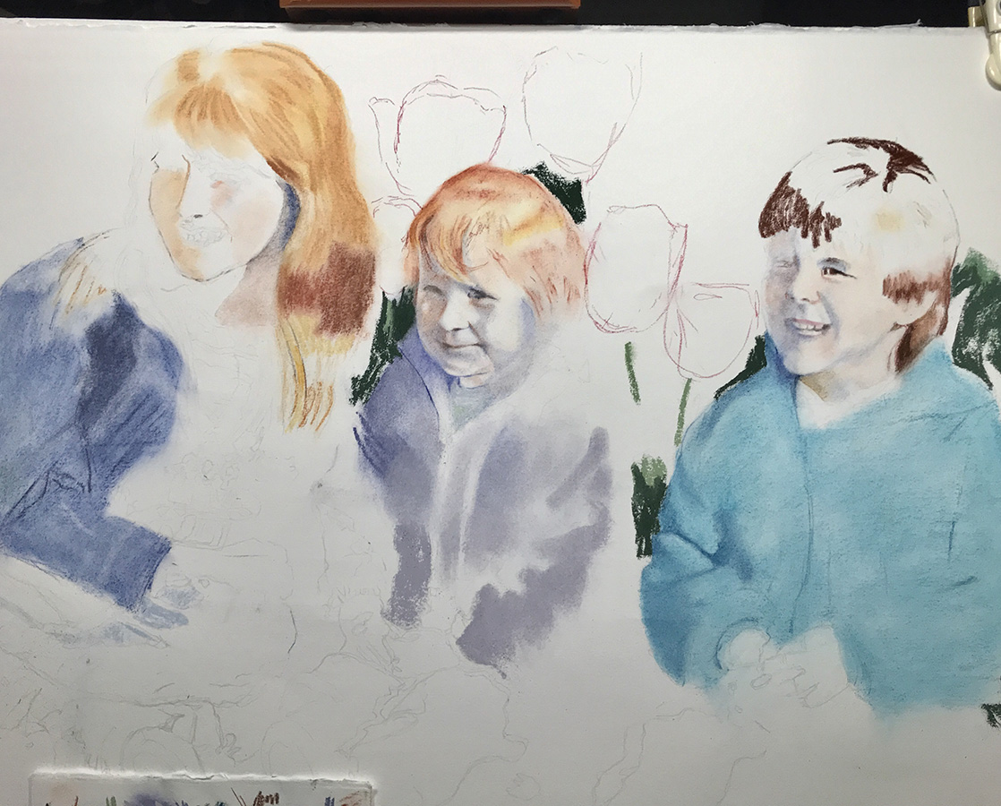
   A dear friend, Jan Fincher, asked if I'd do a pastel portrait of her three children when they were little (being now fully grown with children of their own).
   She then gave me a wonderful 3x5 photo taken many years ago of the kids in a bed of tulips! It's the only one she had of them all laughing together at that age.
   The light was behind them casting shadows on the right side of their faces. I felt like a sleuth trying to figure out what the eyes were doing behind those shadows. You'd be amazed at how much moving something, even something as small as a dot, can change the character of a face. A millimeter or less can make a big difference!
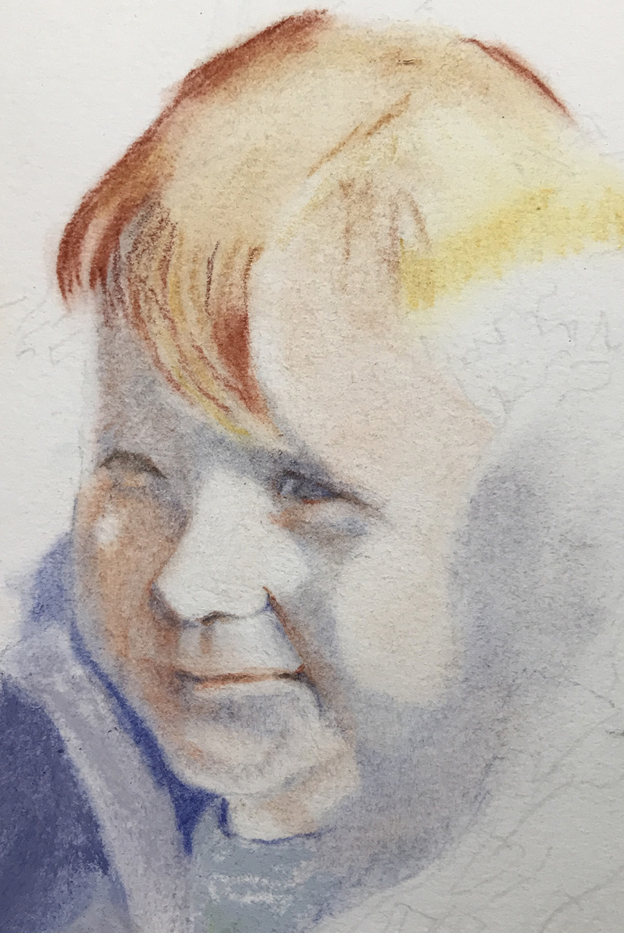
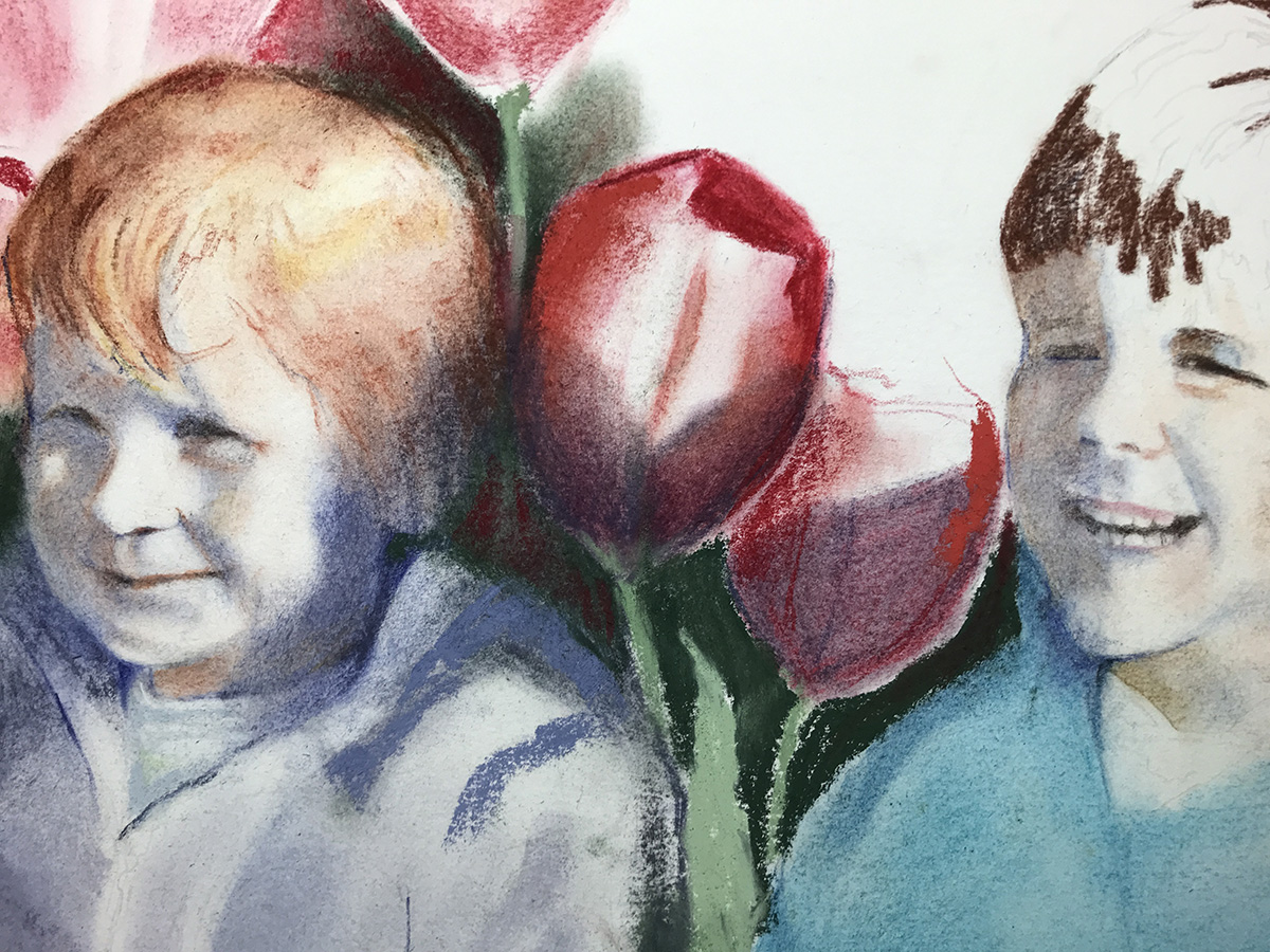
Below is a closeup of Aimeé, the youngest. I love that face! Here I'm trying to find the placement of the features. The hardest part was capturing the slight amusement in her eyes and mouth.
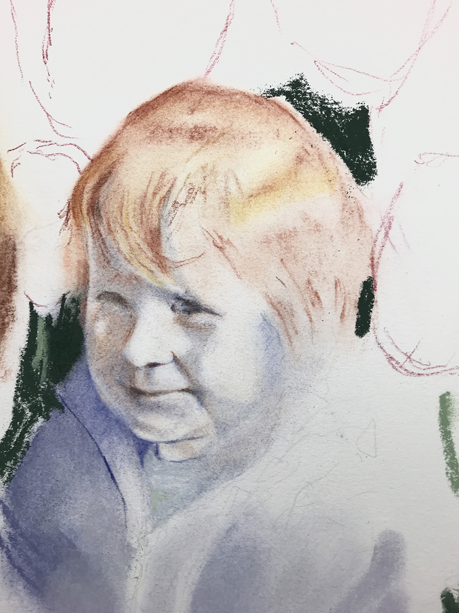
In this next image, I'm laying in the tulips. I'm also thinking about this wonderful red hair!
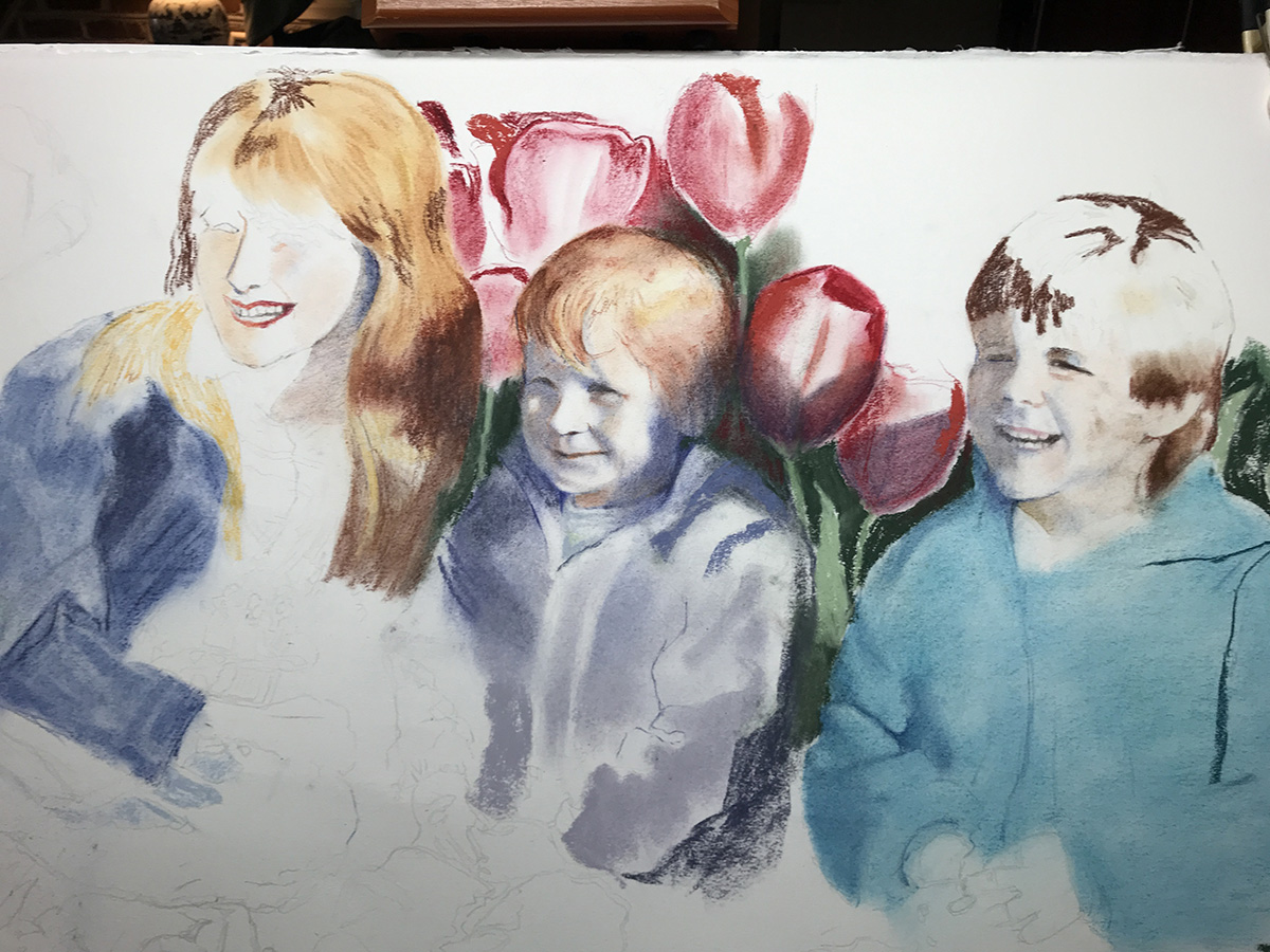
Now I'm adding in the siblings. Ashley has reddish blond hair. Will's hair is brown.
About this stage, I'm realizing that these tulips are as big as Aimeé's head. They really are this size in the photo, but it doesn't work here.
I'm also discovering that if you forget what you're doing and lay your hand down, say on the tulips, you'll then find that red pastel settling wherever your hand lands next. I spent more time than I like erasing or washing my hands...grrr.
Below you'll see that I'm starting to reduce the size of the tulips, trying to treat the picture as a whole. For me, probably the hardest part of painting is eliminating, deciding what is important and what isn't. That's probably why I don't do landscapes. Just look at how many different shapes, lines and greens are out there! Brain implode.
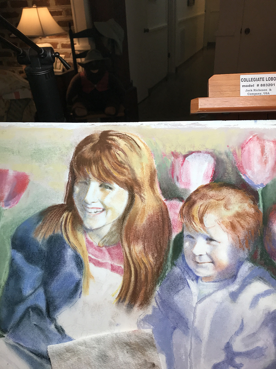
Once I got the ok from Jan that I've managed to capture the kids' likeness, I started to relax and fill in the legs and sneakers.
I'm thrilled that the Finchers are pleased. Jan told me, "I've shown the picture to all three and they all have commented on what cute kids they were! Ha ha!"
That they were!
by Sarah | Jul 4, 2018 | Blog, Blog Posts
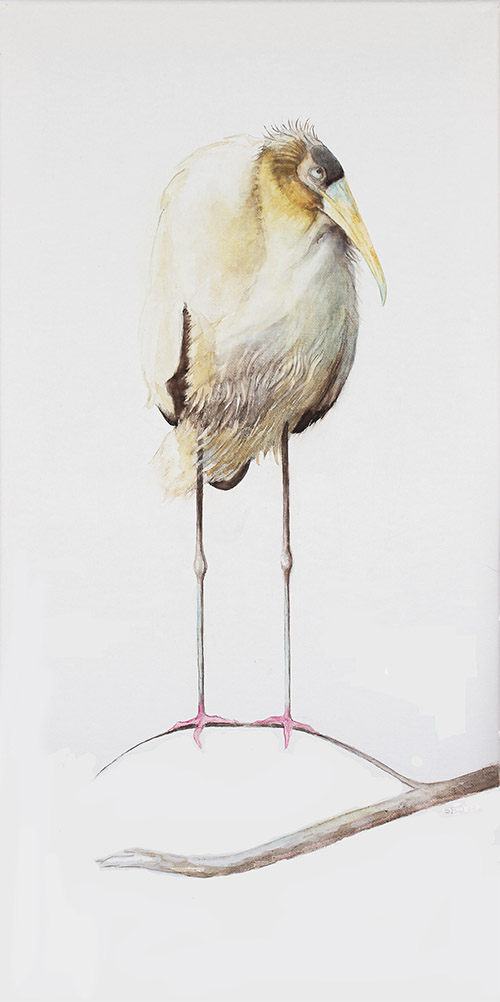
This piece, "Out On A Limb," was so much fun to paint!
This is a watercolor on watercolor canvas, which I've never used before. Every medium has its own very distinct look.
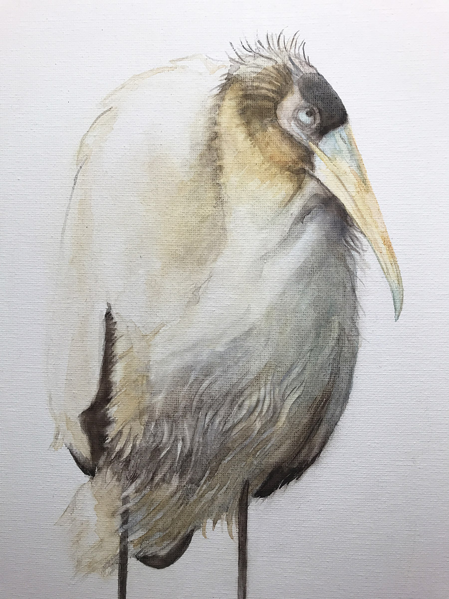
This wood stork is young. Notice that it still has tufts on the top of its head, and its beak is not yet overly long.Wood storks are among the most bizarre looking birds!
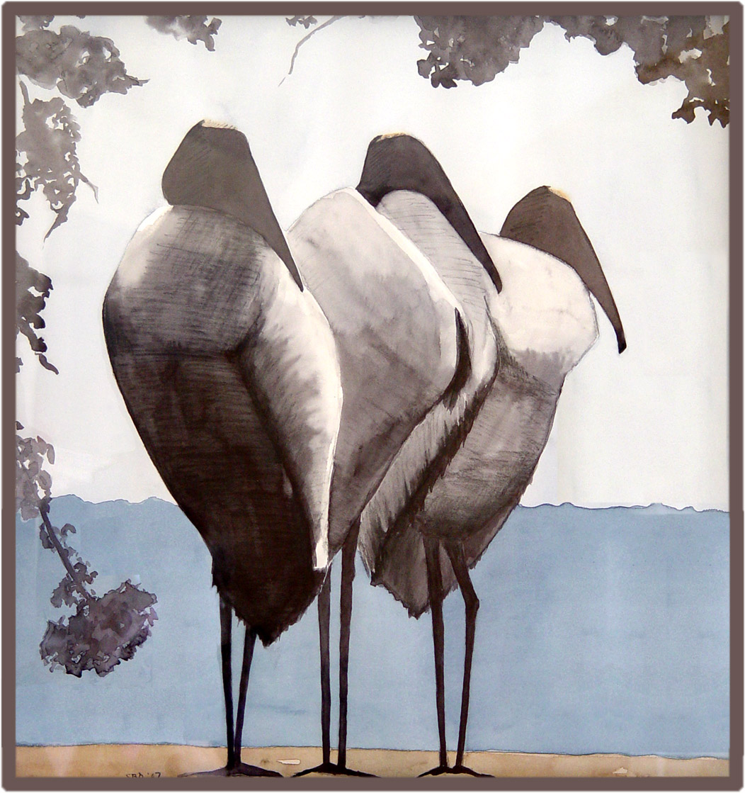
The Three Gents
If you clump mature wood storks together, they look just like old men. For fun, I thought I'd just throw in this humorous watercolor take of wood storks that I did many years ago. It now hangs in the home of dear friends.
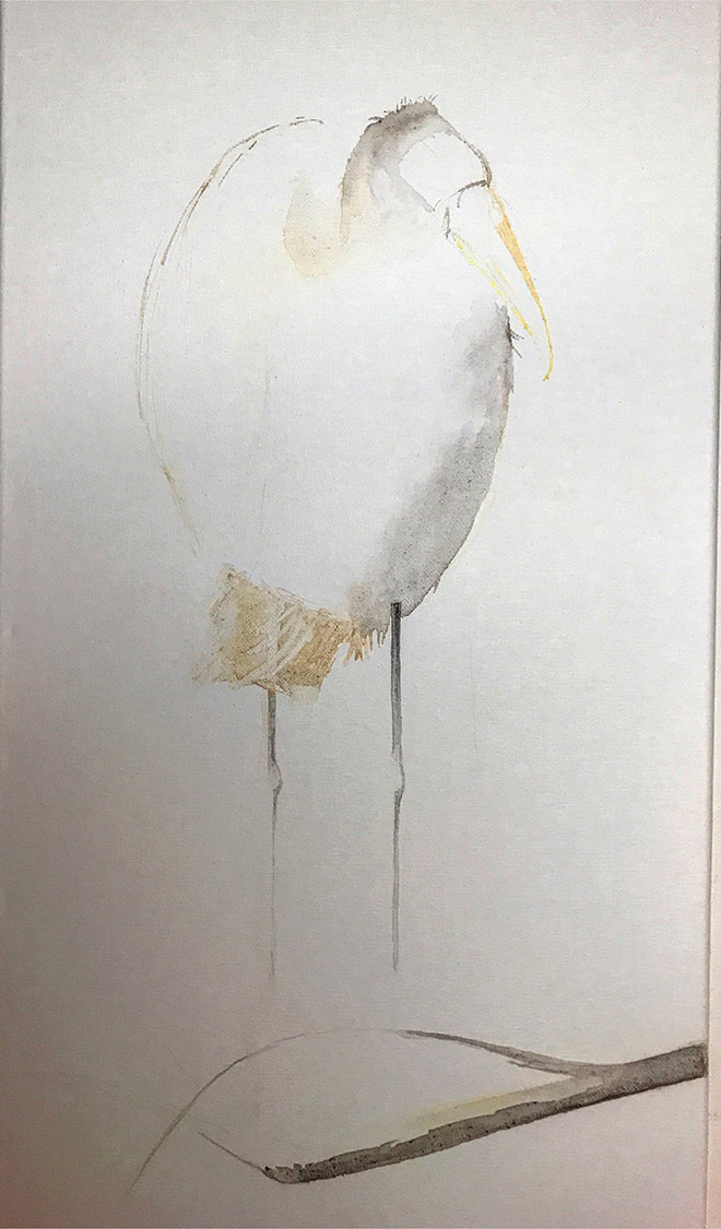
This is my first drawing exploring the "look."
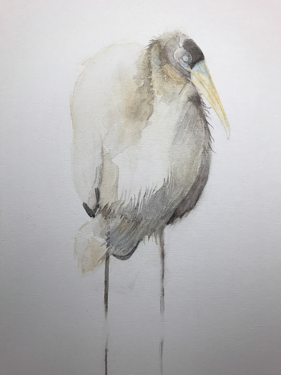
I apologize that all of these images are rather dark at the bottom. They were taken with my Iphone 7 in my studio.
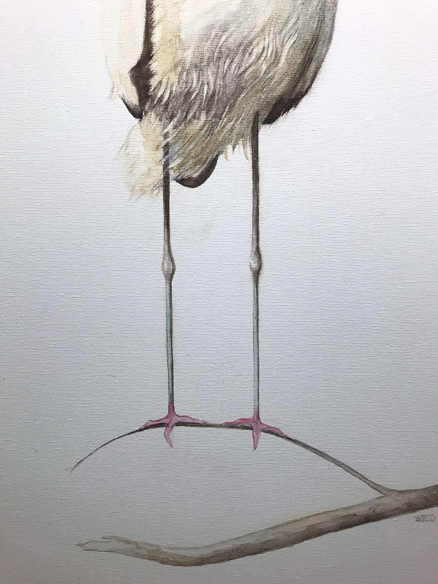
Where to put the knees? I can't tell you how many times I moved the knees up and down. These fellows have deceptively long legs!
At this stage, I'm also trying to determine the length of the beak, which becomes really long as the bird matures. Much like herons and egrets, the necks of wood storks can tuck into their shoulder and back, giving them a hunched-over look, which adds to their overall crazy appearance.
Those pink feet! That's when I think God made animals not only for our pleasure, but also for a real laugh! Life would be so colorless without them.
Here you can see the canvas and strokes. Again, these Iphone photos don't do the finished fellow justice. He is really much brighter, and the background is actually white.
Here he is, out on a limb. He's standing here waiting for someone to take him home.
This photo is more accurate as it was taken with my Canon. The painting is 12"x24".
by Sarah | Oct 10, 2017 | Blog, Blog Posts
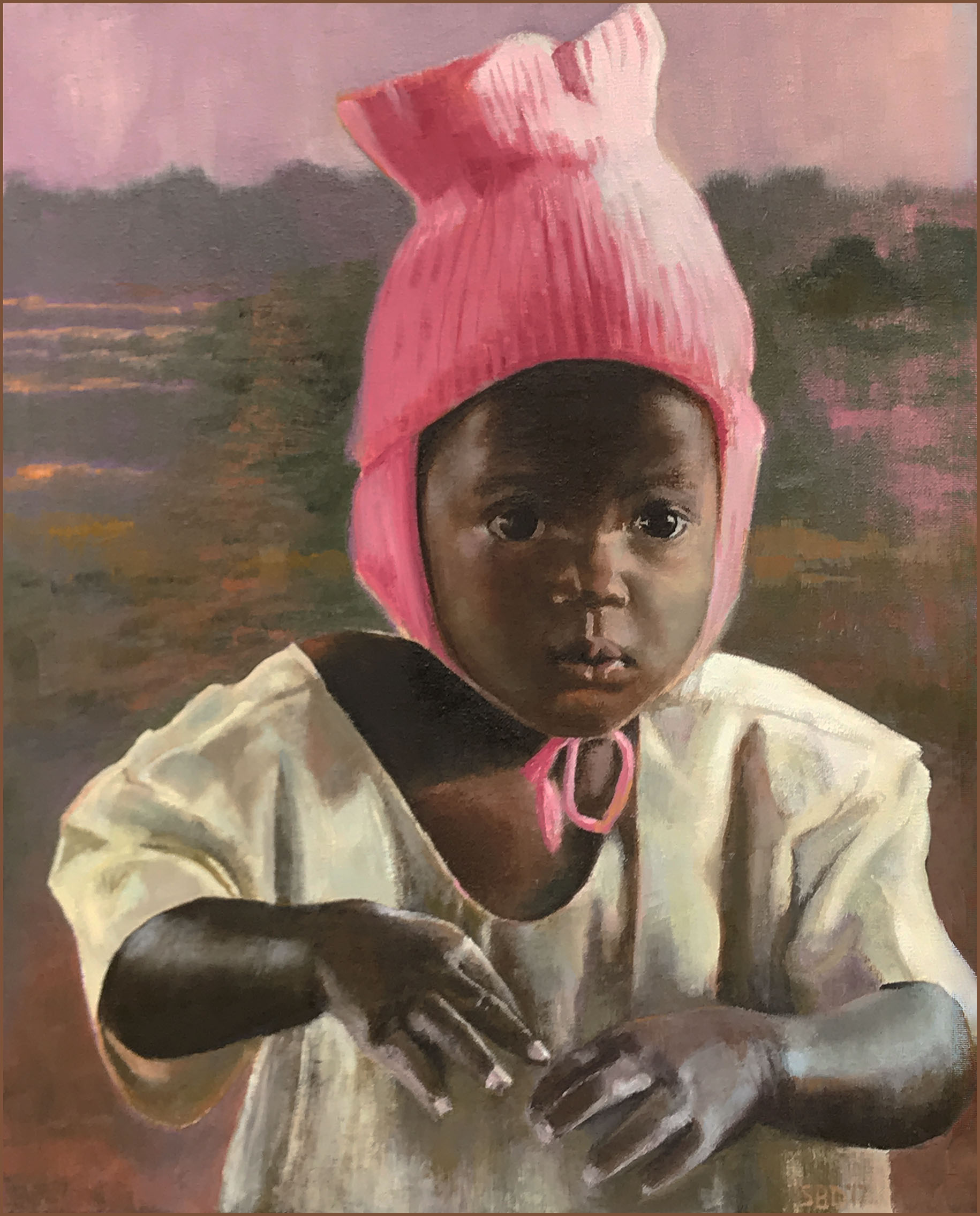
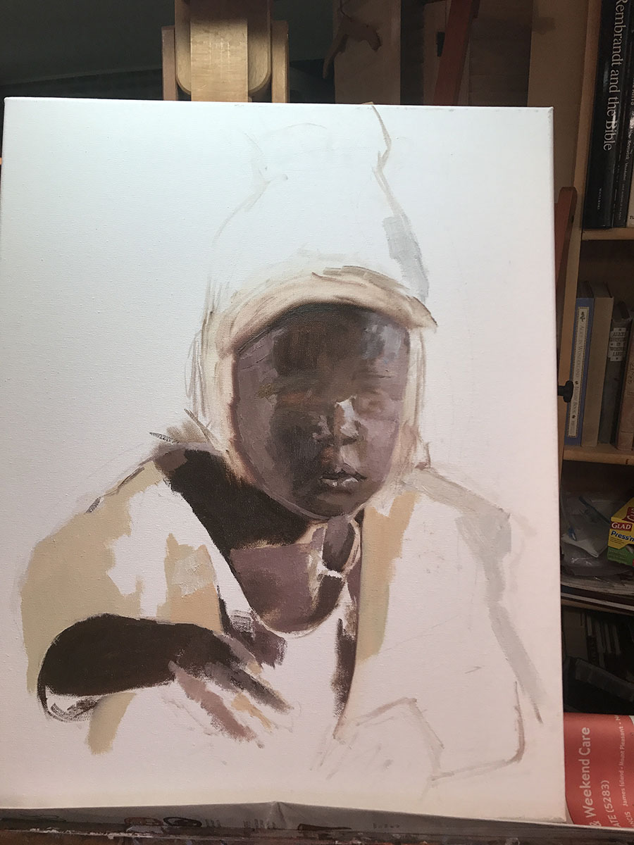
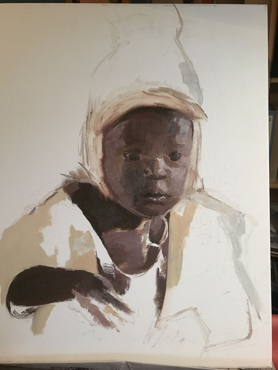
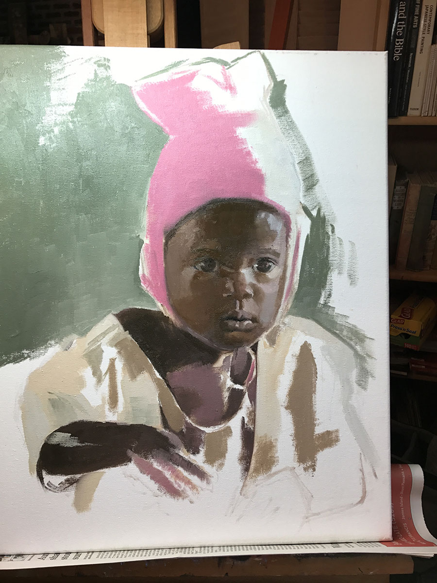
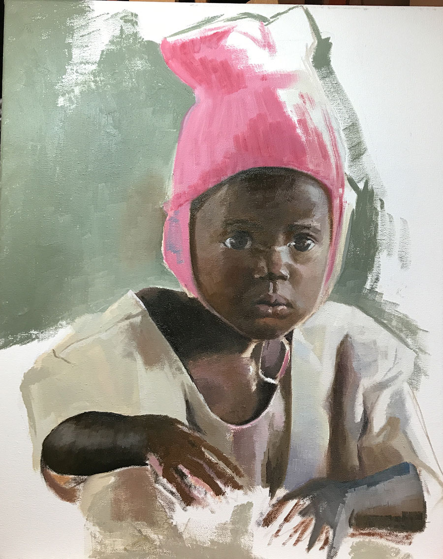
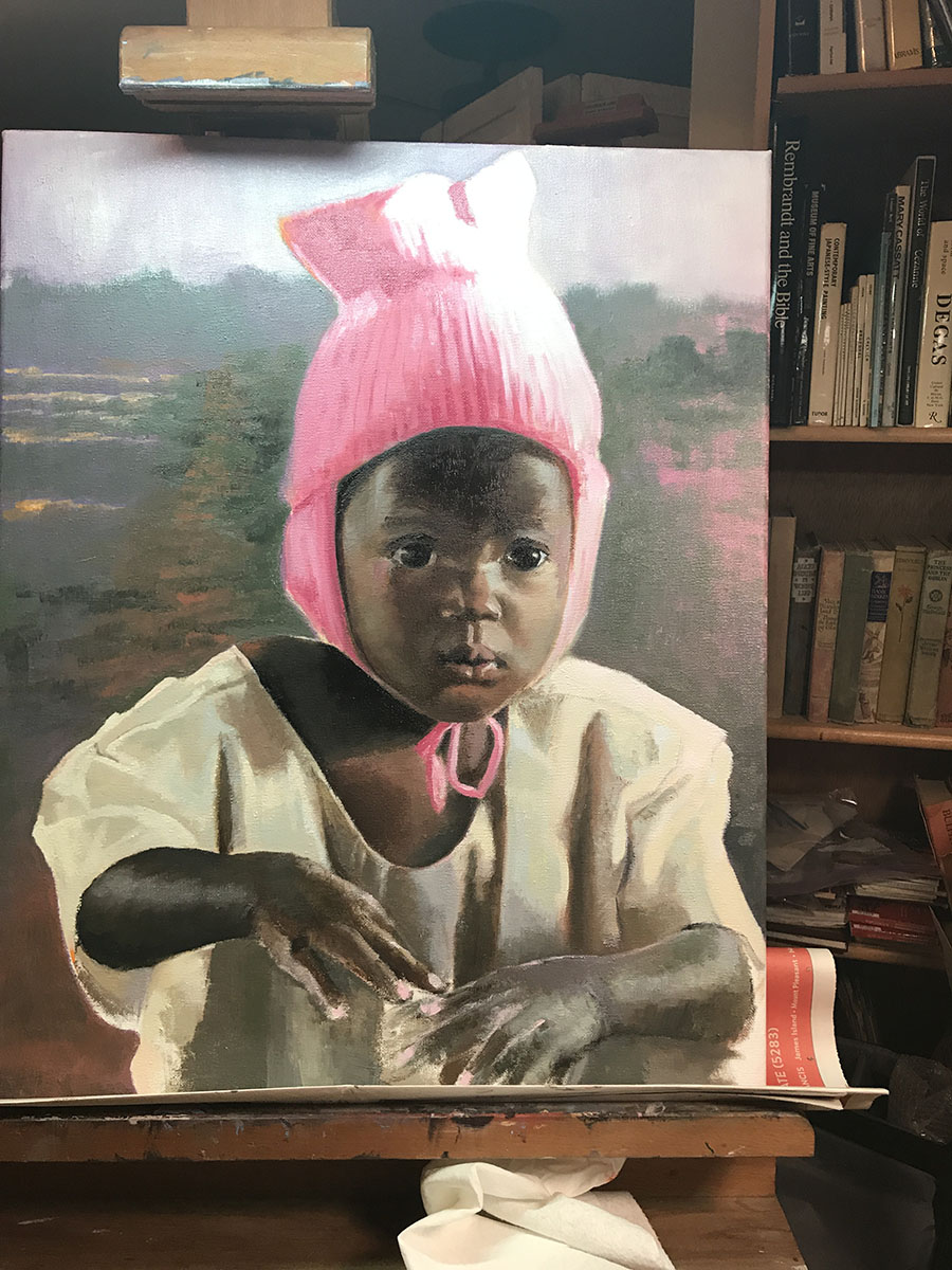
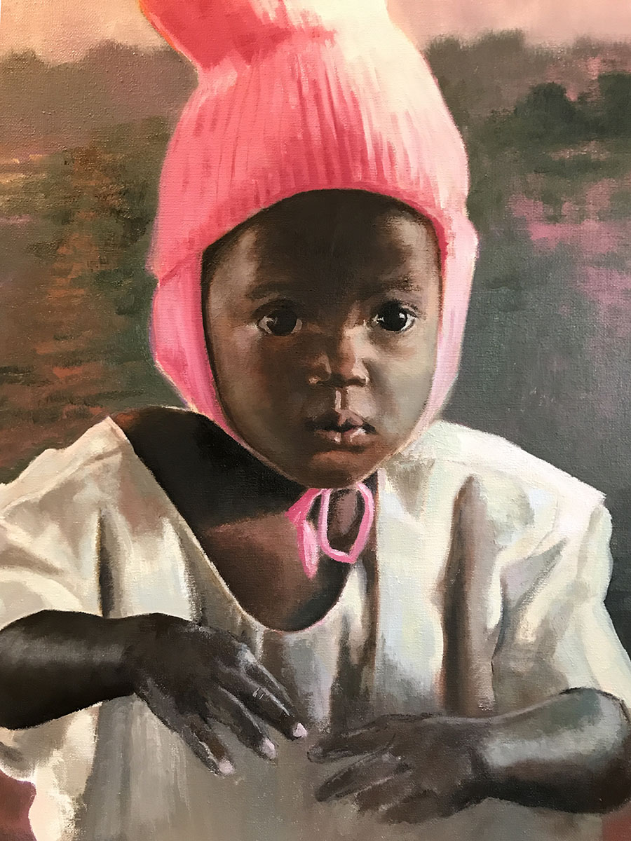
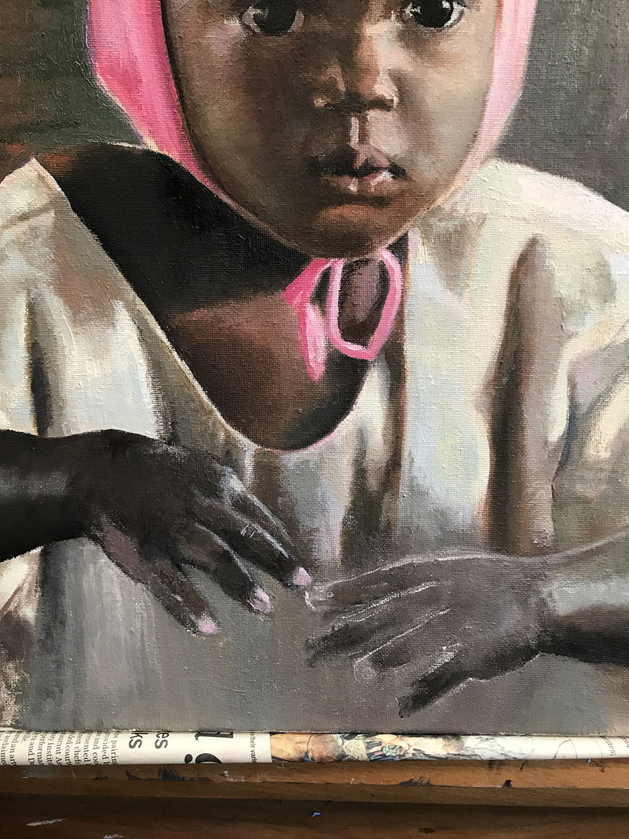
“The Pink Hat” is a painting I’ve been wanting to do for months! A dear friend had been to Uganda, and this little girl’s picture was among the photos. Her innocence was so compelling. So was the hat. Interestingly, the most difficult part for me were the hands. The way the lighting fell on them, and basically removed the dark brown color, made for an interesting problem. How to place the light and not draw the eye there as the subject was really the face!
I forgot to take a picture of the initial drawing. Frankly, I’m amazed I remember to take any pictures at all. I get so immersed in the paint that I forget where I am.
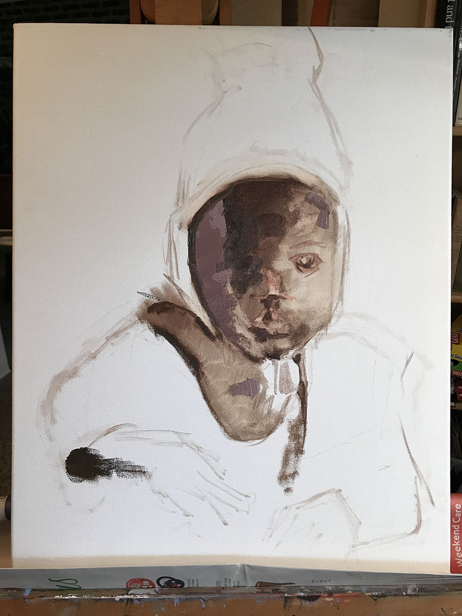
She looks a bit strange…however, I’m trying to locate the shapes and values. The lines had already suggested the movement or placement.
Where are the darkest darks, the midtones, and the light?
I’m still laying in the darks, and finding the placement of the facial features.
She’s starting to take form, and I can lay in the hat, which I’ve been dying to do. I just love her expression!
The wonderful part of being a painter is that you can decide what you want to emphasize or not. What color should the background be? Green is the complement of pink…does that work?
I love her outfit. Again, what shadows do I bring forward (with a reddish tone) or set back (with a cool blue or blue/black). You can create great tension with cool colors against warm, not just light against dark.
I decided I wanted a Ugandan countryside behind this little Ugandan girl. It’s filled with greens, pinks and oranges.
Now I’m moving to the hands with the gown as the background.
Her right hand was interesting in that there were so many colors, shapes, darks and lights.
The left hand was a bear! Hands are so expressive. I remember my mom’s hands so well…she who couldn’t sew on a button, but spoke volumes with her hands. I wanted these hands to express a certain vulnerability. Only time will tell if I succeeded or not.
Here’s the final piece. I decided to go with the left hand connecting with the right but relaxed as she’s not thinking about her hands. This hand was rough as I stated before. You have to be careful where you want the eye to go. It will be drawn to the light, and the hand is not the subject but, hopefully, an added statement.
THANKS if you managed to get to the end of the blog! Please comment if you have things you’d like to know or if I’m not conveying my thoughts in a way that makes sense (which is highly probable..).
’til next time!
Sarah
by Sarah | Aug 14, 2017 | Blog, Blog Posts
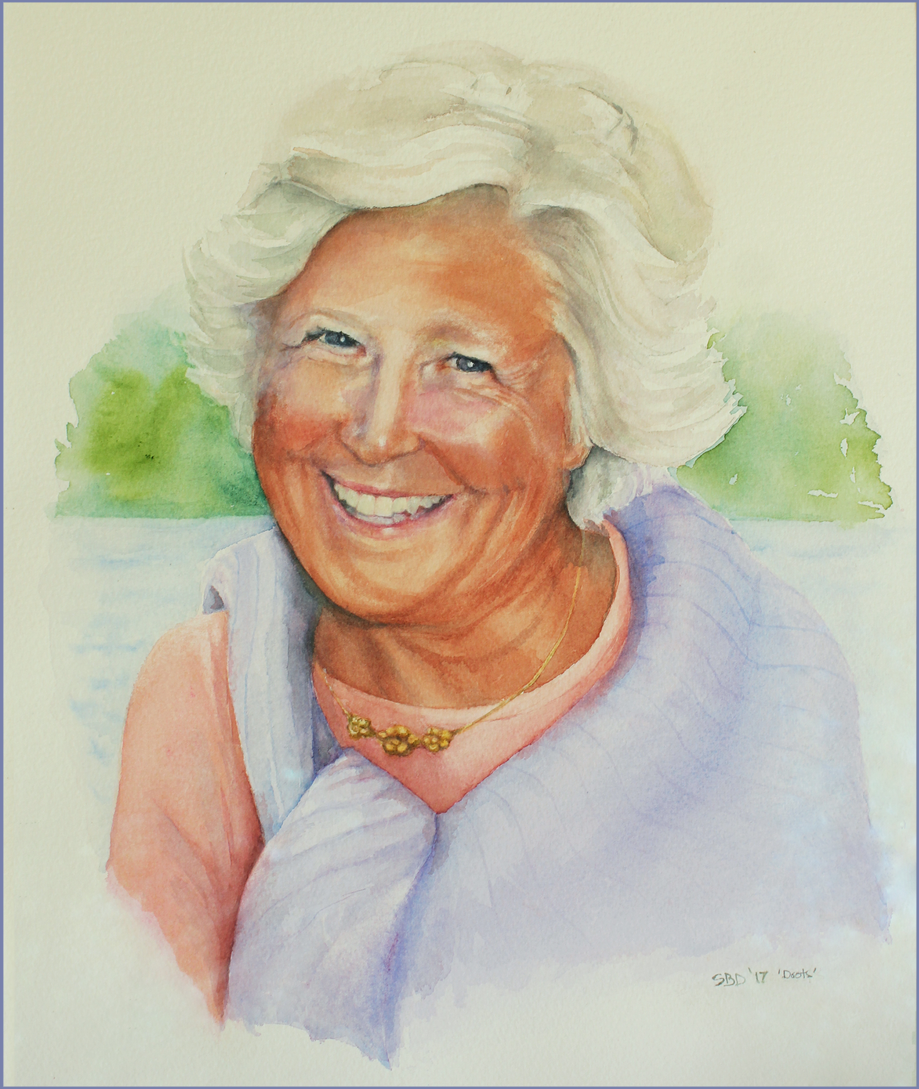
“Doots”
My childhood best friend, who died last year was just so full of life! She loved to laugh.
We met in pre-nursery school, and were both “Doots.” We started the renowned “Doots & Doots Detective Agency”… solving all manner of crimes…often ones that we committed.
I was asked by her siblings to paint her portrait as a gift to her husband. I so dearly wanted to capture this loving, zany friend who was always looking for a joke or plotting something mischievous.
I have to say that this was the hardest painting I’ve ever done. Often I’d cry.
But the painting was presented to her husband last week, and I was so touched by his thoughtful note:
“I can’t begin to describe the impact of your painting. Such a blessing. God’s in His heaven and Sandy’s with Him. Love you.”
Oh, I’m so glad I was asked.
Here are a few thoughts en route to the painting
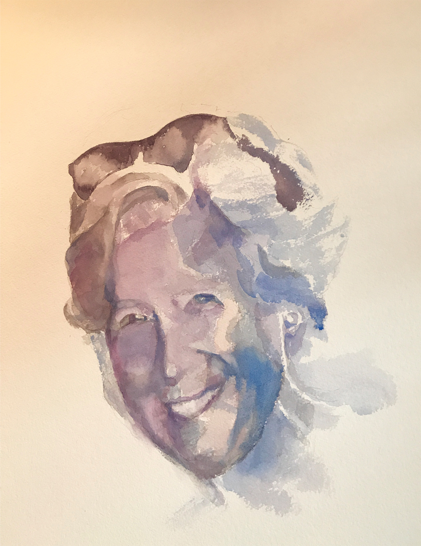
This is what’s called a “value study.” I gave arbitrary colors to the various values on Doots’s face, namely dark black and dark blue for the darkest values. The middle values on the face are purple/gray. The interesting thing I learned is that you can use ANY color in a painting and it will make sense as long as the value is accurate. It will look astoundingly right. Value is key!
I’ve enclosed a value chart here going from the lightest light to the darkest dark, so you can see the variations.
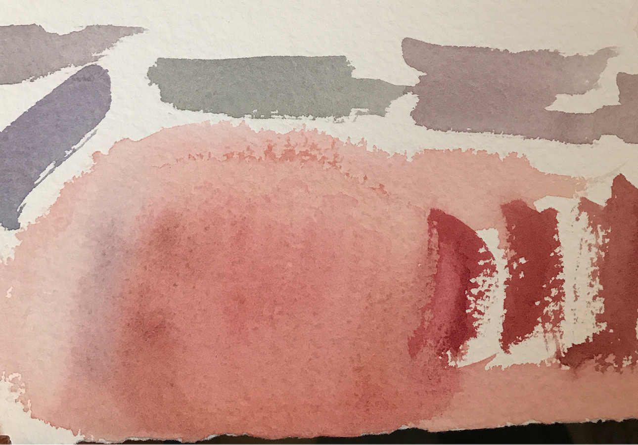
Doots’s brother stopped by, and we determined that he had the same coloration as Doots. These are the sample colors that I used primarily on her face in the painting.
I should add that the finished painting (above) is actually on white paper, so the colors are not accurate (sigh). The camera has a hard time registering white, and often gives the picture a yellow, red or blue cast. Frustrating!
Painting almost always requires many failed attempts. For instance, I couldn’t get the right side of Doots’s face without her looking truly bizarre, so I’m hiding it in this photograph… I, also, realized that her mouth was too wide. She also looked fat, and I didn’t want that, so I scraped the whole thing. Sort of like bad batches of cookies…
I didn’t take many pictures as I worked through this painting as I was so absorbed that I forgot. Next time I’ll do better…
Aside from my fine art paintings, I’m illustrating a book of fables that my husband has written called “Timely Tales.” I love them! Here are two preliminary illustrations. I’ll be posting new ones here as I trot along…

It’s Carnival Day!

I’m bored!

           Back to Work…
Well, now it’s time to get back to work…Â
by Sarah | Mar 28, 2017 | Blog, Blog Posts
I’m posting birds probably because it’s spring, and we’re moving, and I’m decidedly feeling the nesting urge. Our house has sold, but we’re not clear where we’re headed yet, except we know we’re staying in Charleston.
I want all my paintings to find a nice home where they’ll be loved and bring a smile or provoke a thought. The best way to do that, one would think, would be to have a sale.
All my paintings will be anywhere from 20% to 25% reduced. Gag!
I’m hoping this blog will, perhaps, cause you to feel the nesting urge, and bring one of these paintings into your home.
§
This little Wren just found a home! He was grabbed on Instagram before the sale even began!!
I had to paint this Wren as he’s been sitting on my kitchen window sill chirping his heart out. I figured he was singing “paint me!” And so I did.
COME TO MY STUDIO!
1393 SOUTHERN MAGNOLIA LANE MT. PLEASANT, SC 29464
Friday, March 31 ~ 4 – 9pm
Saturday, April 1 ~Â 10am – 3pm
Â
ORÂ PEEK IN ONÂ MY WEBSITE
by Sarah | Mar 12, 2015 | Blog, Blog Posts |

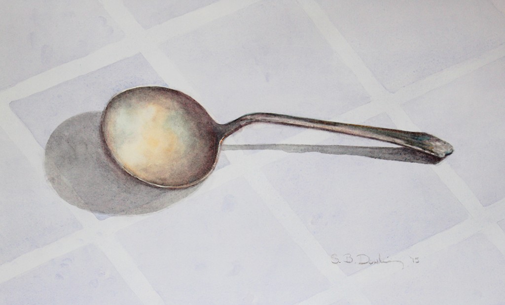
The Beauty in a Spoon
I saw this spoon in a drawer of antique silverware belonging to my mother. I was struck by this particular one and its simple beauty. I loved the way the silver caught the colors that were nearby: the orange ruler and the aqua of a glass bird. They really weren’t even that near, but the spoon seemed to find the colors anyway.
I’m always intrigued with line and shadow, and the line of this spoon seemed wonderfully simple, even elegant. I placed it on this cloth of squares, which to me emphasized the roundness of the bowl and its shadow.
This seemingly simple watercolor is actually more difficult to paint than one would think. I was very touched by the following comment, which the son of a former classmate of mine made when he saw this piece:
“Metal is lit directly (with the source lights that are reflected once to your eye ) and by the surrounding objects that are also reflecting light (so that light reflects twice: once from the directly-lit object and then from the reflecting object to your eye). This is true of all materials that aren’t true black, but metals reflect light in closer to coherent image than other materials, which cause greater ray scattering. So polished silver would show warped but optically coherent reflections of the lit objects around them, and fabric, for example, reflects only the most incoherent suggestions of nearby lit objects, just smudges. To suggest so unambiguously, using only pigments, that the spoon is tarnished silver, is to not only get the colors right (which takes tons of practice) but to smudge the colors to somewhere between optic coherence and total diffusion.”
I wanted to post this piece as it’s the first in a series that I’d like to do using minimal color. I hesitate to say shades of gray, but that’s what fascinates me at this moment. I love the subtleties that can be found in grays. Not only do they range from dark to light, but also from one end of the color spectrum to the other. In my next blog, I’ll give a range of samples.
If anyone is wondering why I have so little to show, I’ve been busy with my younger daughter getting married. It was lovely, and great fun!
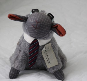
Also, I was thrilled that she wanted me to design and sew her dress. I learned sewing in junior high home economics, and it took. Also, my husband and I had a stuffed animal company (Under the Lamb, Inc), and I created several products, including an executive lamb, called E.F. Mutton, our biggest selling product. I did the original lamb. My husband wrote “The Wool Street Journal” to go with it.

E. F. Mutton
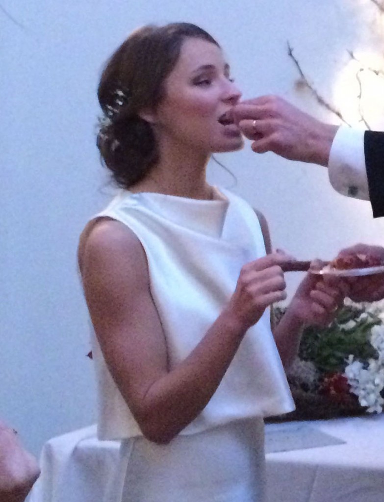
Here is my daughter, Katrina, Â in the dress and train. She, by the way, has been the model for many of my paintings.

Pensive

This cell phone picture shows the top. I love the way it falls around the neck.

Eating the Cake
I’d say that’s enough for now. I’m busy reclaiming my life, and I hope to get painting as I haven’t been able to do in years! This Saturday, I was just juried into the Charleston Art League, and I’m excited to plug in and see what happens next.
In case you didn’t see, we now live in Mt Pleasant, SC, outside of Charleston: Â 1393 Southern Magnolia Lane, Mt. Pleasant, SC, 29464.
Thanks so much for looking!

SPRING IS HERE!

by Sarah | Nov 18, 2014 | Blog, Blog Posts

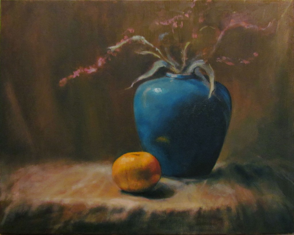
Still Life in Oil
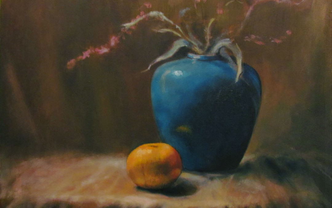
I’ve not done very many paintings in oil, nor am I a still life painter, but I recently took a workshop with Chris Groves, a very talented, Charleston-based painter, and above is the result.
Oils are messy! But I LOVE that you can change up, reposition, and recolor, which is much more difficult to do with watercolors. I love the transparency of watercolors, but I love the texture and freedom with oils. They each have their own beauty. My only obstacle yet is to find the medium with which I can create line, which is my first love. I’m pushing to find where I can create what’s on my heart with which medium with the greatest effect. I truly welcome comments, critical or otherwise!
The idea was to set up the still life in a box with a light aimed on the subject creating a dramatic effect of light and dark, a technique known as “chiaroscuro,” a method perfected by Rembrandt.

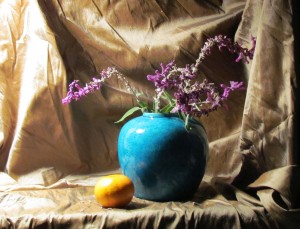
Still life set against cloth background
Here the still life is set up in a box using fabric and draped behind the vase and orange. The light is affixed on the left side of the box aimed at the vase and orange. The drama is set!

Laying in the ground
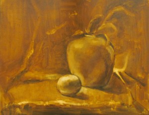
We first chose a color palette, from which I deviated enormously, so I didn’t include it. We next lay in a reddish/brown pigment on the canvas, and lifted paint with paper towels while it was still wet to create the values (from light to dark), and the composition.

Blocking in the colors
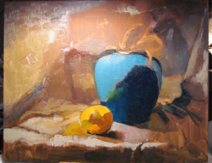
Here I’m laying in blocks of color, and trying to figure out what I’m going to do with all that fabric on the left side of my painting. Where do I want the focal point to be? Am I creating contrasts using only lights and darks? I want to remember to use cools against warm (the orange against the vase) to create contrast. You also have to consider that, even if you like something about a painting, you might need to eliminate it as it adds nothing. I was attracted to the shadow to the right of the vase, but I had to tone it back as it was drawing the eye there rather than to the vase and the orange.

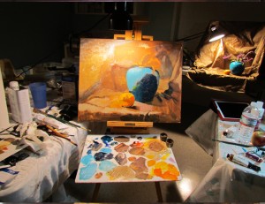
This is the workspace with the actual still life in the background
This picture shows my workspace with the still life in the distance.  This was only a three-day workshop (six hours/day), so you have to work relatively quickly.

Nearly Done
Now it’s getting to the hard part – looking critically at the composition and contrasts. Am I creating enough light and dark? Is the background staying back or competing with the foreground? Is everything too much in the “middle ground?” How do I  make the vase sit on the fabric; are the shadows convincing? These and many others are questions that go repeatedly around in my mind. How much reflection should the orange create? This is where I make my own decisions, and am no longer looking at the still life. I want the warm of the orange in the fabric, although it’s really not there. How far do I push it? Is the brown in the background a warm brown or cool? The shadow in the fabric as it turns towards the floor needs to be warm in order to come forward in front of the blue vase.

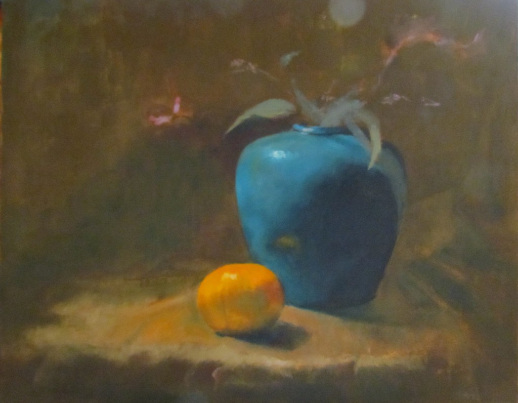
Still Life in Oil
This is the final piece! In the painting, the vase is more aqua but I need to invest in a better camera… I hope I’ve given you some indication of how difficult painting can really be. It’s a shortcut, for me, to brain implosion. I don’t do landscapes because there are so many decisions to make, so many colors, so many lines, so many blocks of shade and light. Perhaps, when I’m more adept, one day I’ll attempt one and succeed. This painting, however, was great fun, and I felt somewhat successful.
We’ve finally settled into our new home. My studio is presently in the dining room….I like that it’s next to the kitchen…
HAPPY THANKSGIVING TO EVERYONE!
To Purchase any of my work, please phone 1-912-223-8674 or email me from my contact page. Thanks!

by Sarah | Nov 5, 2013 | Blog, Blog Posts |

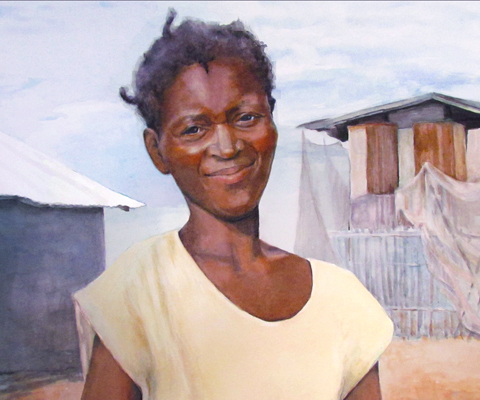
Anite
Anite is a Haitian woman who works at 2nd Story Goods, a non-profit cottage industry started by my friend Kathy Brooks. She tells Anite’s story below:
We stand outside Anite’s tiny thatch home, the one she moved into this past June with her four children. I reach down to fix the collar on the dress of the little girl standing there with Anite’s daughters. Anite tells me that the little girl’s family lived next door until recently and were forced to leave. The momma left with her baby and left this daughter behind. Alone.
Anite is a young widow and might weigh 75 pounds soaking wet. I wonder how many days she has gone without food to keep her children fed… She is a woman of faith. She is a woman fiercely determined to keep her family together and raise her kids well.
Anite has taken this little girl in.
So, this young girl is maybe eight years old. She is so thin and small it is difficult to say. Anite has taken in another mouth to feed, another body to clothe, another child to hold when she cries.
She slays me.
She tells me that God will take care of them, that He promises to do that for those who care for those in need. So she does.
♥ ♥ ♥
I was so touched by Anite’s story that I felt prompted to paint her and offer the print as a means to give money to her family and others like her through the ministry of 2nd Story Goods.
If you wish, you can purchase a signed, limited edition Gicleé print (museum-quality paper using archival ink) for $48.00.
The print will come unmatted, rolled in a solid tube ready to place in a mat or frame.
I will send $35.00 from each sale to 2nd Story Goods for Anite and families like hers.
The remaining $13.00 will cover the cost of reproducing your limited edition print and shipping it to you!
You can place your order through all the various means on the sidebar next to the painting.
Thanks!
 ♥ ♥ ♥
I’ve tried to take some pictures as I’ve worked on this watercolor so you can see the progression.

First step in laying in the painting
This is really not the first step but you’d never be able to see my “first step” pencil drawing as it is so light. So, this is the step after the drawing where you lay in shapes and try to establish some colors.

The next step is to lay in the background and continue to fill in the face.
Now I start laying in the background shapes and colors trying to balance the background against the foreground. In this painting, I don’t want the background to compete very much as Anite’s clearly the focus. I try to keep the colors somewhat muted.
Â
And here is the final piece!

Anite
♥ ♥ ♥
I can’t believe so much time has passed since my last blog! This has been a year of settling kids in college, or not college. I keep thinking I’ll have my own life, but perhaps that’s a myth…
Anyway, I’ve managed to squeak in painting, and I’ll try and catch you up. I’m going to try and keep this post updated (ha) so you can check in at your leisure, if you like. I’m presently working on a piece called “Waiting.” This was generated by a series of photos sent to me by a friend of three Mennonite women at the train station. I’m always intrigued by what people might be thinking, especially when waiting.
Â

He Heals the Brokenhearted
This painting, “He Heals the Brokenhearted,” was accepted for the 72nd National Exhibition of the Watercolor Society of Alabama, Spring, 2013.
Â
The summer has been filled with illustrations, one a commission (below), the others have been submitted to a children’s book publisher (on the right panel).
Â

Garden Whimsy
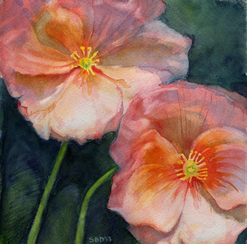
The poppies are just for fun…

Poppies
That’s it for now. As the kids are going off on their lives, I’m starting to get excited about regaining mine… !!

by Sarah | Sep 18, 2012 | Blog, Blog Posts
Thanks for peeking in here! Teaching is not my forte’, but I hope you enjoy this attempt to show you a bit of the watercolor process.
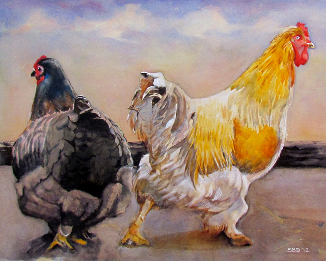
To begin, I placed this painting on a board at about a 45° angle. I taped it down, and then started drawing. Below is a sketch of the two hens I drew on the paper. Normally, I draw with a very light pencil so the lines can’t be seen through the paint. Here I’ve darkened them (in Photoshop) so you can at least see them… the bottom of the drawing got so dark, I had to eliminate it…

- First Sketch of Two Hens
Next, I laid in the shapes, the lights and the darks. I decided to use black India ink in some areas as it’s more intense than watercolor and has it’s own interesting properties. I put ink on the tails and around the feet of the two hens. Water dropped on the ink causes it to fan out and makes an interesting effect as on the dark hen’s tail tip.
 Laying in the Colors and shapes
I continued to layer the colors going from light to dark (with oil paint, you generally go from dark to light), testing the colors on the paper next to the painting, finding the color I need. You can see on the feathers of the orange hen the layers of color, especially on the closeup of the finished hen.
 Chickens – Third Step
 Closeup of Orange Hen
The painting is almost finished except for defining the beaks, and laying in the sky and clouds. This is hard to show as it happens so fast (maybe I’ll do a video some time as the process is really fascinating, I think). First, I carefully wet the background around the hens down to the rails (saturate might be a better word). Next, I mixed a large amount of Cobalt Blue paint with a little Quinacridone Coral. Then I lay the paint across the paper, starting at the top.
Because of the angle of the board, the paint descended – fast! I kept laying in the original color as it descended down the page. As I got closer to the girls’ heads, I started dropping in a pink/coral color and some Quinacridone Gold. You literally do drop the colors in and they fan out and blend, creating a beautiful look which is unique to watercolor. It’s beautiful!
There are several techniques for creating clouds. The one I use most often is to take some paper towel (Viva) and lift the paint while the paper is still quite wet. You can also lift with a paint brush, or wait until the paint dries and lift with a small scrub brush. Watercolor paper is extremely durable, and you can scrub and lift. Even Magic Eraser ( like you use on your kitchen floors) works great!
 Adding the Sky
Here is the finished painting – sky, beaks and all.


by Sarah | Apr 11, 2012 | Blog, Blog Posts
Spring is here (gorgeous!), and it’s time to tend to my long-overdue blog.

Study of seated woman
I’ve been working on a number of pieces over the last months but I’m going to take you through this one that I’ve been painting over a number of weeks. I”m attempting a style of painting called “Tenebrist,” in which most of the figure is engulfed in shadow, but some parts are dramatically illuminated by a beam of light (in this case a spotlight fixed on the side of a black-encased box which is aimed on the model). Caravaggio, a Baroque artist, is generally credited with the invention of this style.

Study for Glazing
The first step in preparing the oil painting is laying down a background color, usually a dark reddish/brown, with an acrylic paint.
The next step is to lay out the drawing (this model is quite ample and a delight to draw), and lay in the lights. The oil paint is very much thinned down with linseed oil to create a thin glaze. I was fascinated with the way the light illuminated her skin, a bright red, winding it’s way up her leg, through her body and resting on her face. She has a wonderful head and chinline. I might add that she’s a terrific model as she never moves!

Second phase of glazing
After the painting dried for several days, I next lay in a rose color as a glaze; namely a very thin layer of oil paint and linseed oil. The rose color, interestingly, over the dark brown becomes a dark blue. The remainder of the painting is done in layers of a thin glaze which, being translucent, gives a feeling of depth to the figure. Vermeer is one of the masters who used this technique beautifully!

Third Step in Glazing
This was the third week of adding glaze. It’s a long process and I have to admit I didn’t always glaze but added full color in order to move along faster. Also, I decided I’d enter a local competition and felt uneasy with this model being unclothed. So, using a slip that I had, I improvised and added a slip to the model. I’m sure it’s not as good as it would be if I had the real thing to look at but I loved the subtle colors of blue/green complementing the rose of her skin.

Close-up of face of model

Study of seated woman
That’s it for now. I learned a lot from this study, and I hope you learned something from my description as well.
I just started a watercolor of a barn and a horse, which I’m painting for a fundraiser at my daughter’s school. It’s for Derby Day, thus the horse. Next blog I’ll try and do a sequence of that piece so you can see how watercolor works. It’s very different from oils. I really love both mediums; each has it’s own beauty.
Happy Spring!
Sarah

by Sarah | Sep 8, 2011 | Blog, Blog Posts

Felder Ann
I just finished my first commissioned portrait, and it was a stretch!! The difficulty with doing a portrait for someone you know is that it needs to look like them…obviously.

Closeup of Felder Ann
Felder Ann has the most extraordinary eyes. I’m delighted that her parents felt that I captured them in the painting. Unfortunately, the photographs don’t capture the painting very well. New camera, wrong setting…

“Going Home”
I did this painting of “Going Home” a while ago from my imagination. It got triggered when I saw a large woman with her baby on her back during a fire drill in an apartment building in Alexandria, VA. That got combined with images from Saba, an island in the Caribbean, that had stuck in my mind. More and more, I see that I’m moved by scenes of vulnerability and light.
I want to redo this painting in time for the Telfair Museum Show in Savannah, November 11th. This time I’ll get a model (it might have to be my daughter, Katrina – I’ll just fatten her up…more Starbucks).
This is a big show, and I’ve promised myself I’d have a unified look. I’ll post things as I complete them.
Thanks!
Sarah

by Sarah | Jun 8, 2011 | Blog, Blog Posts

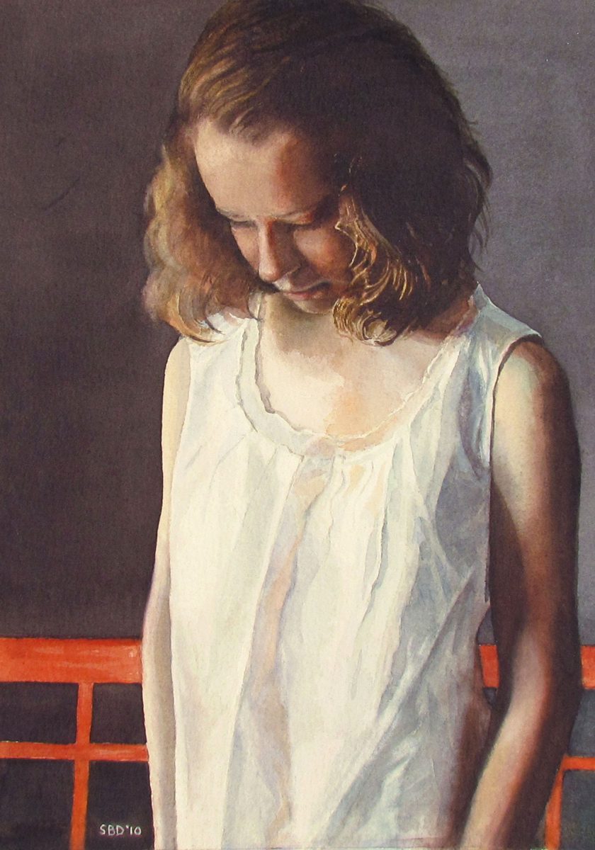
This piece, "Pensive," won first place and People's Choice Award at the Jekyll Island Art Show. This is a watercolor painting of my daughter, and what I really loved aside from her stance was the light on her blouse and her hair, and the orange of the bench.

- Two Old Friends
This watercolor, "Two Old Friends," was accepted into the Southern Watercolor Society Exhibition and won the North Light Books award. This painting was prompted by seeing a small photo of a group of people in a hospital. Several of the women looked like these two, and I was touched. This has a folk art feel to it, different from my more realistic stuff. I'm always trying to resolve the tension of wanting to illustrate/capture humor, and wanting to capture poignancy/reality. Maybe some day they'll meld.

- Dusk
"Dusk" was accepted into the Alabama Watercolor Society Exhibition and won the Georgia Watercolor Society award. This piece was based on a photograph by Bobby Haven of the Brunswick News, Brunswick, GA.

- My oil painting teacher, Carl Fougerousse
This is an oil painting I did of my teacher Carl Fougerousse. The model never showed up so Carl sat. I was thrilled as he has a much more interesting face; great nose and hair! Good looking fellow!
I still want to work on the shirt. I'm fascinated with light on fabric. I guess I love the way light plays on almost anything. God's touch.
That's it!


