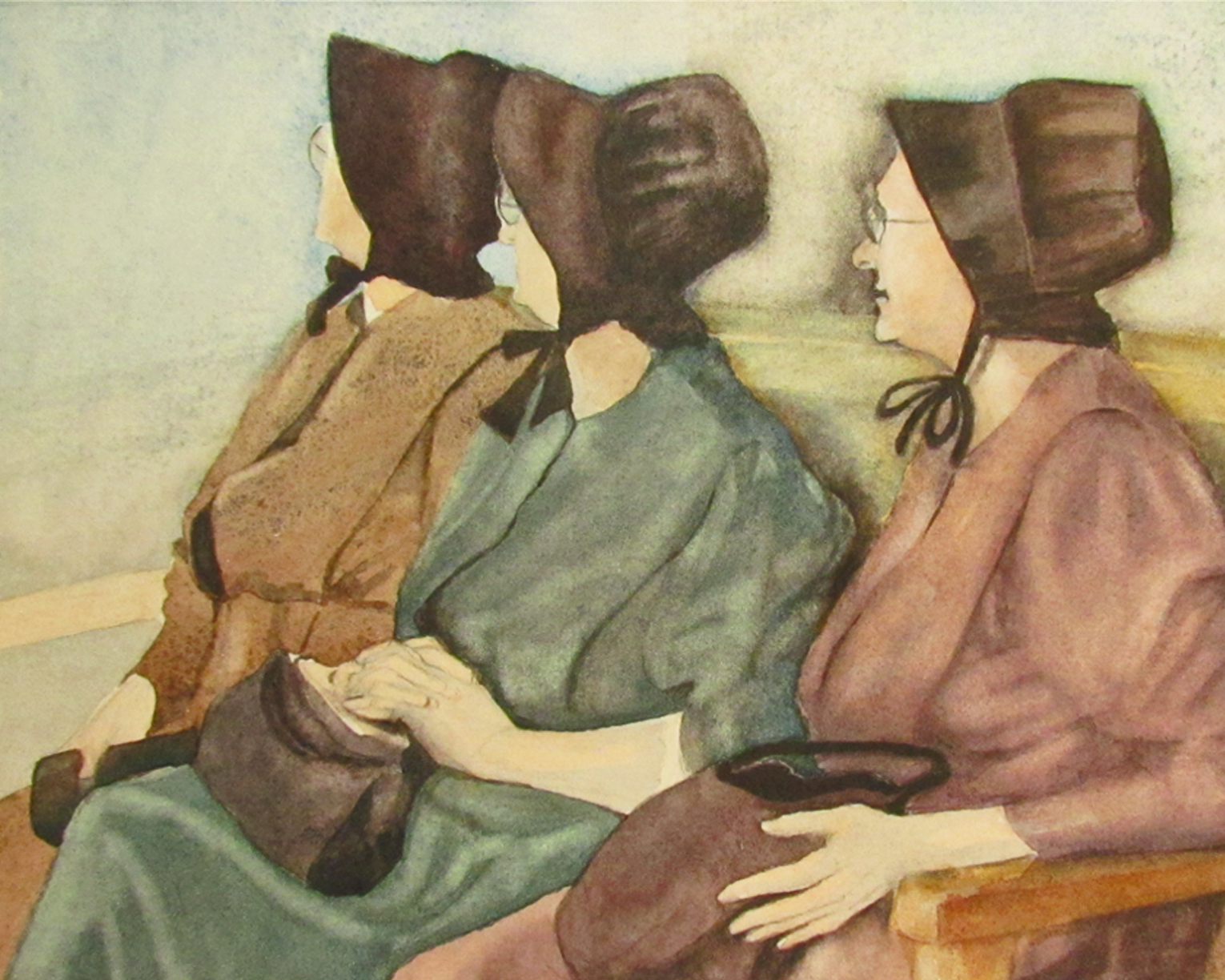
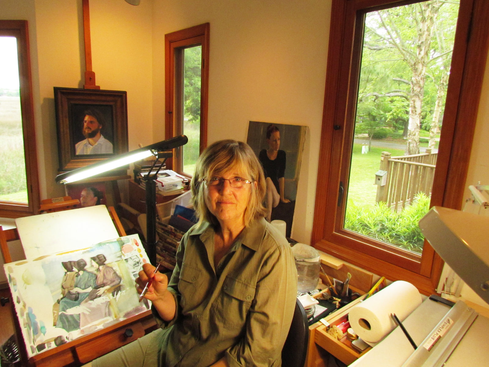
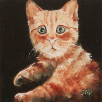
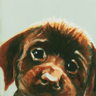
Sarah's Update What a year this has been! Most of it has been dedicated to illustration and the publication of our book, Frog's Rainy-Day Story and Other Fables. I've been able to grab time to fit in these little paintings, which I've grown to love. I have them...
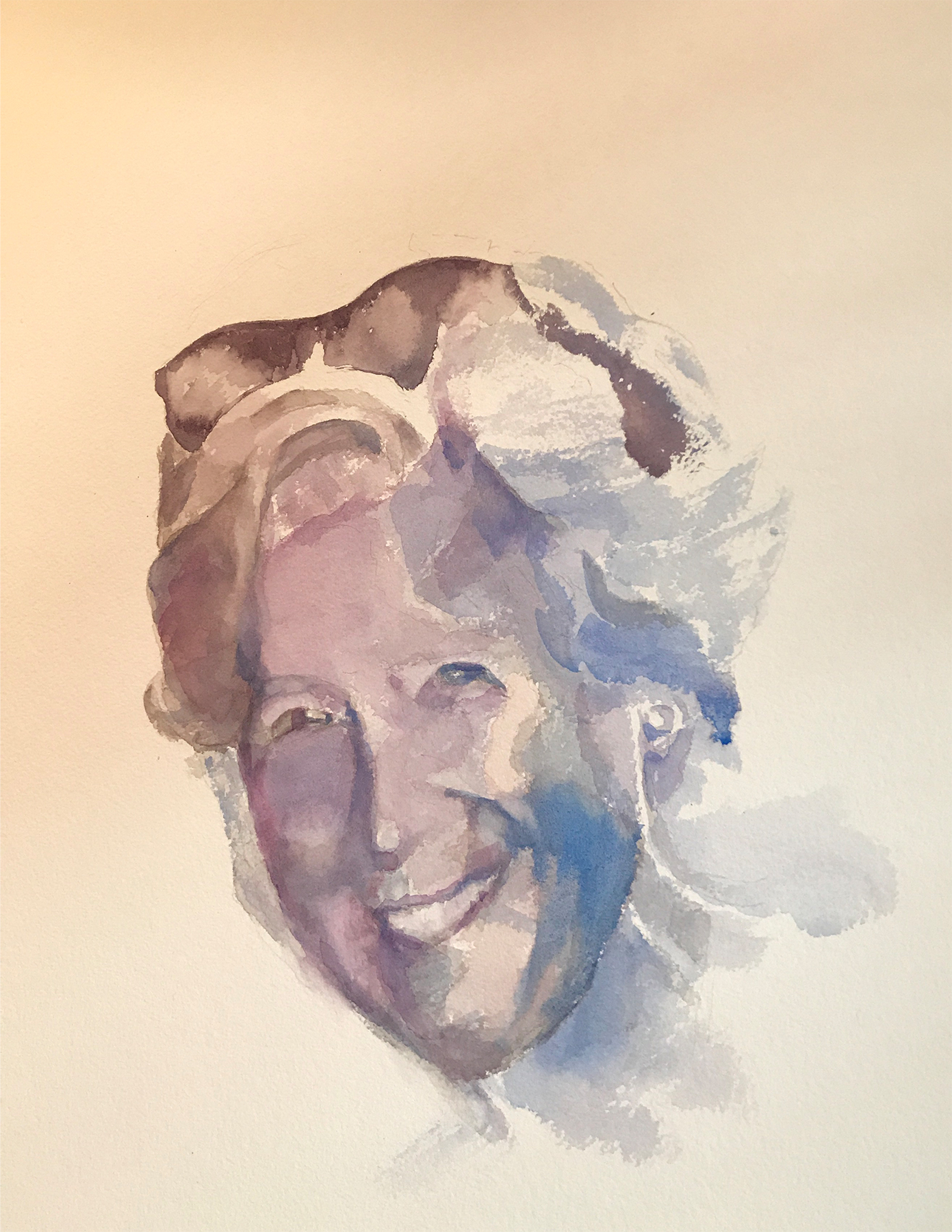
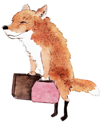
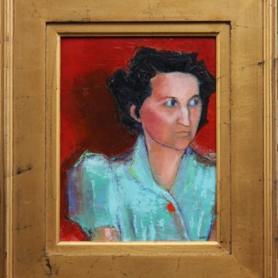
Portrait of a very dear friend

“Doots”
My childhood best friend, who died last year was just so full of life! She loved to laugh.
We met in pre-nursery school, and were both “Doots.” We started the renowned “Doots & Doots Detective Agency”… solving all manner of crimes…often ones that we committed.
I was asked by her siblings to paint her portrait as a gift to her husband. I so dearly wanted to capture this loving, zany friend who was always looking for a joke or plotting something mischievous.
I have to say that this was the hardest painting I’ve ever done. Often I’d cry.
But the painting was presented to her husband last week, and I was so touched by his thoughtful note:
“I can’t begin to describe the impact of your painting. Such a blessing. God’s in His heaven and Sandy’s with Him. Love you.”
Oh, I’m so glad I was asked.
Here are a few thoughts en route to the painting
This is what’s called a “value study.” I gave arbitrary colors to the various values on Doots’s face, namely dark black and dark blue for the darkest values. The middle values on the face are purple/gray. The interesting thing I learned is that you can use ANY color in a painting and it will make sense as long as the value is accurate. It will look astoundingly right. Value is key!
I’ve enclosed a value chart here going from the lightest light to the darkest dark, so you can see the variations.

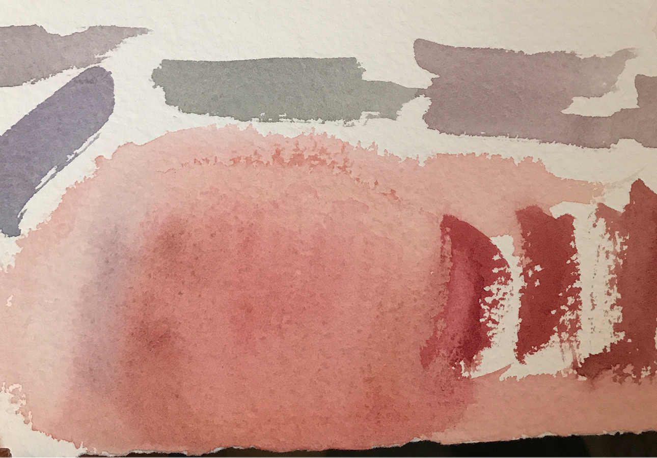
Doots’s brother stopped by, and we determined that he had the same coloration as Doots. These are the sample colors that I used primarily on her face in the painting.
I should add that the finished painting (above) is actually on white paper, so the colors are not accurate (sigh). The camera has a hard time registering white, and often gives the picture a yellow, red or blue cast. Frustrating!
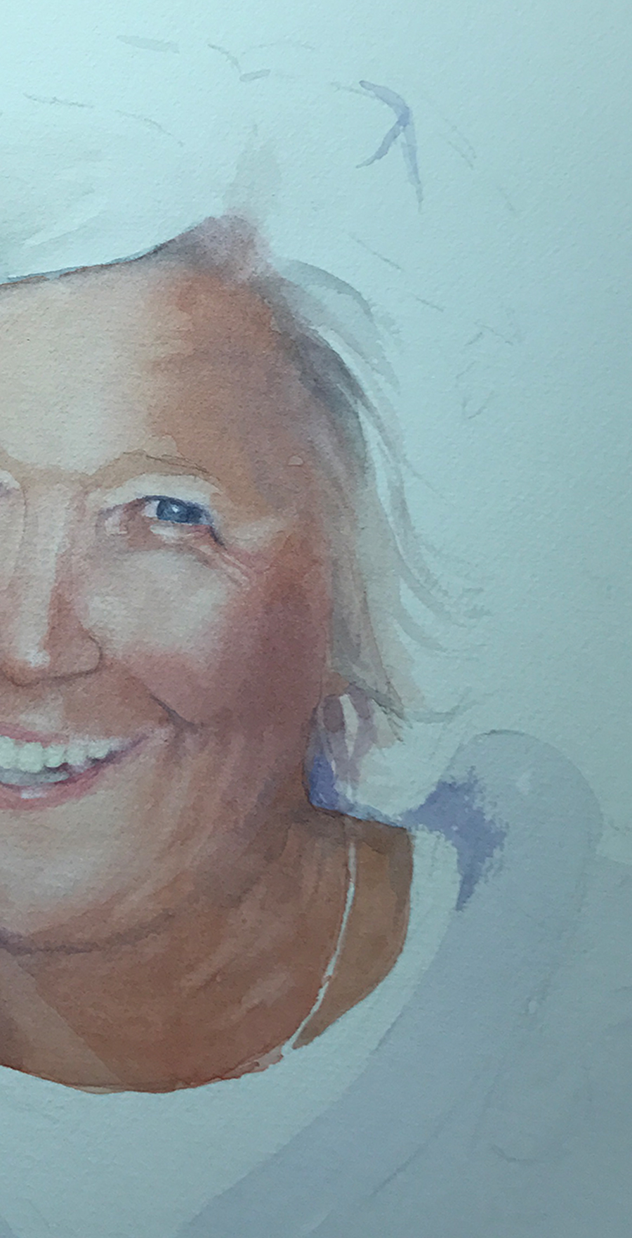
Painting almost always requires many failed attempts. For instance, I couldn’t get the right side of Doots’s face without her looking truly bizarre, so I’m hiding it in this photograph… I, also, realized that her mouth was too wide. She also looked fat, and I didn’t want that, so I scraped the whole thing. Sort of like bad batches of cookies…
I didn’t take many pictures as I worked through this painting as I was so absorbed that I forgot. Next time I’ll do better…
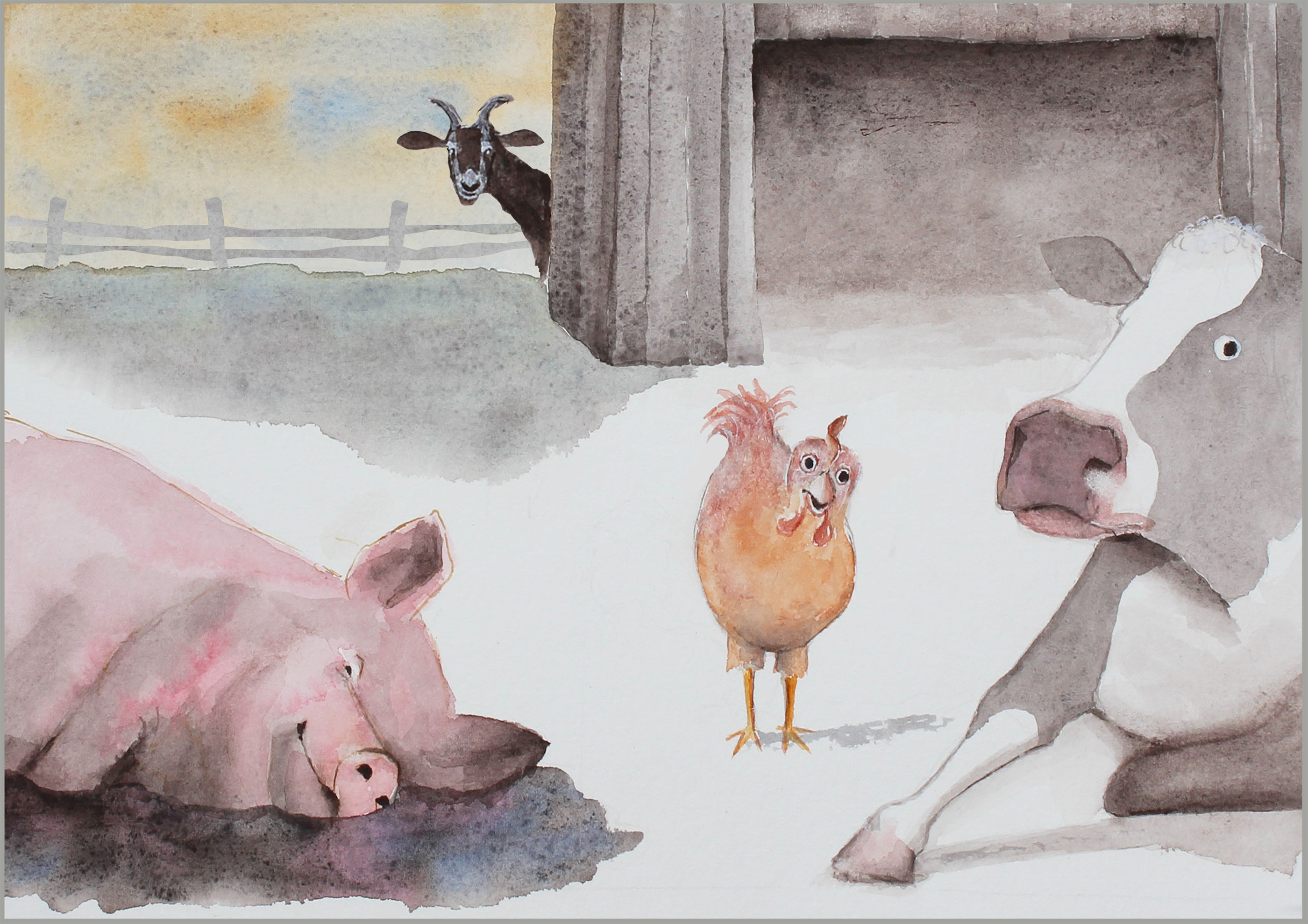
Aside from my fine art paintings, I’m illustrating a book of fables that my husband has written called “Timely Tales.” I love them! Here are two preliminary illustrations. I’ll be posting new ones here as I trot along…
GOOSE'S INVITATION
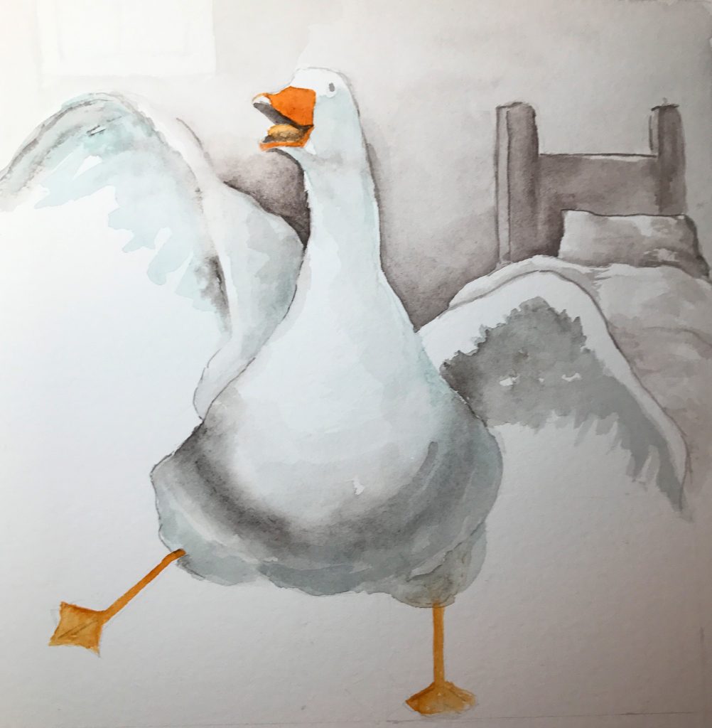
It’s Carnival Day!
PIG'S PLAY
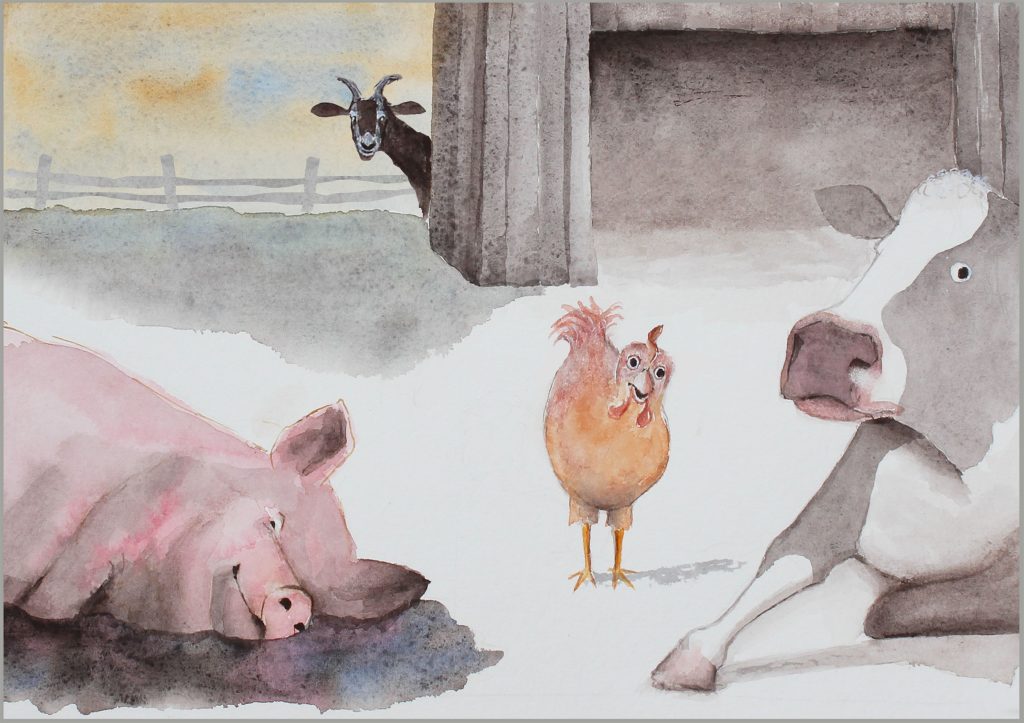
I’m bored!
           Back to Work…
Well, now it’s time to get back to work…Â
Thanksgiving Blog
James’ New Puppy
This is James and his new puppy. His grandmother (a dear friend) asked me to paint a portrait as a Christmas present to her son and his wife. She wanted a soft look, and watercolor is a perfect medium for that. I was given a 3"x5" photo from which to work, and the...
Pastel Portrait
   A dear friend, Jan Fincher, asked if I'd do a pastel portrait of her three children when they were little (being now fully grown with children of their own).    She then gave me a wonderful 3x5 photo taken many years ago of the kids in a bed of tulips!...
Out On A Limb
Out On A LimbThis piece, "Out On A Limb," was so much fun to paint! This is a watercolor on watercolor canvas, which I've never used before. Every medium has its own very distinct look. This wood stork is young. Notice that it still has tufts on the top of its head,...
Charleston At Dawn
This is a commission that I just finished for someone who had seen the photo (below), and wanted me to paint it. I knew that the photo below (taken by Luke Champion, a teenager who has split-second reflexes) needed to be a watercolor, as there were these wonderful...
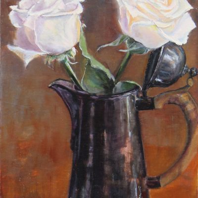
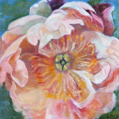
Winter Rose
How this still life evolved I started out with this rather pathetic setup. The rose was dying, and I'm working against time. I loved the light on the vase, and the colors in the rose, but not the pine table top. This is when I decided to improvise. Â Â I laid in the...
The Pink Hat
"The Pink Hat" is a painting I've been wanting to do for months! A dear friend had been to Uganda, and this little girl's picture was among the photos. Her innocence was so compelling. So was the hat. Interestingly, the most difficult part for me were the hands. The...
Portrait of a very dear friend
"Doots" My childhood best friend, who died last year was just so full of life! She loved to laugh. We met in pre-nursery school, and were both "Doots." We started the renowned "Doots & Doots Detective Agency"... solving all manner of crimes...often ones that we...
Teaching this class was so much fun!
I taught my first class! They liked it!! Who knew.... When I was in my twenties, I taught an art class of about twenty students, all ages. Within several weeks, most of the class had evaporated! Â After that, I determined that I should leave teaching to...
Painting On A Billboard!
I never thought that a painting I did with enticing lips would be chosen to be on a billboard! A wonderful group called "ArtPop" (ArtPop Street Gallery) is on a move to fill billboards all across the US and eventually even in Europe with art!...
Sarah Buell Dowling’s First-Ever Sale
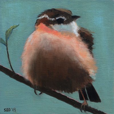
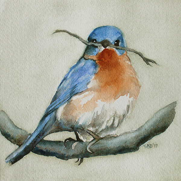
I'm posting birds probably because it's spring, and we're moving, and I'm decidedly feeling the nesting urge. Our house has sold, but we're not clear where we're headed yet, except we know we're staying in Charleston. I want all my paintings to find a nice home...
Christmas Commission
This painting was a Christmas gift from Luke to his wife, Rosie. Tackling this portrait was scary because I know Rosie, and I wanted this to be good, PLUS I’ve never done anything with this many different personalities in one portrait. I mean, look at the...
Christmas Blog
Merry Christmas & Happy New Year to All! Sarah
Blog
Merry Christmas & Happy New Year to All!
Holiday Season Blog
"SOPHIE" Â Pastel Portraits Make wonderful Keepsake Gifts! "Two Asparagus" - watercolor print "Shallots" - 11" x 11" watercolor available for sale "Merry Christmas, Sophie" - Personalized digital print fits right into an 11" x 17" frame ~ wonderful gift for a child ~...
Pastel & Charcoal Pencil Portraits!
"SOPHIE"  I'm now offering colored pastel as well as sepia and charcoal portraits! These make really wonderful gifts! Patrick’s boys actually picked the charcoal as the look they would like. They’re thrilled! To see more portraits and to order click...
PENCIL PORTRAITS
Image size - 11" x 14" Matted size (ready for framing) - 16" x 20"             ~ 3 DIFFERENT CHOICES sepia on toned tan paper sepia on white drawing paper charcoal on toned gray paper             ~ I'M NOW OFFERING PENCIL...
Sarah Buell Dowling Spring Blog 2016
I'm madly painting and framing in anticipation of this Spoleto Festival. I have no idea what to expect, but I'm hoping that the people who might like my work will find me. As you can see from the paintings on this post and in the side panel, I don't have one style. I...


