by Sarah | Aug 14, 2017 | Blog, Blog Posts
“Doots”
My childhood best friend, who died last year was just so full of life! She loved to laugh.
We met in pre-nursery school, and were both “Doots.” We started the renowned “Doots & Doots Detective Agency”… solving all manner of crimes…often ones that we committed.
I was asked by her siblings to paint her portrait as a gift to her husband. I so dearly wanted to capture this loving, zany friend who was always looking for a joke or plotting something mischievous.
I have to say that this was the hardest painting I’ve ever done. Often I’d cry.
But the painting was presented to her husband last week, and I was so touched by his thoughtful note:
“I can’t begin to describe the impact of your painting. Such a blessing. God’s in His heaven and Sandy’s with Him. Love you.”
Oh, I’m so glad I was asked.
Here are a few thoughts en route to the painting
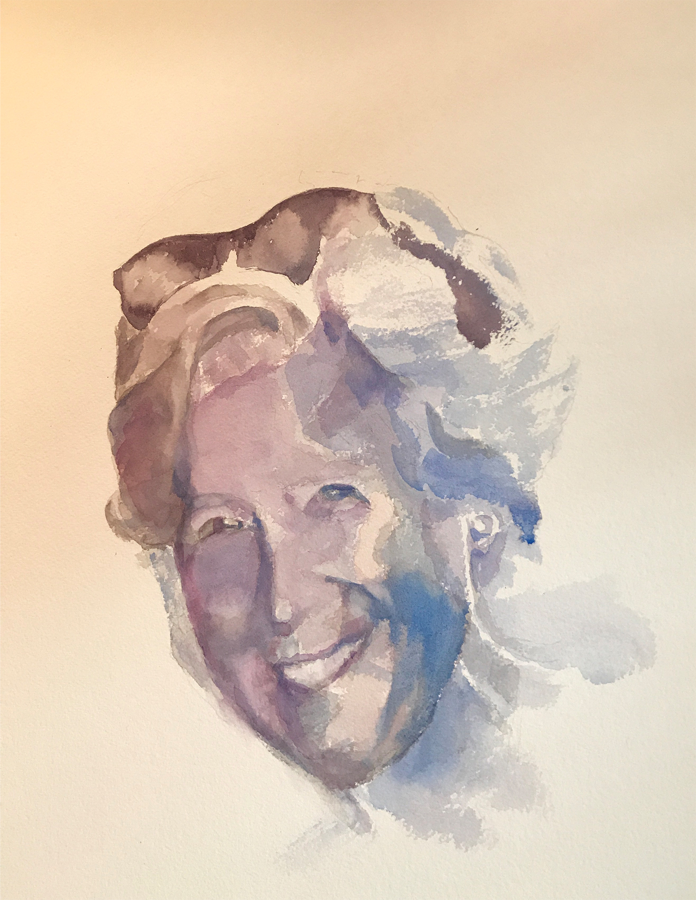
This is what’s called a “value study.” I gave arbitrary colors to the various values on Doots’s face, namely dark black and dark blue for the darkest values. The middle values on the face are purple/gray. The interesting thing I learned is that you can use ANY color in a painting and it will make sense as long as the value is accurate. It will look astoundingly right. Value is key!
I’ve enclosed a value chart here going from the lightest light to the darkest dark, so you can see the variations.
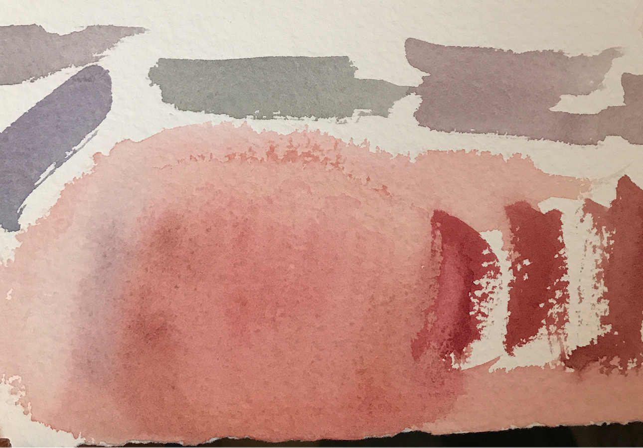
Doots’s brother stopped by, and we determined that he had the same coloration as Doots. These are the sample colors that I used primarily on her face in the painting.
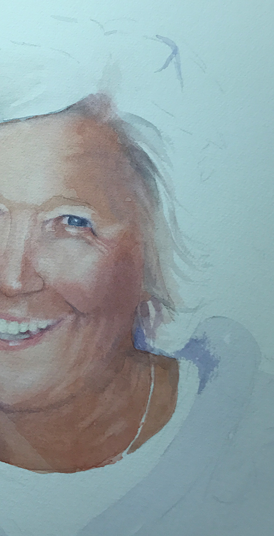
I should add that the finished painting (above) is actually on white paper, so the colors are not accurate (sigh). The camera has a hard time registering white, and often gives the picture a yellow, red or blue cast. Frustrating!
Painting almost always requires many failed attempts. For instance, I couldn’t get the right side of Doots’s face without her looking truly bizarre, so I’m hiding it in this photograph… I, also, realized that her mouth was too wide. She also looked fat, and I didn’t want that, so I scraped the whole thing. Sort of like bad batches of cookies…
I didn’t take many pictures as I worked through this painting as I was so absorbed that I forgot. Next time I’ll do better…
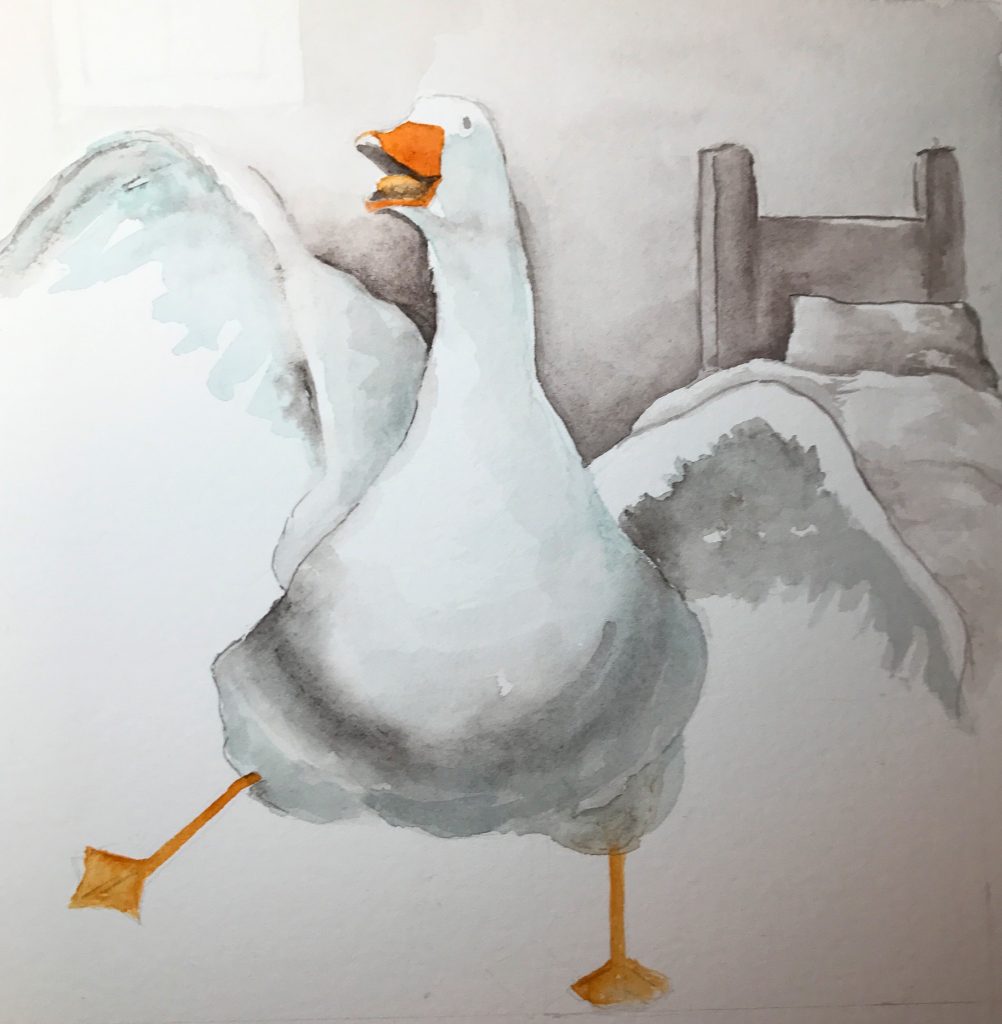
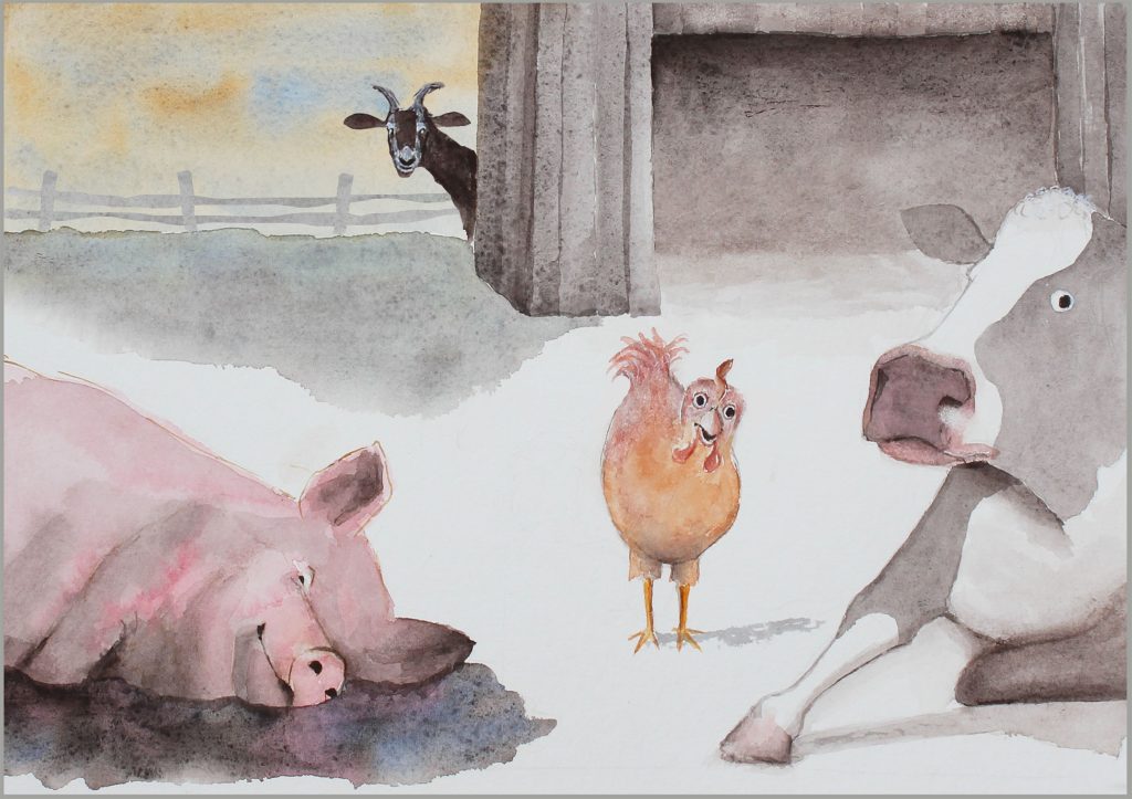
Aside from my fine art paintings, I’m illustrating a book of fables that my husband has written called “Timely Tales.” I love them! Here are two preliminary illustrations. I’ll be posting new ones here as I trot along…
It’s Carnival Day!
I’m bored!
           Back to Work…
Well, now it’s time to get back to work…Â
by Sarah | May 7, 2014 | Blog
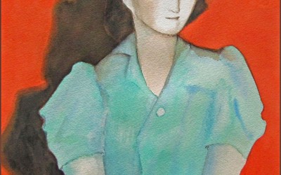
Cautious
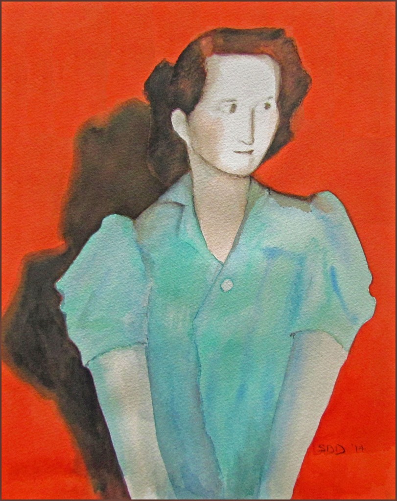
I painted this somewhat abstract painting, “Cautious” in response to seeing a photo of my aunt (taken somewhere around the mid-1930s) hiding in the back of a room peopled with mostly old women wearing assorted hats and solid shoes – perhaps, a garden club meeting… She was not comfortable, and I loved her stance and obvious fragility. I used these colors to augment her being set apart, young and alone. I am always torn between super-realism and folk art. This, to me, seems a bit in-between the two. I did this piece as a study for a large painting, which I’ll start soon. I think it will be a powerful work large!
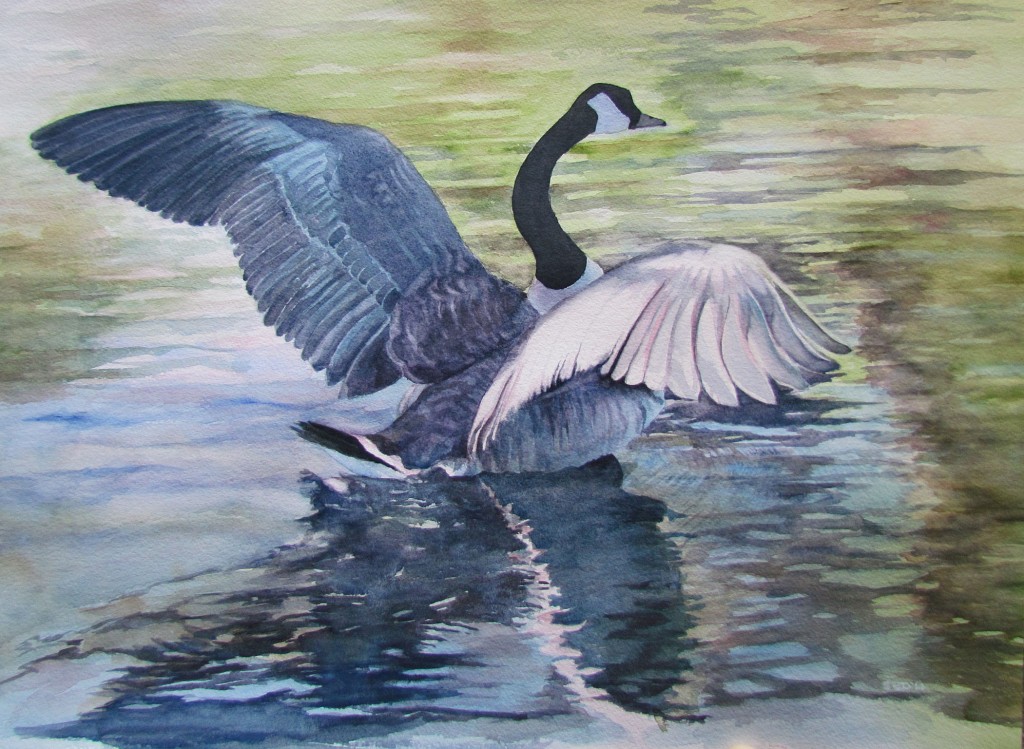
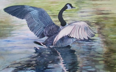
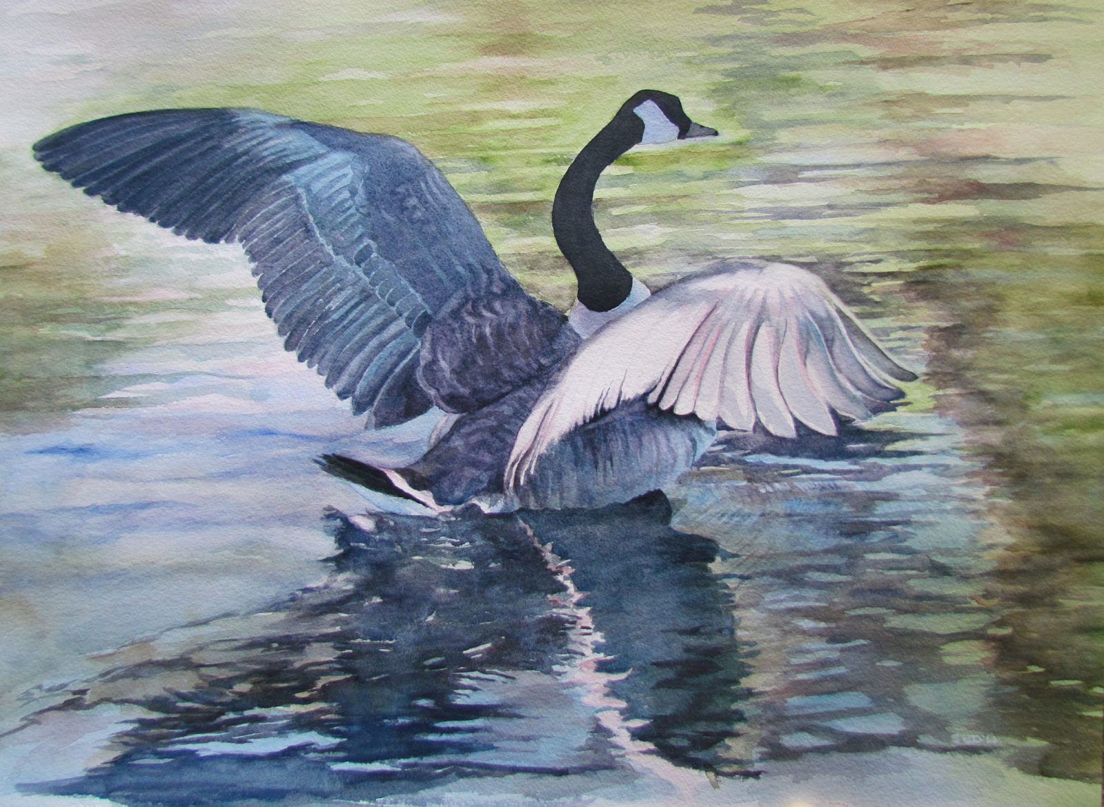
Taking Off
Framed Watercolor on Arches cold press paper
$1700.00
This piece “Taking Off” is taken from a photo that I saw on a friend’s Facebook page. Bob McCarthy is a renowned musician, and a terrific photographer! I am so often moved by birds, and this Canada Goose was no exception. They’re like dancers of the ballet sort… I just loved the movement of the water and the anticipated lift-off!
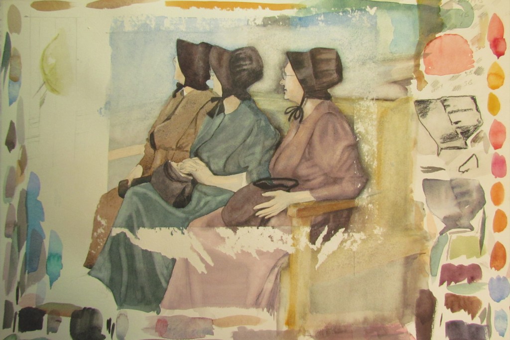
Three Mennonite Women
I’ve added this next piece, “Three Mennonite Women,” just so you can see my process which is often messy. I like the idea of these three, but I’ll definitely redo it, maybe several times until I get what I want. Lots of times I don’t even know what I want. I’m just pulled, and then I work until it makes some sense to me.
Here is a closeup of the three ladies (click on it if you’d like to see a larger rendition). The color is quite blah but I’m often drawn to that as well. I like the lines. I like the shapes. I’ve also used some watercolors that are “granular” and they give a texture to the painting which adds some interest. These ladies are waiting for a train, but they could be waiting for almost anything.
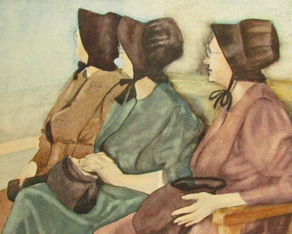
Three Mennonite Women closeup
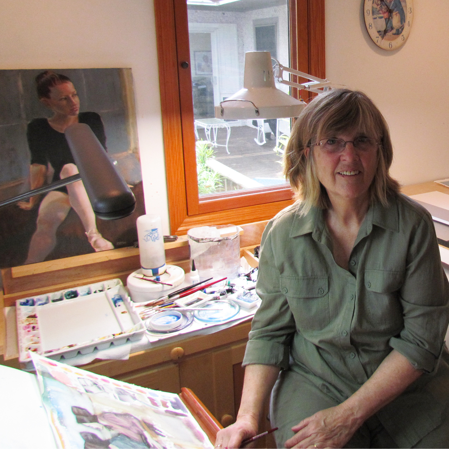
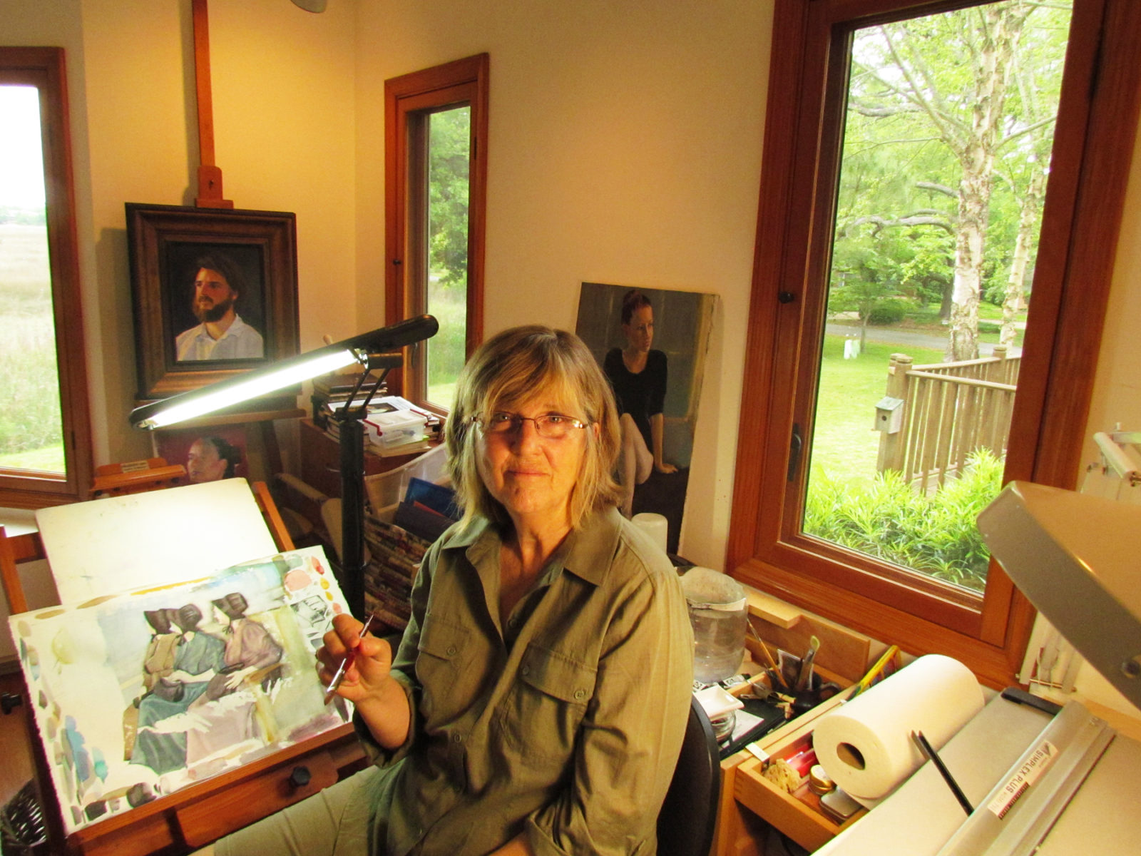
I thought you might enjoy seeing where I work. If I’m not here, I’m in the other side of the house in the office where my husband works and which houses our computers. There I set up my blog.

Here I am in my studio. Not quite sure what I’m thinking…
My paints and water are on a table right behind me.
Another studio shot
Here you can see my palette and water holders. With watercolor you leave the areas blank where you want white or you lift the color with a damp paintbrush. You’re constantly using water to either lay down paint or lift it off the paper. Depending on the amount of water, your color will be more or less intense. The less intense (or the more watered down), the more you can see the paper through the pigment. That’s the beauty of watercolor. You can layer the paint, and see the underlying colors, creating it’s distinctive look.
Behind me is a large table where I mat and frame my work. You can also see that mat cutter in the photo below. I keep hoping there’ll come a day when I can hire someone to mat and frame…sigh.
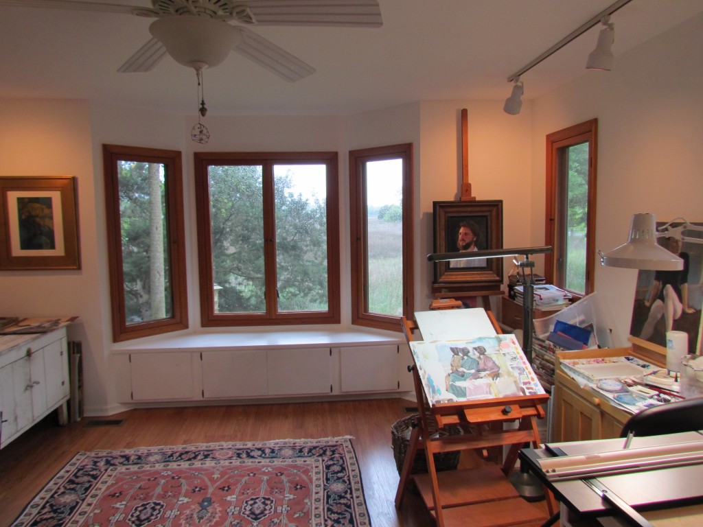
Studio bay window
This is what I look out on. I really love my studio! I have a bird feeder right outside, and I love watching the birds and seeing the marsh colors change throughout the day. There are few things more beautiful than a marsh, I think. Who would think that a swamp could be filled with such color and majesty! God’s handiwork at His finest, I’d say.
Thanks so much for looking in here. I hope you’ve enjoyed it!

by Sarah | Apr 11, 2012 | Blog, Blog Posts
Spring is here (gorgeous!), and it’s time to tend to my long-overdue blog.

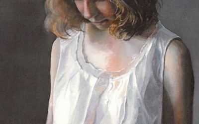
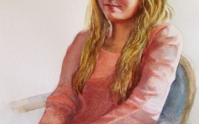
Study of seated woman
I’ve been working on a number of pieces over the last months but I’m going to take you through this one that I’ve been painting over a number of weeks. I”m attempting a style of painting called “Tenebrist,” in which most of the figure is engulfed in shadow, but some parts are dramatically illuminated by a beam of light (in this case a spotlight fixed on the side of a black-encased box which is aimed on the model). Caravaggio, a Baroque artist, is generally credited with the invention of this style.

Study for Glazing
The first step in preparing the oil painting is laying down a background color, usually a dark reddish/brown, with an acrylic paint.
The next step is to lay out the drawing (this model is quite ample and a delight to draw), and lay in the lights. The oil paint is very much thinned down with linseed oil to create a thin glaze. I was fascinated with the way the light illuminated her skin, a bright red, winding it’s way up her leg, through her body and resting on her face. She has a wonderful head and chinline. I might add that she’s a terrific model as she never moves!

Second phase of glazing
After the painting dried for several days, I next lay in a rose color as a glaze; namely a very thin layer of oil paint and linseed oil. The rose color, interestingly, over the dark brown becomes a dark blue. The remainder of the painting is done in layers of a thin glaze which, being translucent, gives a feeling of depth to the figure. Vermeer is one of the masters who used this technique beautifully!

Third Step in Glazing
This was the third week of adding glaze. It’s a long process and I have to admit I didn’t always glaze but added full color in order to move along faster. Also, I decided I’d enter a local competition and felt uneasy with this model being unclothed. So, using a slip that I had, I improvised and added a slip to the model. I’m sure it’s not as good as it would be if I had the real thing to look at but I loved the subtle colors of blue/green complementing the rose of her skin.

Close-up of face of model
Study of seated woman
That’s it for now. I learned a lot from this study, and I hope you learned something from my description as well.
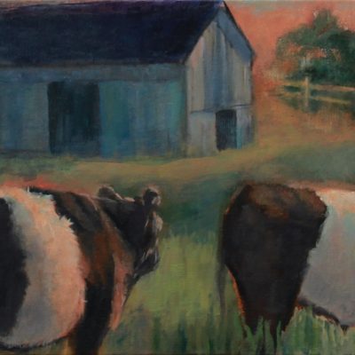
I just started a watercolor of a barn and a horse, which I’m painting for a fundraiser at my daughter’s school. It’s for Derby Day, thus the horse. Next blog I’ll try and do a sequence of that piece so you can see how watercolor works. It’s very different from oils. I really love both mediums; each has it’s own beauty.
Happy Spring!
Sarah


