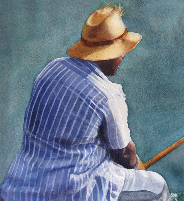
by Sarah | Oct 10, 2017 | Blog, Blog Posts
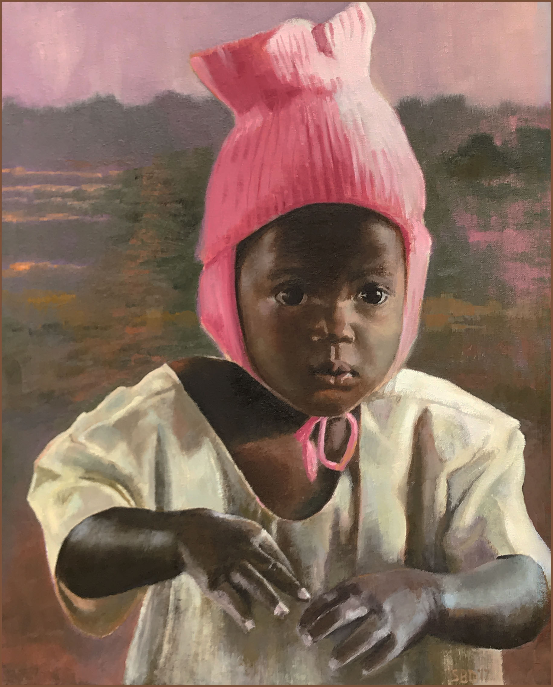
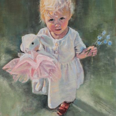
“The Pink Hat” is a painting I’ve been wanting to do for months! A dear friend had been to Uganda, and this little girl’s picture was among the photos. Her innocence was so compelling. So was the hat. Interestingly, the most difficult part for me were the hands. The way the lighting fell on them, and basically removed the dark brown color, made for an interesting problem. How to place the light and not draw the eye there as the subject was really the face!
I forgot to take a picture of the initial drawing. Frankly, I’m amazed I remember to take any pictures at all. I get so immersed in the paint that I forget where I am.
She looks a bit strange…however, I’m trying to locate the shapes and values. The lines had already suggested the movement or placement.
Where are the darkest darks, the midtones, and the light?
I’m still laying in the darks, and finding the placement of the facial features.
She’s starting to take form, and I can lay in the hat, which I’ve been dying to do. I just love her expression!
The wonderful part of being a painter is that you can decide what you want to emphasize or not. What color should the background be? Green is the complement of pink…does that work?
I love her outfit. Again, what shadows do I bring forward (with a reddish tone) or set back (with a cool blue or blue/black). You can create great tension with cool colors against warm, not just light against dark.
I decided I wanted a Ugandan countryside behind this little Ugandan girl. It’s filled with greens, pinks and oranges.
Now I’m moving to the hands with the gown as the background.
Her right hand was interesting in that there were so many colors, shapes, darks and lights.
The left hand was a bear! Hands are so expressive. I remember my mom’s hands so well…she who couldn’t sew on a button, but spoke volumes with her hands. I wanted these hands to express a certain vulnerability. Only time will tell if I succeeded or not.
Here’s the final piece. I decided to go with the left hand connecting with the right but relaxed as she’s not thinking about her hands. This hand was rough as I stated before. You have to be careful where you want the eye to go. It will be drawn to the light, and the hand is not the subject but, hopefully, an added statement.
THANKS if you managed to get to the end of the blog! Please comment if you have things you’d like to know or if I’m not conveying my thoughts in a way that makes sense (which is highly probable..).
’til next time!
Sarah
by Sarah | Mar 28, 2017 | Blog, Blog Posts
I’m posting birds probably because it’s spring, and we’re moving, and I’m decidedly feeling the nesting urge. Our house has sold, but we’re not clear where we’re headed yet, except we know we’re staying in Charleston.
I want all my paintings to find a nice home where they’ll be loved and bring a smile or provoke a thought. The best way to do that, one would think, would be to have a sale.
All my paintings will be anywhere from 20% to 25% reduced. Gag!
I’m hoping this blog will, perhaps, cause you to feel the nesting urge, and bring one of these paintings into your home.
§
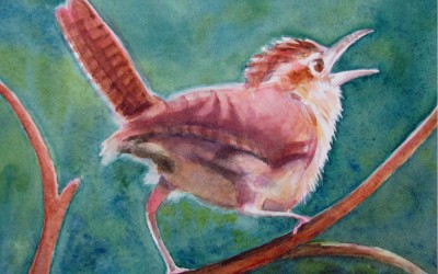
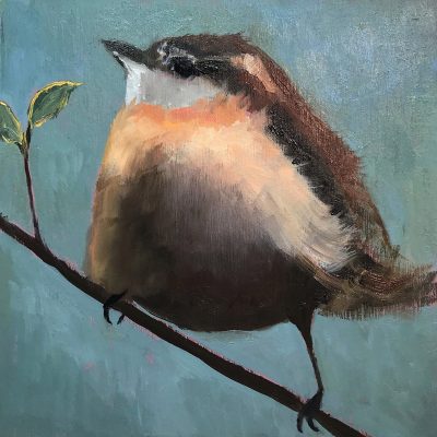
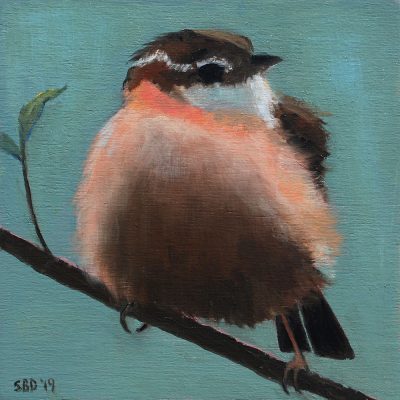
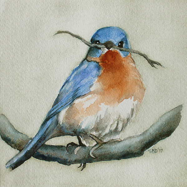
This little Wren just found a home! He was grabbed on Instagram before the sale even began!!
I had to paint this Wren as he’s been sitting on my kitchen window sill chirping his heart out. I figured he was singing “paint me!” And so I did.
COME TO MY STUDIO!
1393 SOUTHERN MAGNOLIA LANE MT. PLEASANT, SC 29464
Friday, March 31 ~ 4 – 9pm
Saturday, April 1 ~Â 10am – 3pm
Â
ORÂ PEEK IN ONÂ MY WEBSITE

by Sarah | Nov 18, 2014 | Blog, Blog Posts

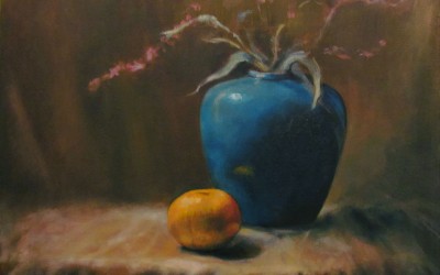
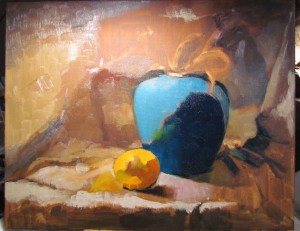
Still Life in Oil
I’ve not done very many paintings in oil, nor am I a still life painter, but I recently took a workshop with Chris Groves, a very talented, Charleston-based painter, and above is the result.
Oils are messy! But I LOVE that you can change up, reposition, and recolor, which is much more difficult to do with watercolors. I love the transparency of watercolors, but I love the texture and freedom with oils. They each have their own beauty. My only obstacle yet is to find the medium with which I can create line, which is my first love. I’m pushing to find where I can create what’s on my heart with which medium with the greatest effect. I truly welcome comments, critical or otherwise!
The idea was to set up the still life in a box with a light aimed on the subject creating a dramatic effect of light and dark, a technique known as “chiaroscuro,” a method perfected by Rembrandt.
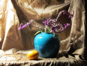
Still life set against cloth background
Here the still life is set up in a box using fabric and draped behind the vase and orange. The light is affixed on the left side of the box aimed at the vase and orange. The drama is set!
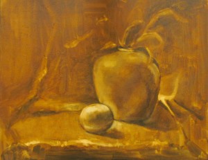
Laying in the ground
We first chose a color palette, from which I deviated enormously, so I didn’t include it. We next lay in a reddish/brown pigment on the canvas, and lifted paint with paper towels while it was still wet to create the values (from light to dark), and the composition.
Blocking in the colors
Here I’m laying in blocks of color, and trying to figure out what I’m going to do with all that fabric on the left side of my painting. Where do I want the focal point to be? Am I creating contrasts using only lights and darks? I want to remember to use cools against warm (the orange against the vase) to create contrast. You also have to consider that, even if you like something about a painting, you might need to eliminate it as it adds nothing. I was attracted to the shadow to the right of the vase, but I had to tone it back as it was drawing the eye there rather than to the vase and the orange.

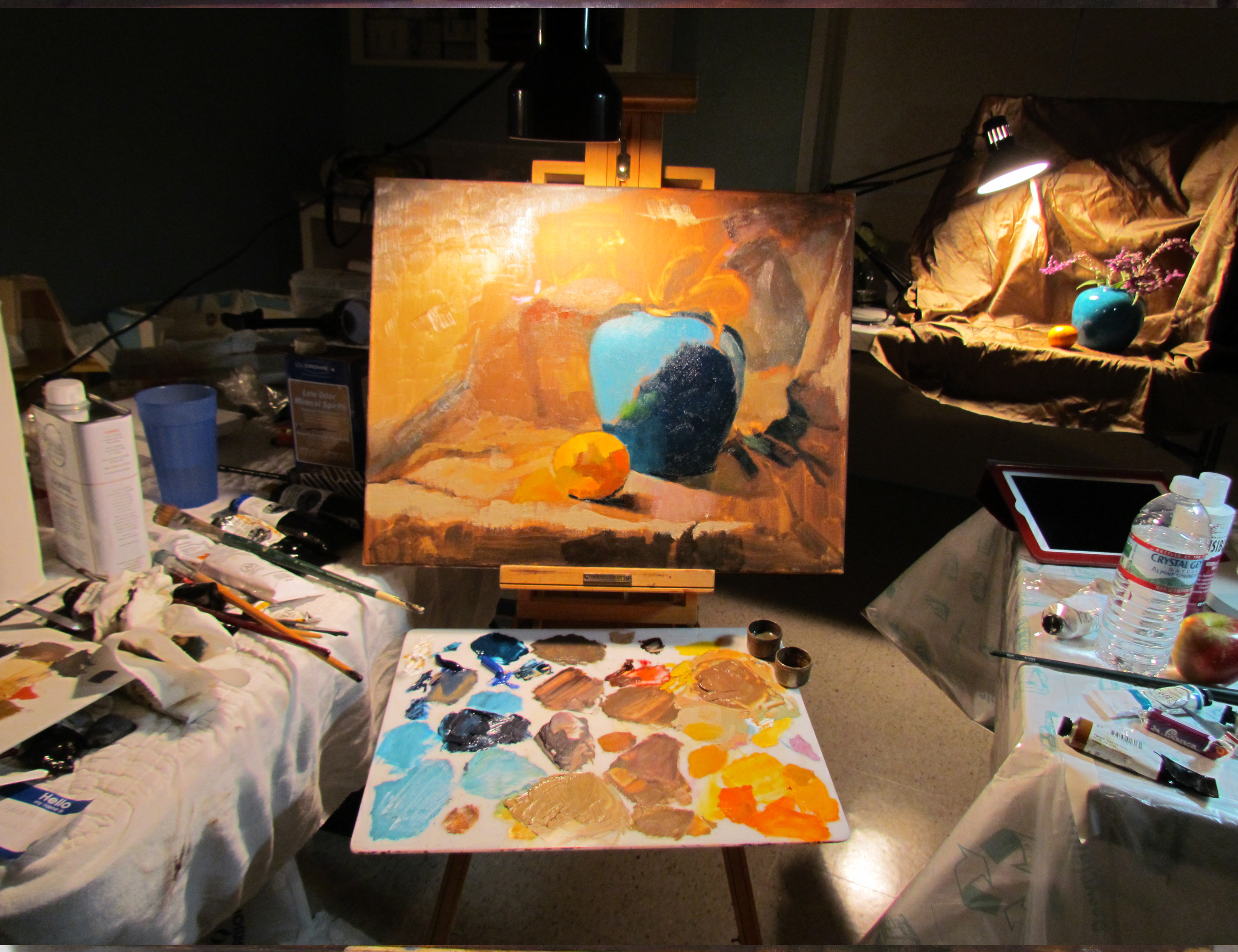
This is the workspace with the actual still life in the background
This picture shows my workspace with the still life in the distance.  This was only a three-day workshop (six hours/day), so you have to work relatively quickly.

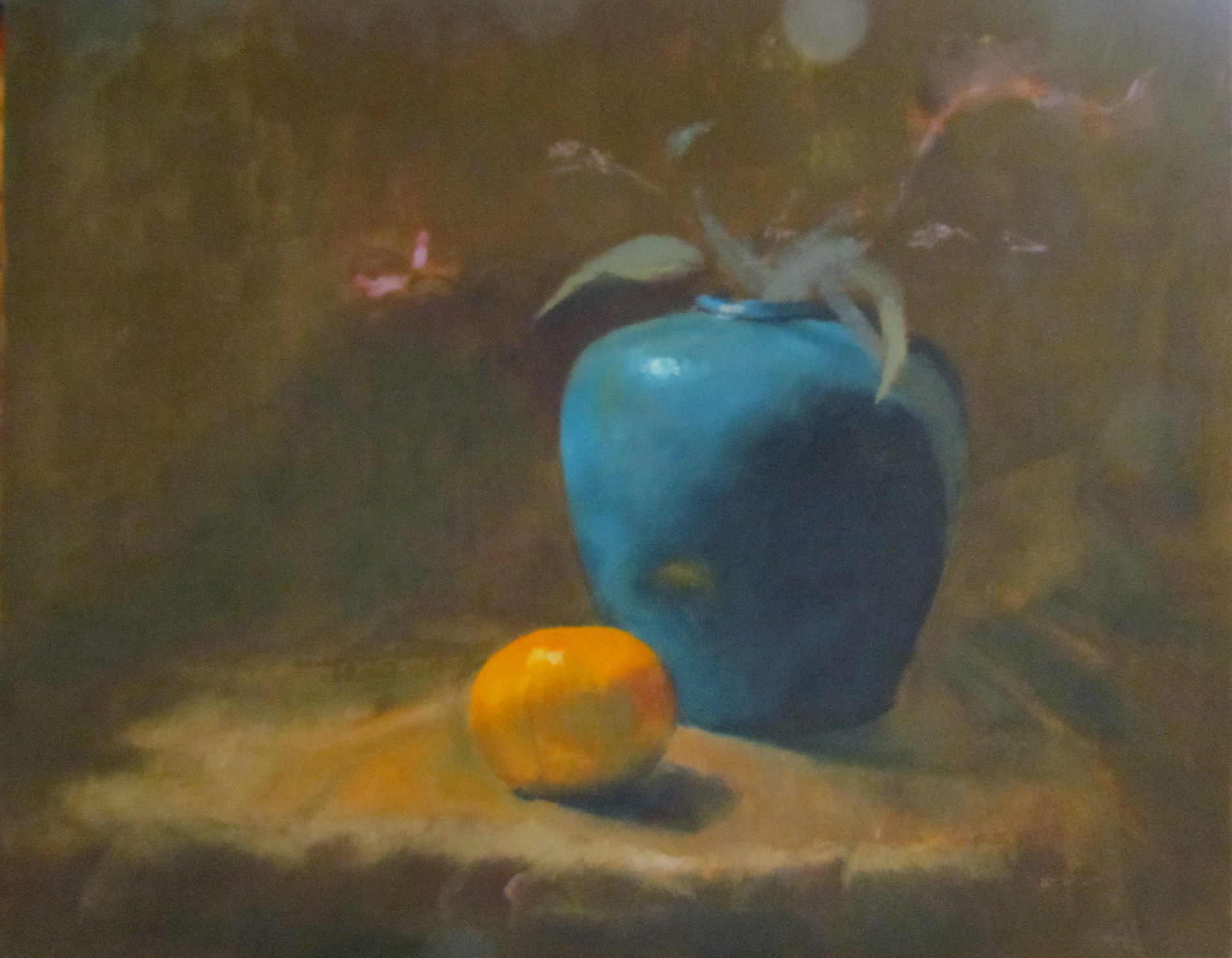
Nearly Done
Now it’s getting to the hard part – looking critically at the composition and contrasts. Am I creating enough light and dark? Is the background staying back or competing with the foreground? Is everything too much in the “middle ground?” How do I  make the vase sit on the fabric; are the shadows convincing? These and many others are questions that go repeatedly around in my mind. How much reflection should the orange create? This is where I make my own decisions, and am no longer looking at the still life. I want the warm of the orange in the fabric, although it’s really not there. How far do I push it? Is the brown in the background a warm brown or cool? The shadow in the fabric as it turns towards the floor needs to be warm in order to come forward in front of the blue vase.
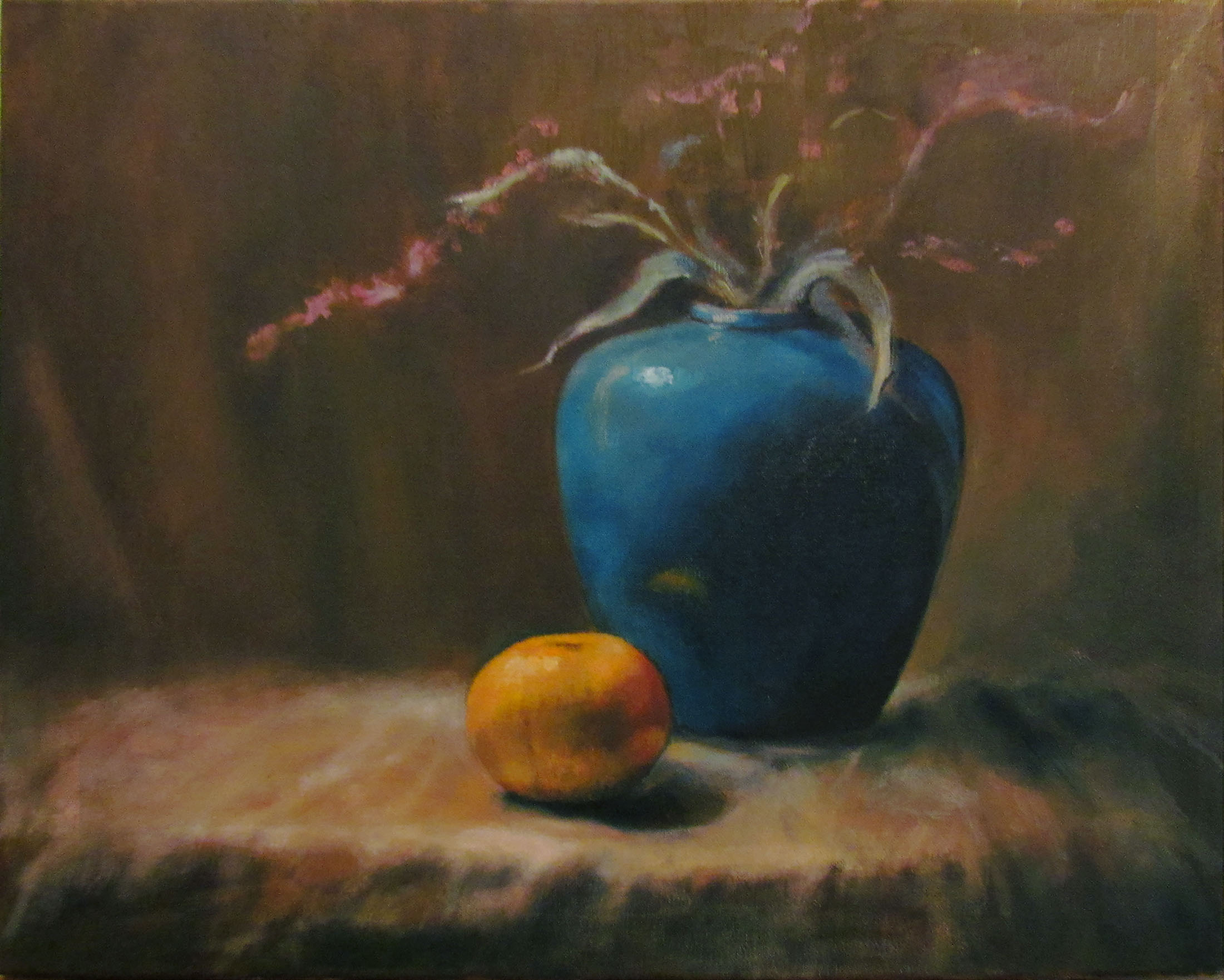
Still Life in Oil
This is the final piece! In the painting, the vase is more aqua but I need to invest in a better camera… I hope I’ve given you some indication of how difficult painting can really be. It’s a shortcut, for me, to brain implosion. I don’t do landscapes because there are so many decisions to make, so many colors, so many lines, so many blocks of shade and light. Perhaps, when I’m more adept, one day I’ll attempt one and succeed. This painting, however, was great fun, and I felt somewhat successful.
We’ve finally settled into our new home. My studio is presently in the dining room….I like that it’s next to the kitchen…
HAPPY THANKSGIVING TO EVERYONE!
To Purchase any of my work, please phone 1-912-223-8674 or email me from my contact page. Thanks!

by Sarah | Apr 11, 2012 | Blog, Blog Posts
Spring is here (gorgeous!), and it’s time to tend to my long-overdue blog.

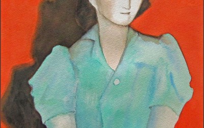
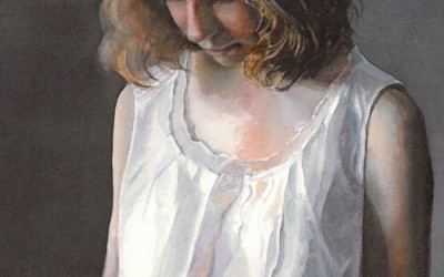
Study of seated woman
I’ve been working on a number of pieces over the last months but I’m going to take you through this one that I’ve been painting over a number of weeks. I”m attempting a style of painting called “Tenebrist,” in which most of the figure is engulfed in shadow, but some parts are dramatically illuminated by a beam of light (in this case a spotlight fixed on the side of a black-encased box which is aimed on the model). Caravaggio, a Baroque artist, is generally credited with the invention of this style.

Study for Glazing
The first step in preparing the oil painting is laying down a background color, usually a dark reddish/brown, with an acrylic paint.
The next step is to lay out the drawing (this model is quite ample and a delight to draw), and lay in the lights. The oil paint is very much thinned down with linseed oil to create a thin glaze. I was fascinated with the way the light illuminated her skin, a bright red, winding it’s way up her leg, through her body and resting on her face. She has a wonderful head and chinline. I might add that she’s a terrific model as she never moves!

Second phase of glazing
After the painting dried for several days, I next lay in a rose color as a glaze; namely a very thin layer of oil paint and linseed oil. The rose color, interestingly, over the dark brown becomes a dark blue. The remainder of the painting is done in layers of a thin glaze which, being translucent, gives a feeling of depth to the figure. Vermeer is one of the masters who used this technique beautifully!

Third Step in Glazing
This was the third week of adding glaze. It’s a long process and I have to admit I didn’t always glaze but added full color in order to move along faster. Also, I decided I’d enter a local competition and felt uneasy with this model being unclothed. So, using a slip that I had, I improvised and added a slip to the model. I’m sure it’s not as good as it would be if I had the real thing to look at but I loved the subtle colors of blue/green complementing the rose of her skin.

Close-up of face of model
Study of seated woman
That’s it for now. I learned a lot from this study, and I hope you learned something from my description as well.
I just started a watercolor of a barn and a horse, which I’m painting for a fundraiser at my daughter’s school. It’s for Derby Day, thus the horse. Next blog I’ll try and do a sequence of that piece so you can see how watercolor works. It’s very different from oils. I really love both mediums; each has it’s own beauty.
Happy Spring!
Sarah