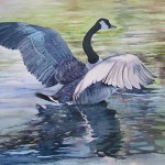
by Sarah | Jan 23, 2019 | Blog
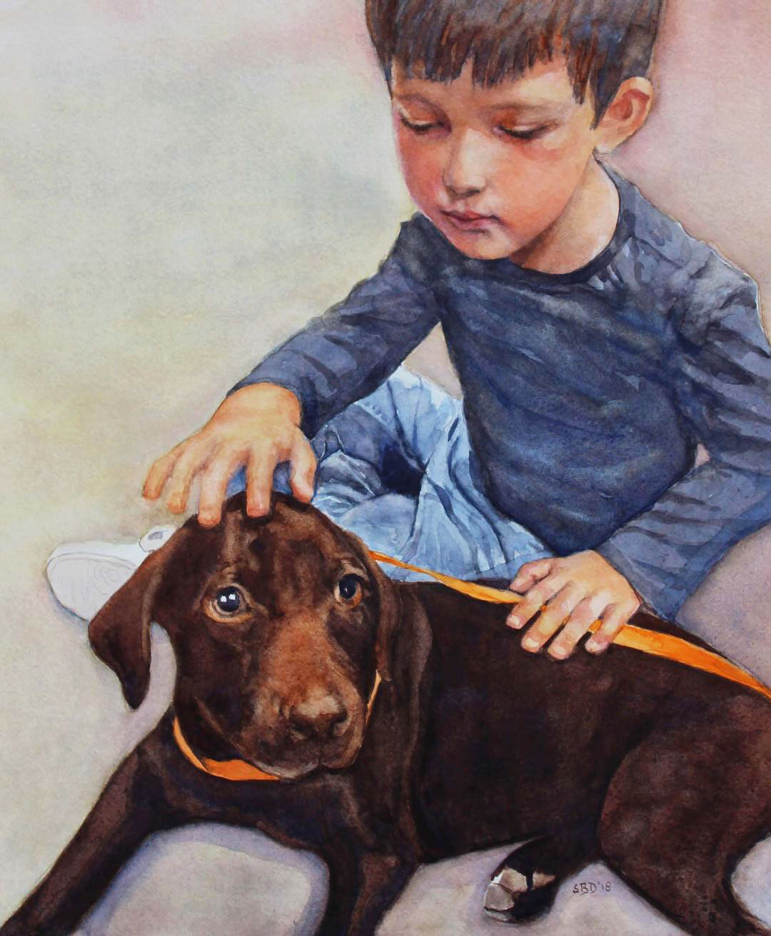
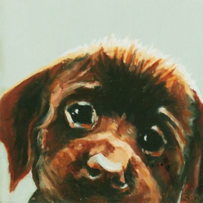
This is James and his new puppy. His grandmother (a dear friend) asked me to paint a portrait as a Christmas present to her son and his wife. She wanted a soft look, and watercolor is a perfect medium for that.
I was given a 3″x5″ photo from which to work, and the finished portrait would be 16″ x 20″. Help! Thank goodness for PhotoShop. I was able to blow the picture up and see some of the details. Next the colors. Would they be accurate? Mary sent me samples of hair and skin color as James lives in Colorado…I live in Charleston…
This is going to be a short blog as I got well into James’ portrait and remembered I needed to take photos. You can see some of the drawing here, and the puppy is well underway. I used a combination of Transparent Red Oxide and Quinacridone Sienna to arrive at the wonderful orange/copper color on the nose and highlighted in the fur. At this point, I’m just starting to figure out the fingers and hand placement. Also, what is going on with the rear paw? Which leg was it attached to (look at the photo below)?
Here is the sweet photo of James and the puppy.
I thought you might like a closeup of James’ sweet face. I really wanted to capture his intent, his thoughtfulness. I hope I succeeded.
Mary sent me this wonderful picture. “They love it!” she said.
No sweeter words.
by Sarah | Nov 18, 2014 | Blog, Blog Posts

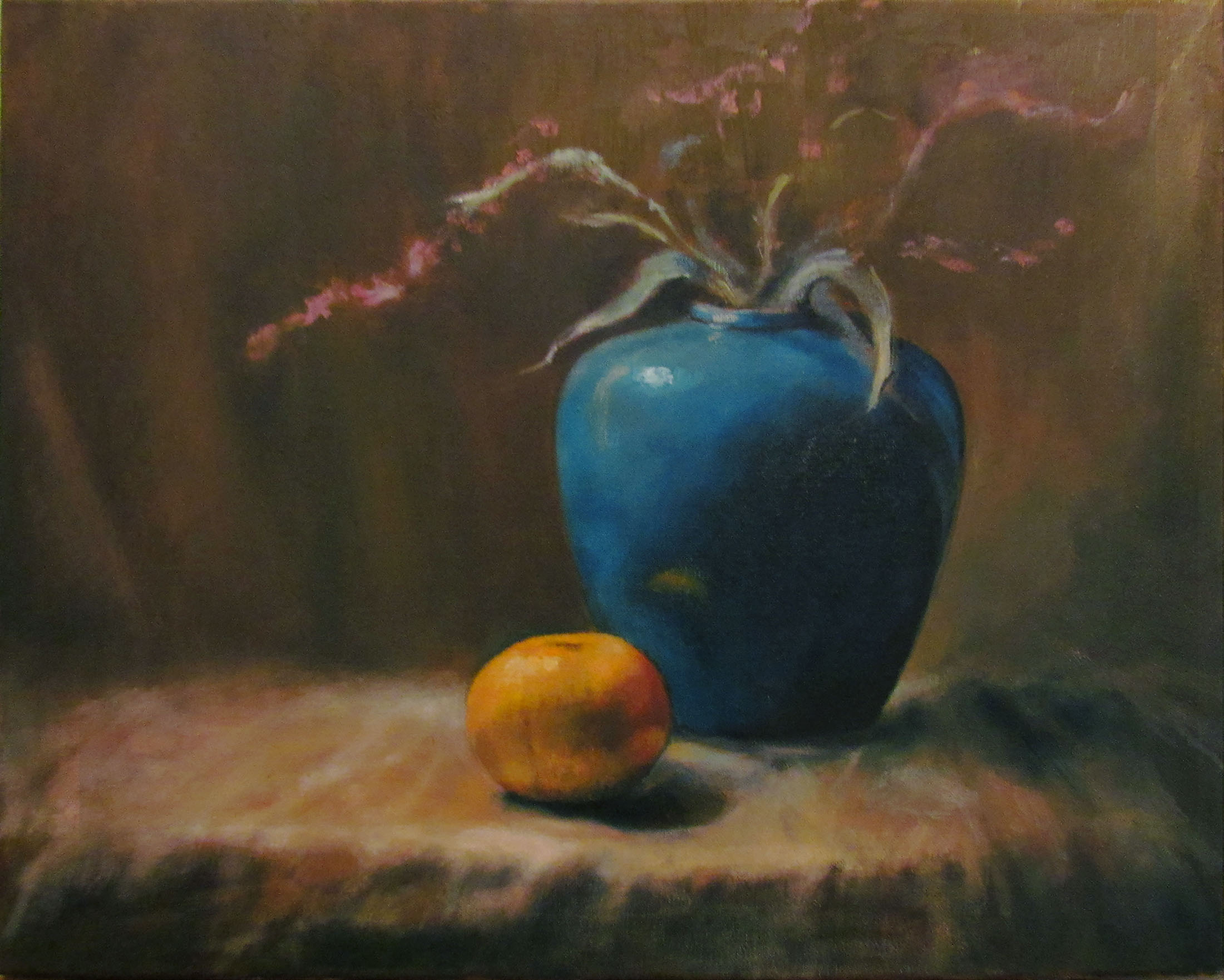
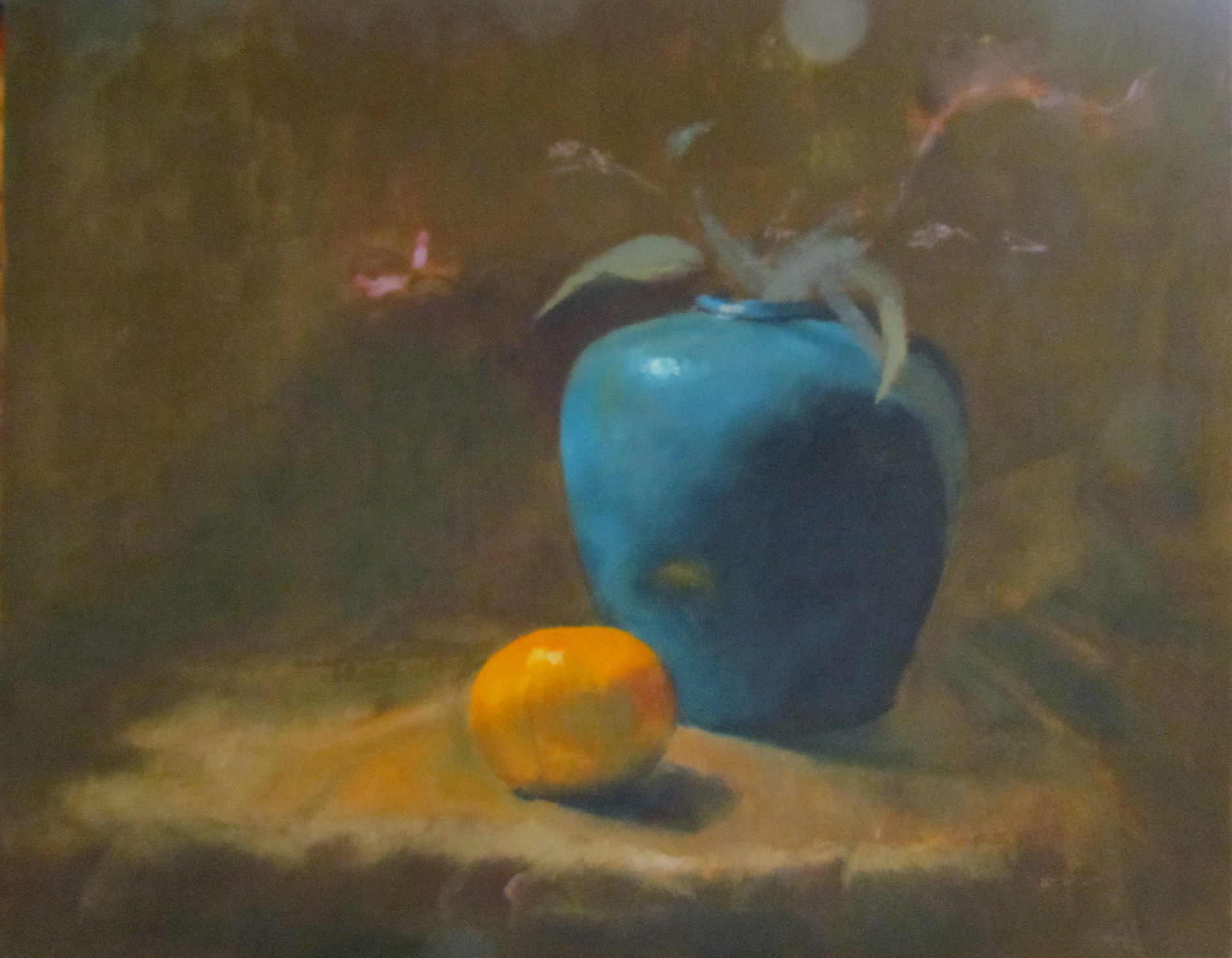
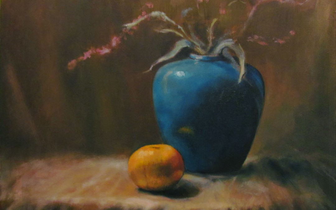
Still Life in Oil
I’ve not done very many paintings in oil, nor am I a still life painter, but I recently took a workshop with Chris Groves, a very talented, Charleston-based painter, and above is the result.
Oils are messy! But I LOVE that you can change up, reposition, and recolor, which is much more difficult to do with watercolors. I love the transparency of watercolors, but I love the texture and freedom with oils. They each have their own beauty. My only obstacle yet is to find the medium with which I can create line, which is my first love. I’m pushing to find where I can create what’s on my heart with which medium with the greatest effect. I truly welcome comments, critical or otherwise!
The idea was to set up the still life in a box with a light aimed on the subject creating a dramatic effect of light and dark, a technique known as “chiaroscuro,” a method perfected by Rembrandt.
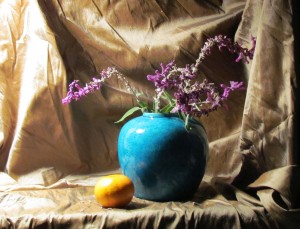
Still life set against cloth background
Here the still life is set up in a box using fabric and draped behind the vase and orange. The light is affixed on the left side of the box aimed at the vase and orange. The drama is set!
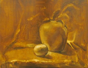
Laying in the ground
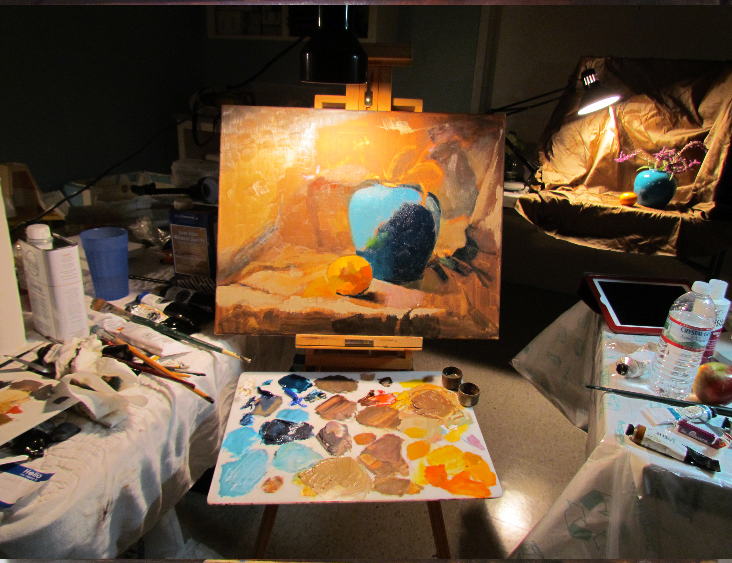
We first chose a color palette, from which I deviated enormously, so I didn’t include it. We next lay in a reddish/brown pigment on the canvas, and lifted paint with paper towels while it was still wet to create the values (from light to dark), and the composition.
Blocking in the colors
Here I’m laying in blocks of color, and trying to figure out what I’m going to do with all that fabric on the left side of my painting. Where do I want the focal point to be? Am I creating contrasts using only lights and darks? I want to remember to use cools against warm (the orange against the vase) to create contrast. You also have to consider that, even if you like something about a painting, you might need to eliminate it as it adds nothing. I was attracted to the shadow to the right of the vase, but I had to tone it back as it was drawing the eye there rather than to the vase and the orange.

This is the workspace with the actual still life in the background
This picture shows my workspace with the still life in the distance.  This was only a three-day workshop (six hours/day), so you have to work relatively quickly.

Nearly Done
Now it’s getting to the hard part – looking critically at the composition and contrasts. Am I creating enough light and dark? Is the background staying back or competing with the foreground? Is everything too much in the “middle ground?” How do I  make the vase sit on the fabric; are the shadows convincing? These and many others are questions that go repeatedly around in my mind. How much reflection should the orange create? This is where I make my own decisions, and am no longer looking at the still life. I want the warm of the orange in the fabric, although it’s really not there. How far do I push it? Is the brown in the background a warm brown or cool? The shadow in the fabric as it turns towards the floor needs to be warm in order to come forward in front of the blue vase.
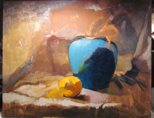
Still Life in Oil
This is the final piece! In the painting, the vase is more aqua but I need to invest in a better camera… I hope I’ve given you some indication of how difficult painting can really be. It’s a shortcut, for me, to brain implosion. I don’t do landscapes because there are so many decisions to make, so many colors, so many lines, so many blocks of shade and light. Perhaps, when I’m more adept, one day I’ll attempt one and succeed. This painting, however, was great fun, and I felt somewhat successful.
We’ve finally settled into our new home. My studio is presently in the dining room….I like that it’s next to the kitchen…
HAPPY THANKSGIVING TO EVERYONE!
To Purchase any of my work, please phone 1-912-223-8674 or email me from my contact page. Thanks!
by Sarah | Apr 6, 2014 | Gallery, Portfolio
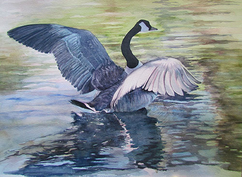
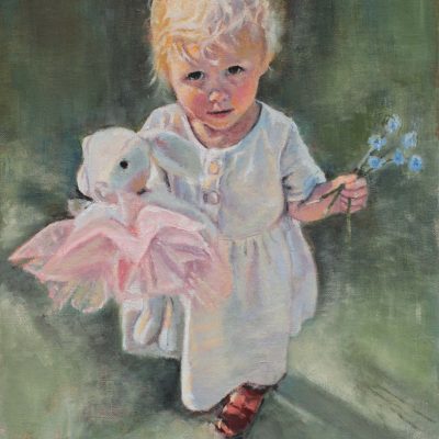
Taking Off
Framed Watercolor on Arches cold press paper
$1700.00
by Sarah | Mar 13, 2014 | Gallery, Portfolio

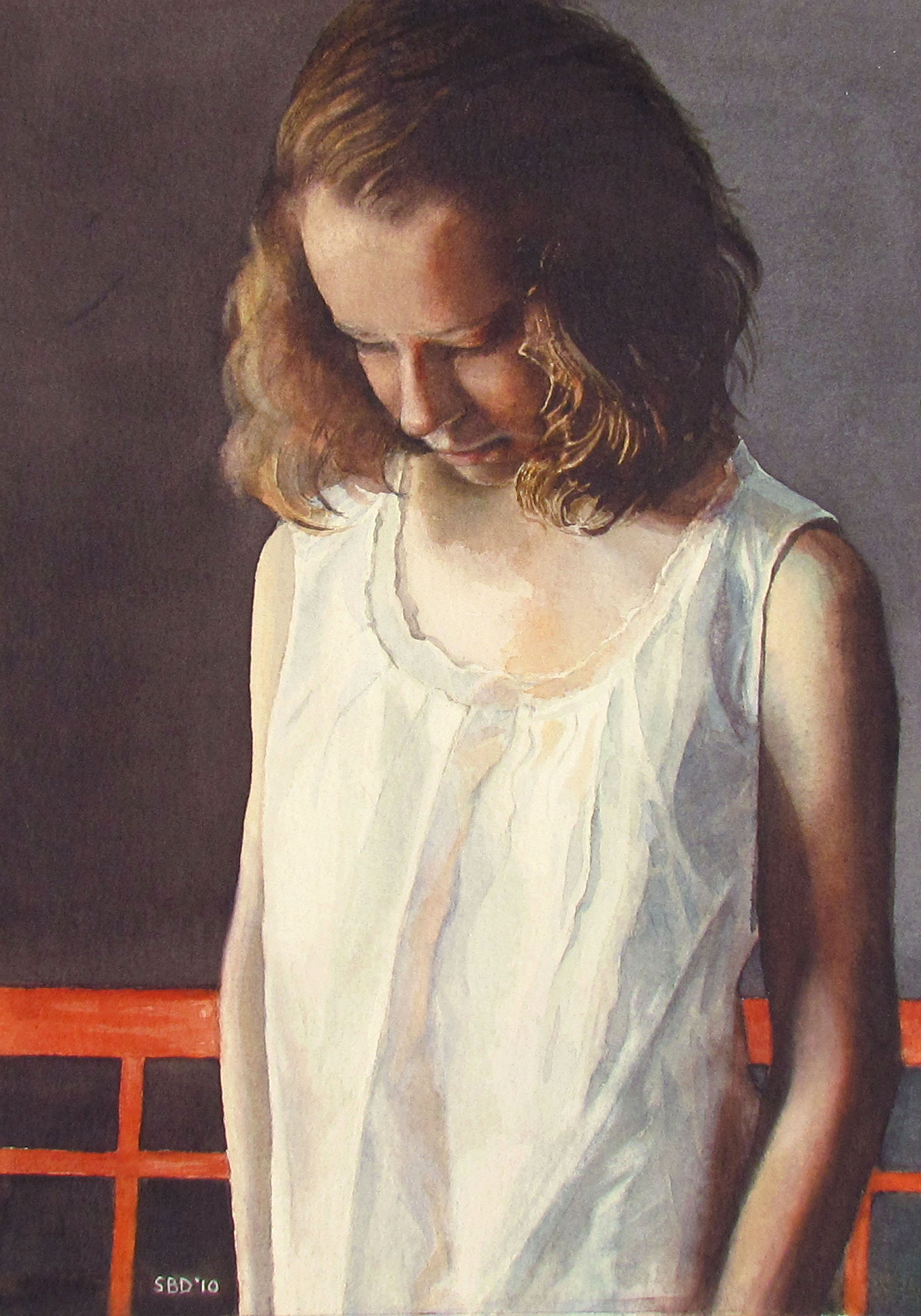
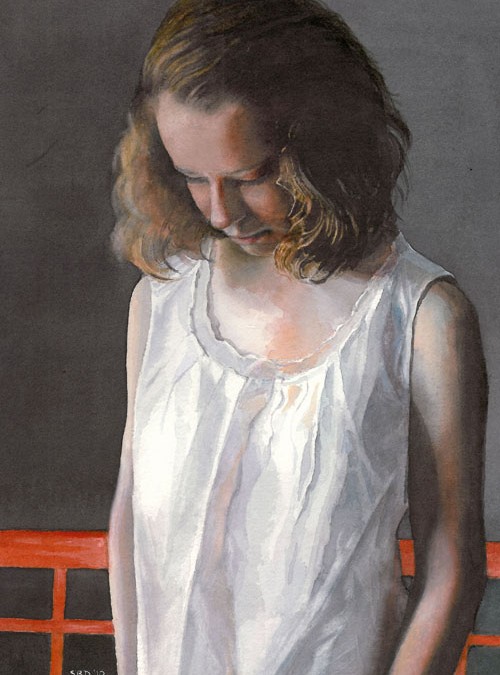
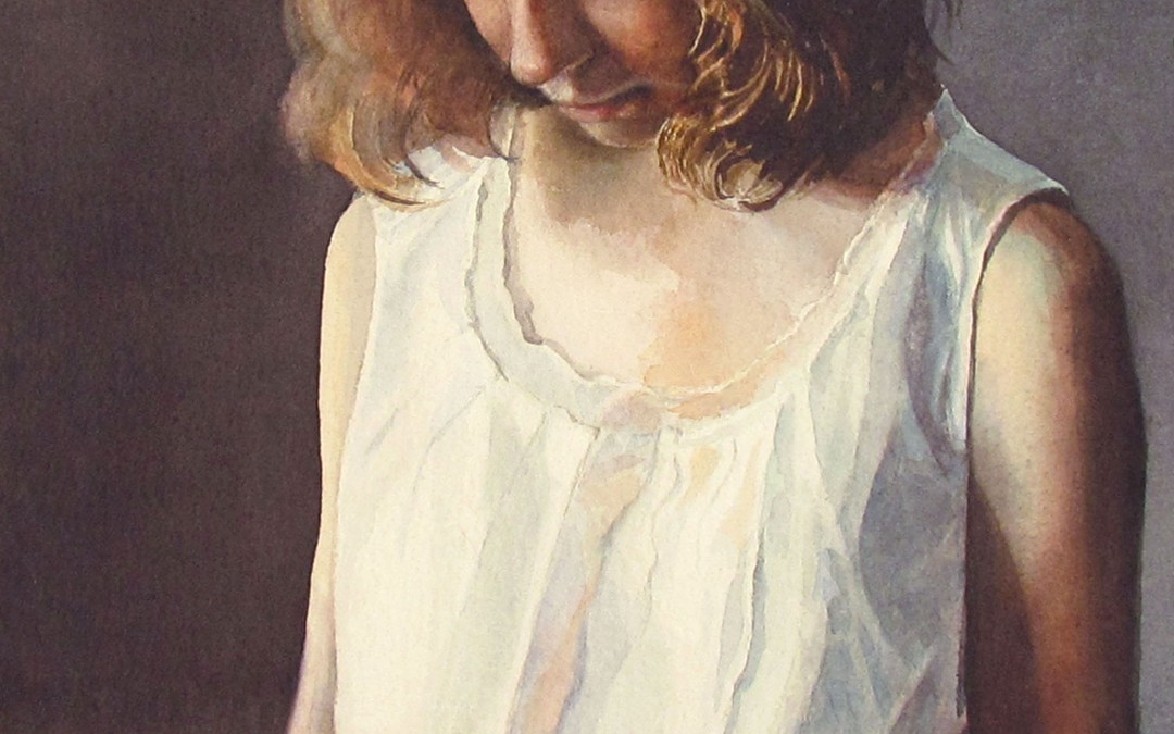
Pensive
watercolor on Arches cold press paper – 13″ h x 9″ w
$2400 framed
by Sarah | Mar 13, 2014 | Gallery, Portfolio
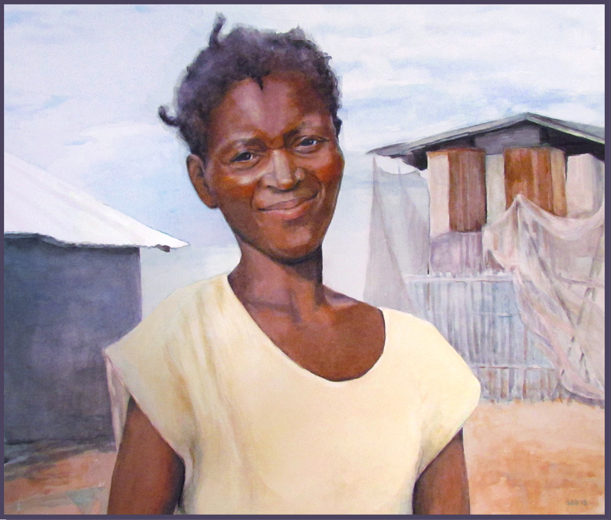
Anite – Watercolor on Arches hot press paper – 19″h x 21″w
Anite is a Haitian mother. Her story is on my blog
$1700.00 framed
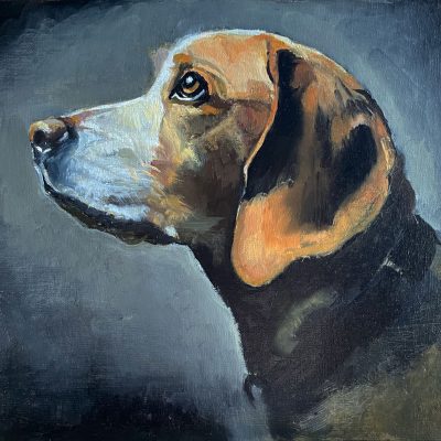
by Sarah | Feb 13, 2014 | Portfolio
Oil on canvas – 16″h x 12″w
 $1200.00 framed
by Sarah | Jun 8, 2011 | Blog, Blog Posts

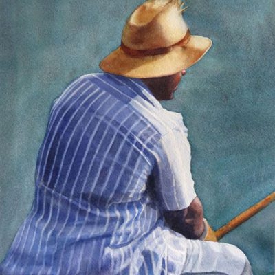
This piece, “Pensive,” won first place and People’s Choice Award at the Jekyll Island Art Show. This is a watercolor painting of my daughter, and what I really loved aside from her stance was the light on her blouse and her hair, and the orange of the bench.

- Two Old Friends
This watercolor, “Two Old Friends,” was accepted into the Southern Watercolor Society Exhibition and won the North Light Books award. This painting was prompted by seeing a small photo of a group of people in a hospital. Several of the women looked like these two, and I was touched. This has a folk art feel to it, different from my more realistic stuff. I’m always trying to resolve the tension of wanting to illustrate/capture humor, and wanting to capture poignancy/reality. Maybe some day they’ll meld.

- Dusk
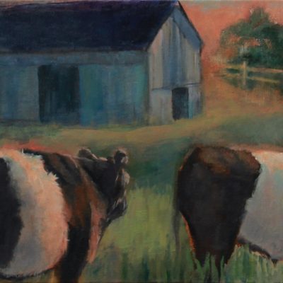
“Dusk” was accepted into the Alabama Watercolor Society Exhibition and won the Georgia Watercolor Society award. This piece was based on a photograph by Bobby Haven of the Brunswick News, Brunswick, GA.

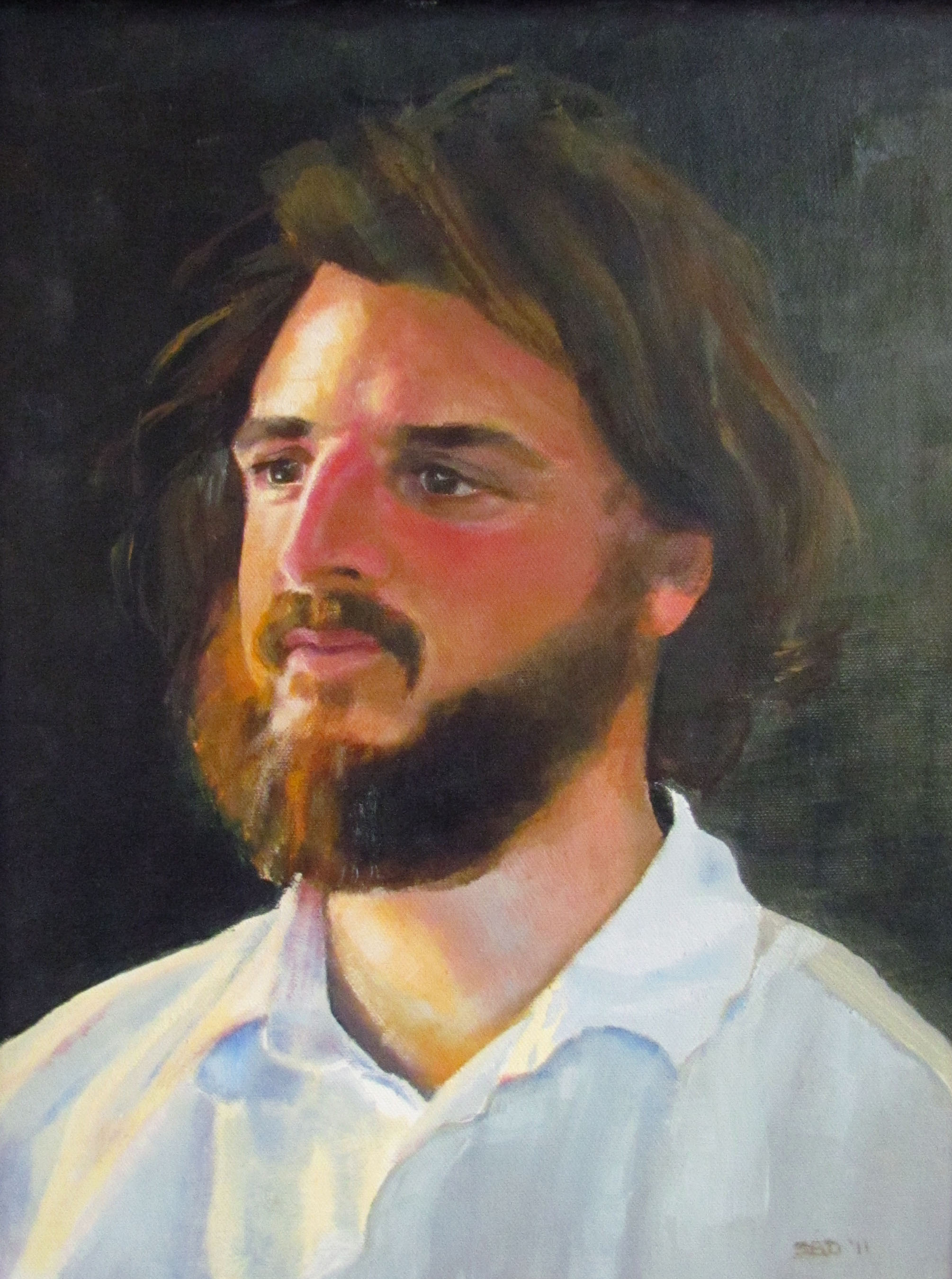
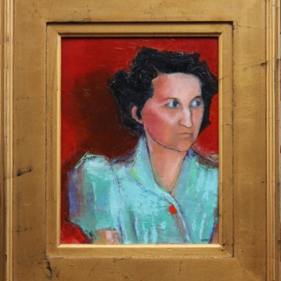
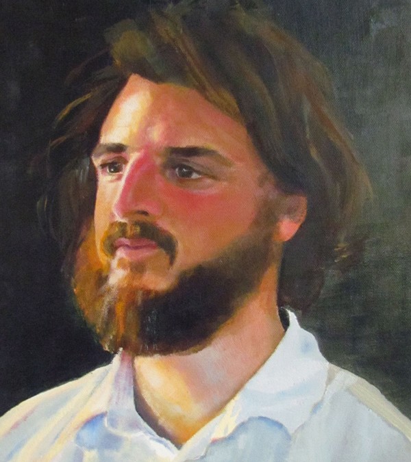
- My oil painting teacher, Carl Fougerousse
This is an oil painting I did of my teacher Carl Fougerousse. The model never showed up so Carl sat. I was thrilled as he has a much more interesting face; great nose and hair! Good looking fellow!
I still want to work on the shirt. I’m fascinated with light on fabric. I guess I love the way light plays on almost anything. God’s touch.
That’s it!