
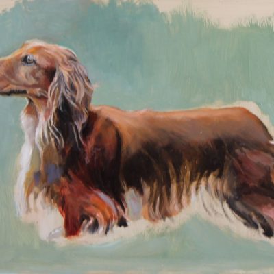
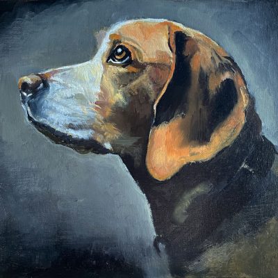
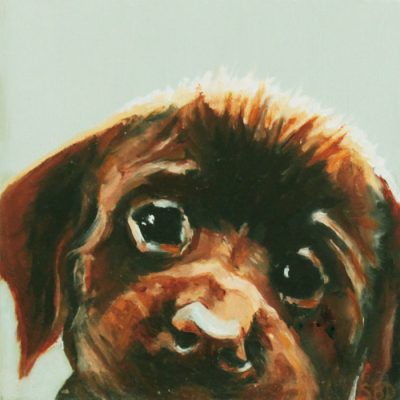
“Doots”
Here are a few thoughts en route to the painting
This is what’s called a “value study.” I gave arbitrary colors to the various values on Doots’s face, namely dark black and dark blue for the darkest values. The middle values on the face are purple/gray. The interesting thing I learned is that you can use ANY color in a painting and it will make sense as long as the value is accurate. It will look astoundingly right. Value is key!
I’ve enclosed a value chart here going from the lightest light to the darkest dark, so you can see the variations.

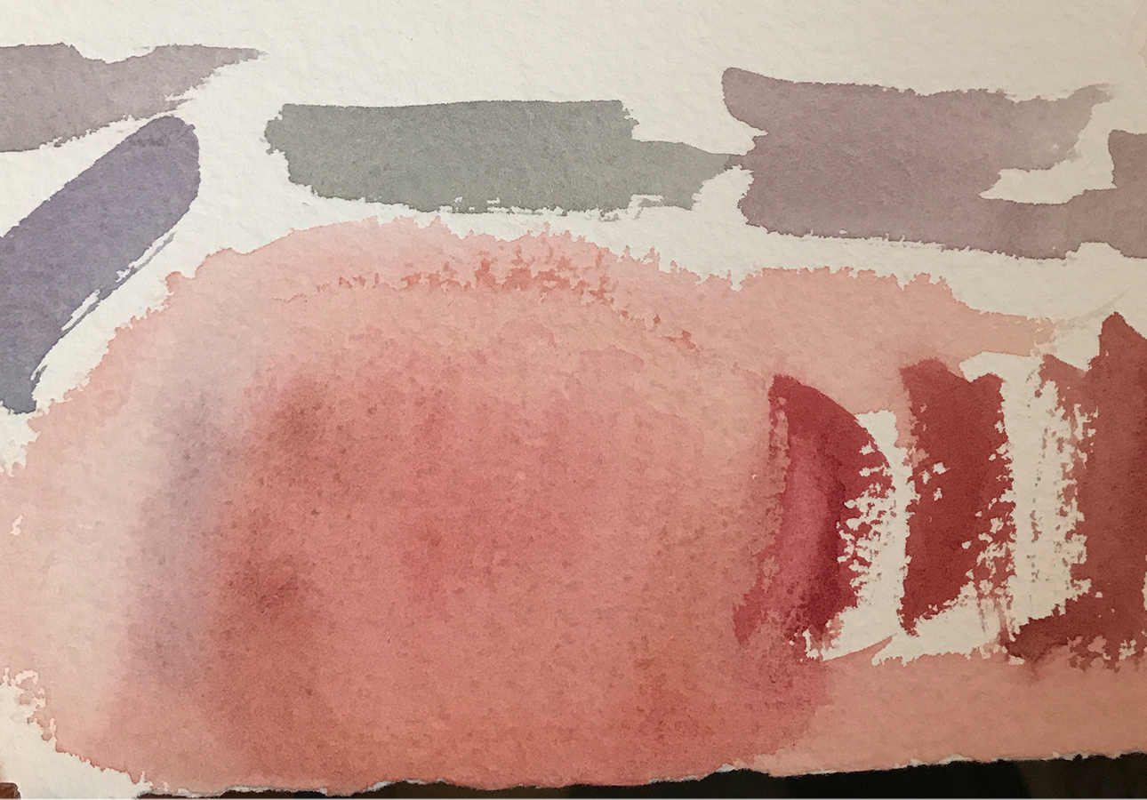
Doots’s brother stopped by, and we determined that he had the same coloration as Doots. These are the sample colors that I used primarily on her face in the painting.
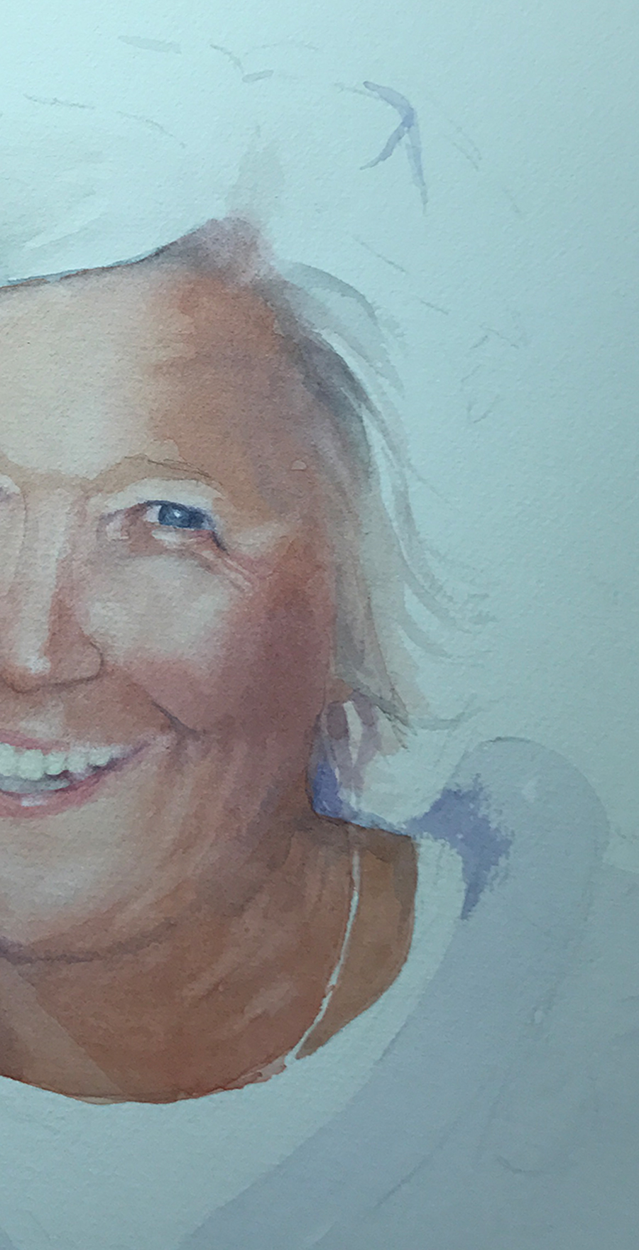
I should add that the finished painting (above) is actually on white paper, so the colors are not accurate (sigh). The camera has a hard time registering white, and often gives the picture a yellow, red or blue cast. Frustrating!
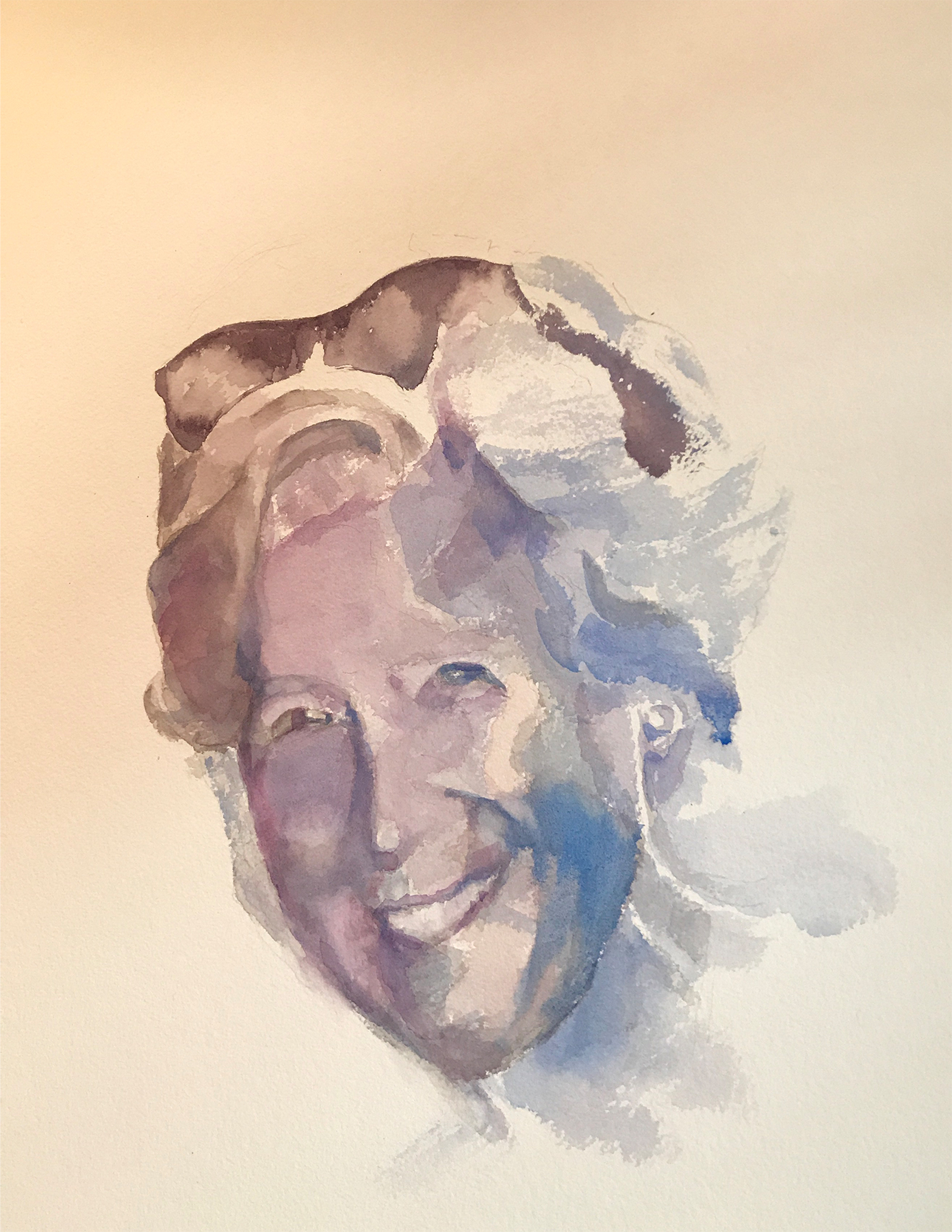
Painting almost always requires many failed attempts. For instance, I couldn’t get the right side of Doots’s face without her looking truly bizarre, so I’m hiding it in this photograph… I, also, realized that her mouth was too wide. She also looked fat, and I didn’t want that, so I scraped the whole thing. Sort of like bad batches of cookies…
I didn’t take many pictures as I worked through this painting as I was so absorbed that I forgot. Next time I’ll do better…
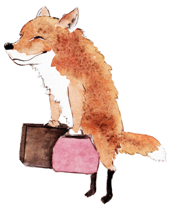
Aside from my fine art paintings, I’m illustrating a book of fables that my husband has written called “Timely Tales.” I love them! Here are two preliminary illustrations. I’ll be posting new ones here as I trot along…
GOOSE'S INVITATION
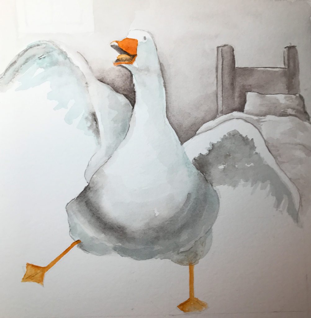
It’s Carnival Day!
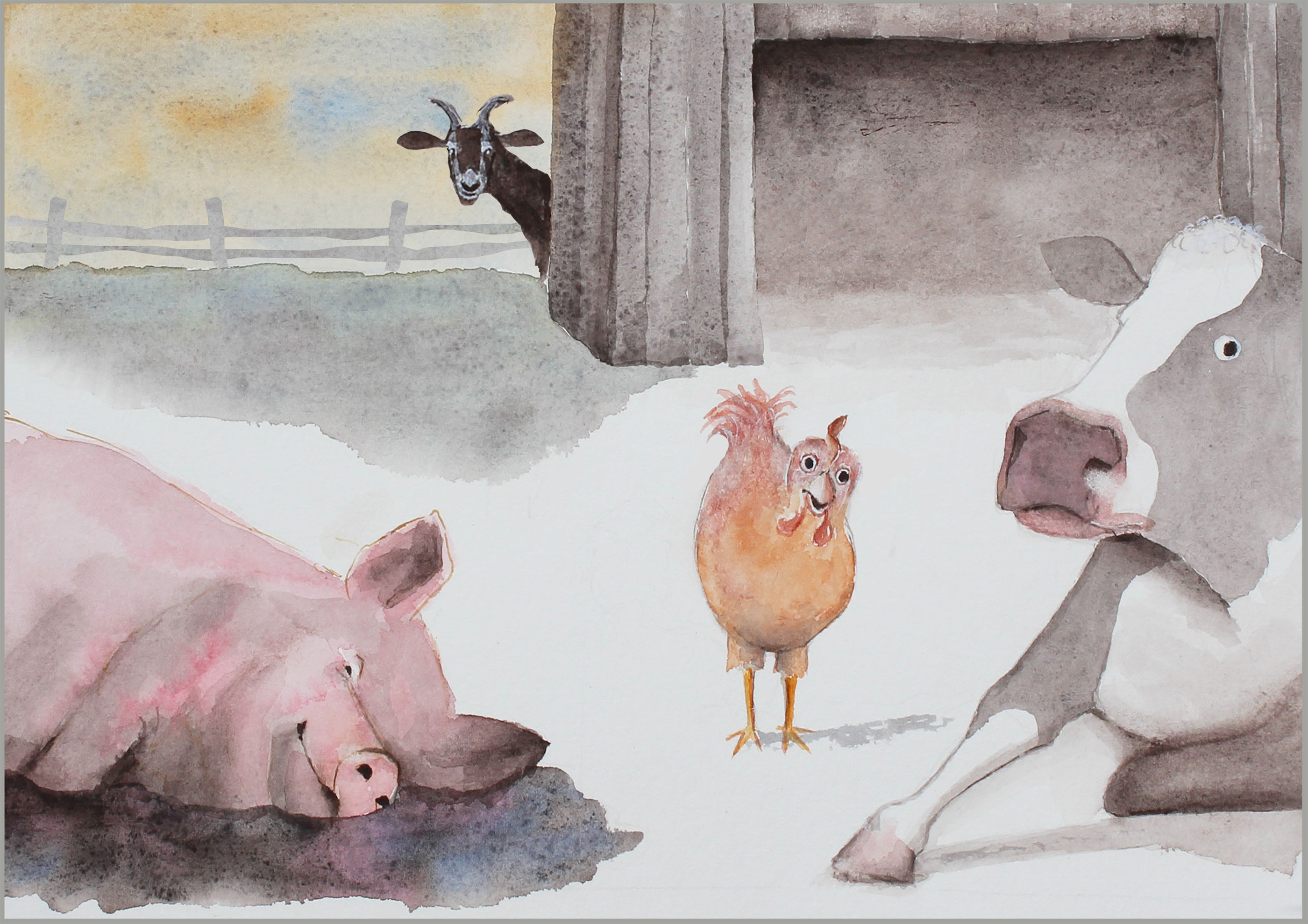
PIG'S PLAY
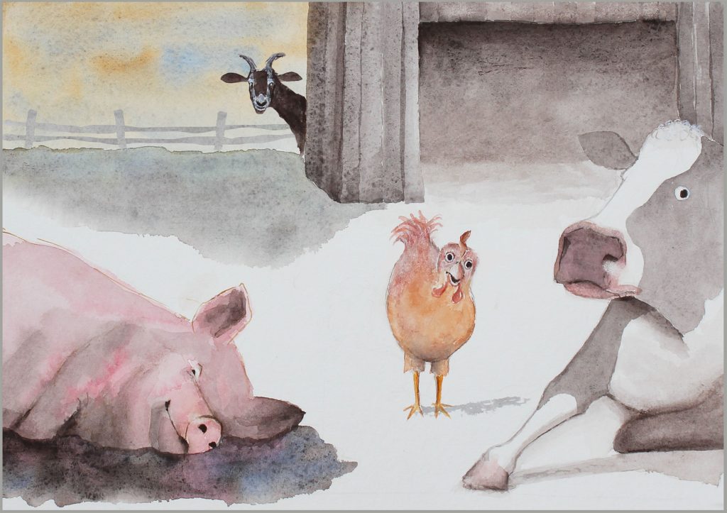
I’m bored!
           Back to Work…
Well, now it’s time to get back to work…Â
SPRING 2015 IS HERE!
I saw this spoon in a drawer of antique silverware belonging to my mother. I was struck by this particular one and its simple beauty. I loved the way the silver caught the colors that were nearby: the orange ruler and the aqua of a glass bird. They really...
Sarah Buell Dowling Fall Blog
I've not done very many paintings in oil, nor am I a still life painter, but I recently took a workshop with Chris Groves, a very talented, Charleston-based painter, and above is the result. Oils are messy! But I LOVE that you can change up, reposition, and...
May Blog
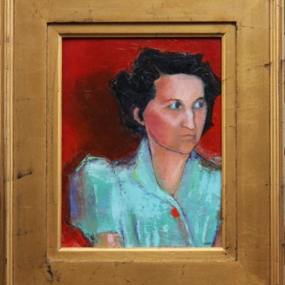
I painted this somewhat abstract painting, "Cautious" in response to seeing a photo of my aunt (taken somewhere around the mid-1930s) hiding in the back of a room peopled with mostly old women wearing assorted hats and solid shoes - perhaps, a garden club...
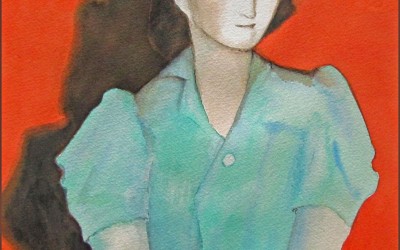
Cautious
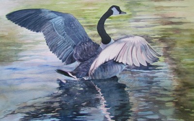
Taking Off
Two Old Friends
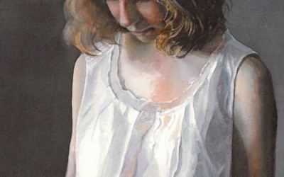
Pensive
Anite
Felder Ann
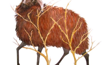
Ram In the thicket
Dusk
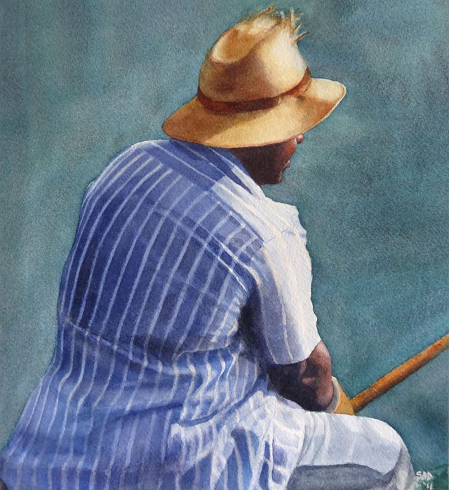
Grey Day @ Gould’s Inlet
Watercolor on Arches cold press paper.
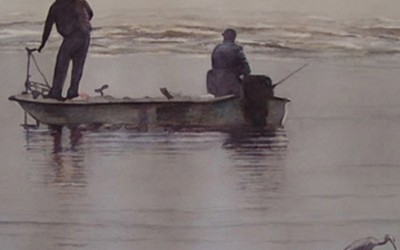
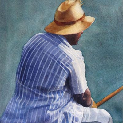
Just Fishing IV
"Just Fishing" is a watercolor done on Arches cold press paper.
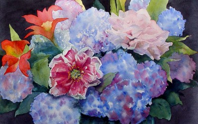
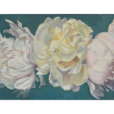
Hydrangeas
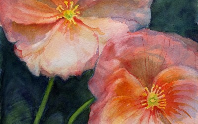
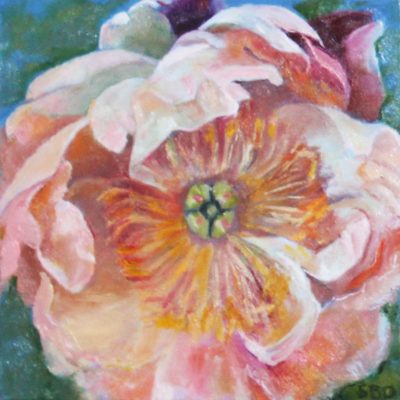
Poppies
Early Spring Blog
A season in my life comes to a close. Time to see what’s next.
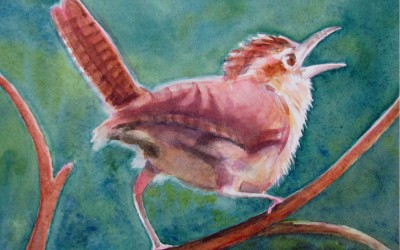
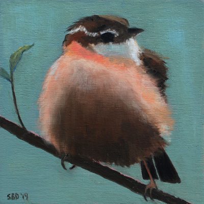
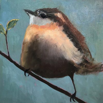
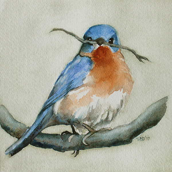
Wren


